UI/UX Design
Holland America
Holland America
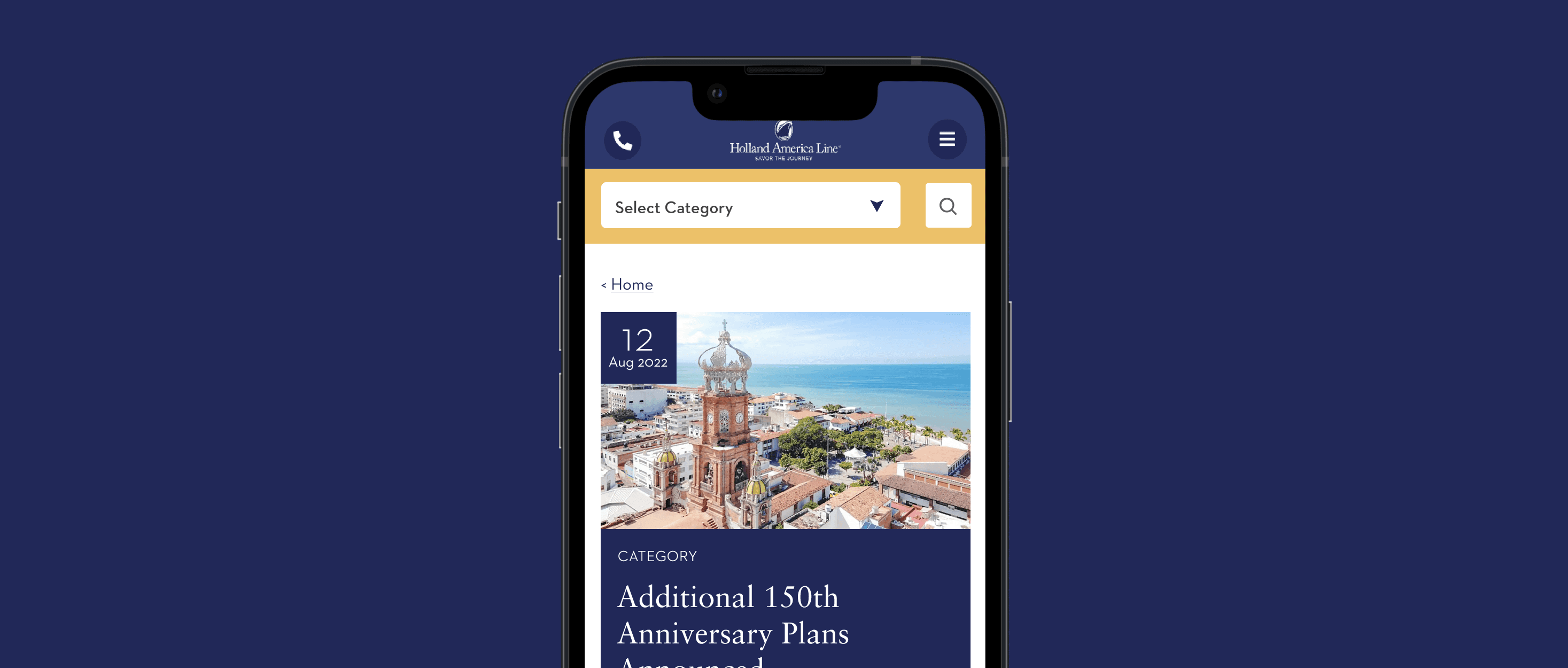
Holland America Line is an established cruise company.
Holland America Line is an established cruise company.

Overview
Overview
Overview
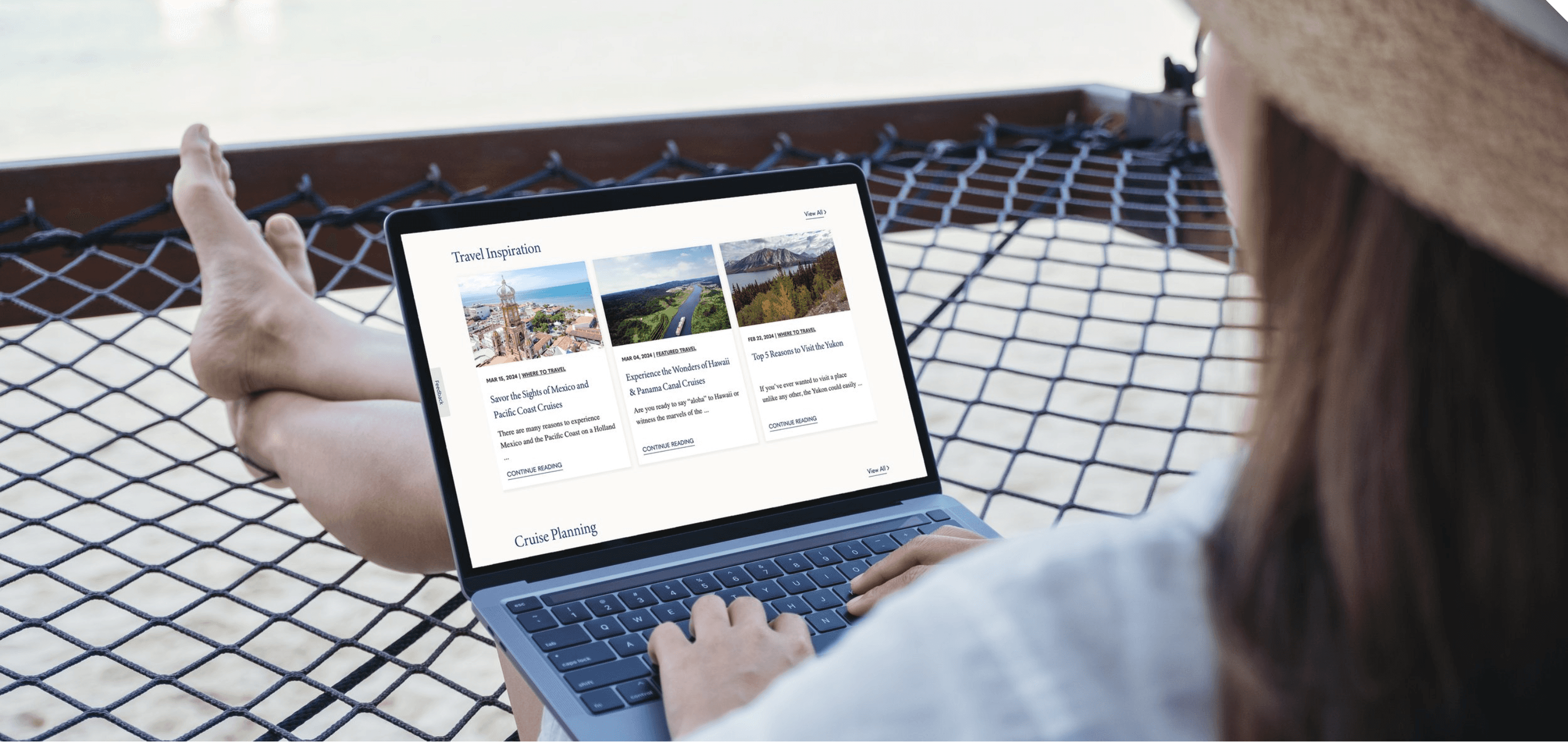
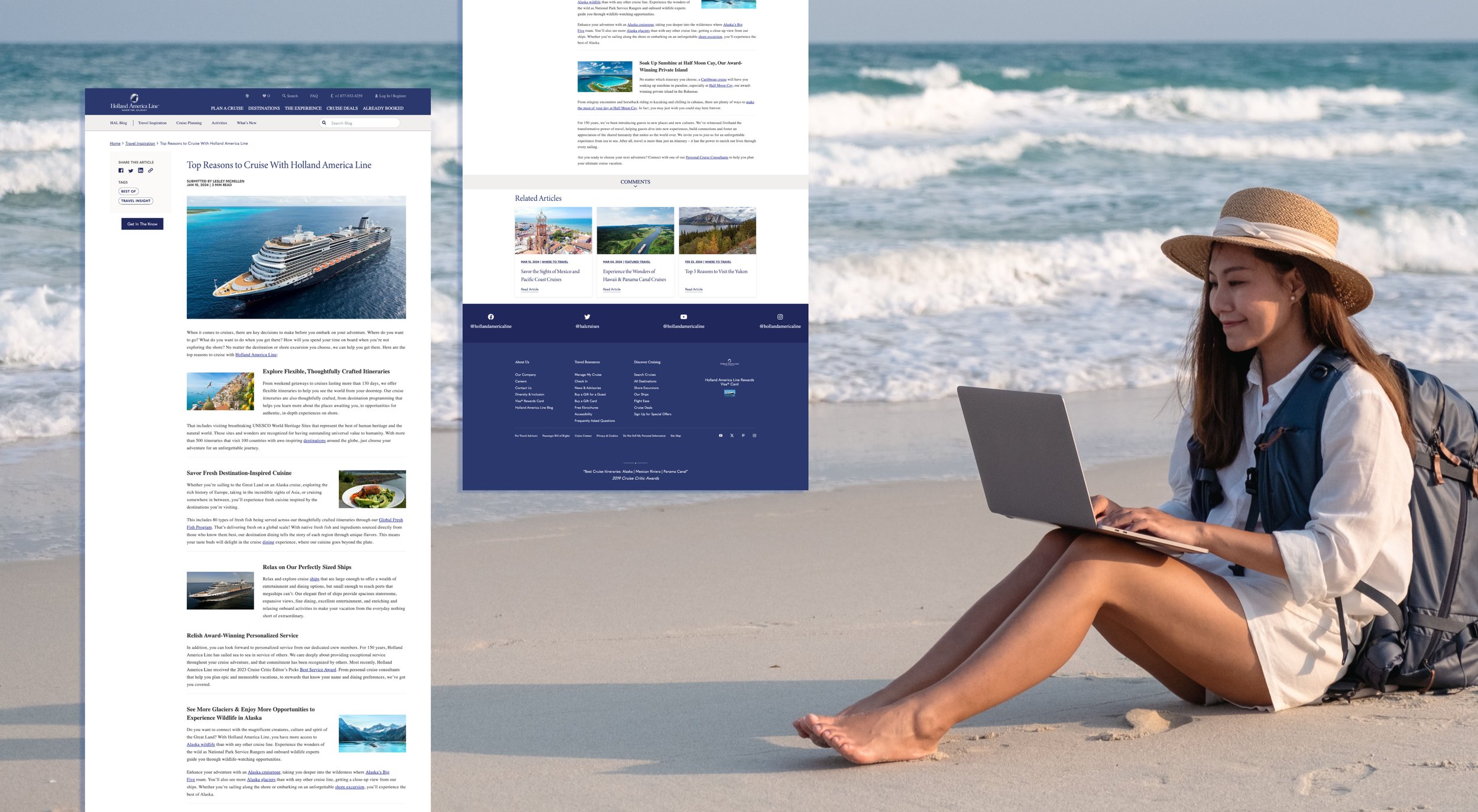
I improved the navigation experience on Holland America Line's blog page by leveraging their customer-focused approach and rich content. My goal was to help users make informed destination choices. I addressed issues with poor information hierarchy, uncategorized content, and disorganized layout to encourage users to explore the blog more easily.
I improved the navigation experience on Holland America Line's blog page by leveraging their customer-focused approach and rich content. My goal was to help users make informed destination choices. I addressed issues with poor information hierarchy, uncategorized content, and disorganized layout to encourage users to explore the blog more easily.
I improved the navigation experience on Holland America Line's blog page by leveraging their customer-focused approach and rich content. My goal was to help users make informed destination choices. I addressed issues with poor information hierarchy, uncategorized content, and disorganized layout to encourage users to explore the blog more easily.
Challenge
Challenge
Challenge
The challenge was dealing with a poor information hierarchy, uncategorized content, and the overall disorganized and complex nature of the blog.
The challenge was dealing with a poor information hierarchy, uncategorized content, and the overall disorganized and complex nature of the blog.
The challenge was dealing with a poor information hierarchy, uncategorized content, and the overall disorganized and complex nature of the blog.
Info
Info
Info
Agency
Agency
DAC Agency
DAC Agency
Year
Year
2022
2022
Tools
Tools
Figma
Figma
My Role
My Role
User Experience and User Interface
User Experience and User Interface
Team
Team
Micha Gappolo - Senior Designer
Teni Melkonyan - Designer
Micha Gappolo - Senior Designer
Teni Melkonyan - Designer
The Problem
The last update to the Holland America Line's blog page occurred in 2021. However, as the company expanded its services and users' expectations changed, the limitations of the current blog platform became more apparent. A series of issues emerged that hindered users from accessing the content they were looking for quickly and effectively:
Content Structure: The layout was too complicated, making it hard for users to find what they needed.
Search and Filter: Limited search tools made it slow to locate specific topics.
Design and Ease of Reading: Old designs and hard-to-use elements made the site less attractive and difficult to read.
Feedback: Not having a way to collect user feedback made it hard to keep improving.
Categories: Missing categories like Recent Articles and Travel Tips made it tough to find information.
Goal
Our general aim was to create a seamless blog page access experience for Holland America, maintaining the integrity of our existing offerings while embracing new possibilities, solving customer issues, and preparing for future innovations.
Content Organization:Making it easier to find things by improving how content is organized and navigated.
Upgrading Search and Filtering:Making search and filtering faster and more effective to quickly get to specific topics or interests.
Modernizing Design:Updating the look and making text easier to read to improve the overall feel and usability.
User Feedback: Creating a strong system to collect and use user feedback for ongoing improvements.
Streamlining Categories: Organizing information into clear groups like Recent Articles and Travel Tips to help find information faster.

UNDERSTAND THE PROBLEM
UNDERSTAND THE PROBLEM
UNDERSTAND THE PROBLEM
User Research
User Research
User Research
I began research to answer questions such as how to improve the user experience of the Holland America Line blog page and where users encounter issues. Following research, I observed that many users struggled to access desired content due to small text sizes and lack of categorized content.
I began research to answer questions such as how to improve the user experience of the Holland America Line blog page and where users encounter issues. Following research, I observed that many users struggled to access desired content due to small text sizes and lack of categorized content.
I began research to answer questions such as how to improve the user experience of the Holland America Line blog page and where users encounter issues. Following research, I observed that many users struggled to access desired content due to small text sizes and lack of categorized content.
Aking Users
Aking Users
Interviews
Interviews
Interviewees were divided into two groups. Two of these groups, consisting of 5 individuals each, are new users, and we aim to learn about their experiences with the Holland America Line blog page. The other 3 individuals are existing users who no longer wish to use the Holland America Line blog page, and we want to understand their reasons. We expect our participants to be aged between 50 and 65 and residing in Canada.
Interviewees were divided into two groups. Two of these groups, consisting of 5 individuals each, are new users, and we aim to learn about their experiences with the Holland America Line blog page. The other 3 individuals are existing users who no longer wish to use the Holland America Line blog page, and we want to understand their reasons. We expect our participants to be aged between 50 and 65 and residing in Canada.
What topics interest you the most when navigating the Holland America Line blog page?
What types of content do you find most appealing on the blog page?
What are the biggest challenges you encounter when using the Holland America Line blog page?
What kind of feedback motivates you and makes you feel engaged?
What suggestions do you have to make the blog page more effective and user-friendly?
What types of incentives could be used to increase your usage of the Holland America Line blog page?
of new users reported experiencing difficulties with the search functionality on the blog page, indicating it wasn't intuitive enough for their needs
of new users reported experiencing difficulties with the search functionality on the blog page, indicating it wasn't intuitive enough for their needs
of new users reported experiencing difficulties with the search functionality on the blog page, indicating it wasn't intuitive enough for their needs
of existing users acknowledged improvements in article navigation on the blog page, but suggested further enhancements in search efficiency and layout design.
of existing users acknowledged improvements in article navigation on the blog page, but suggested further enhancements in search efficiency and layout design.
of existing users acknowledged improvements in article navigation on the blog page, but suggested further enhancements in search efficiency and layout design.
tHE Problem
How can we create a blog page for Holland America Line that allows users to navigate seamlessly, ensuring easy access to accurate information in a hierarchical structure, facilitating their search for desired information?
How can we create a blog page for Holland America Line that allows users to navigate seamlessly, ensuring easy access to accurate information in a hierarchical structure, facilitating their search for desired information?
How can we create a blog page for Holland America Line that allows users to navigate seamlessly, ensuring easy access to accurate information in a hierarchical structure, facilitating their search for desired information?
Evaluating Market Landscape
Evaluating Market Landscape
Evaluating Market Landscape
Competitive Analysis
Competitive Analysis
Competitive Analysis
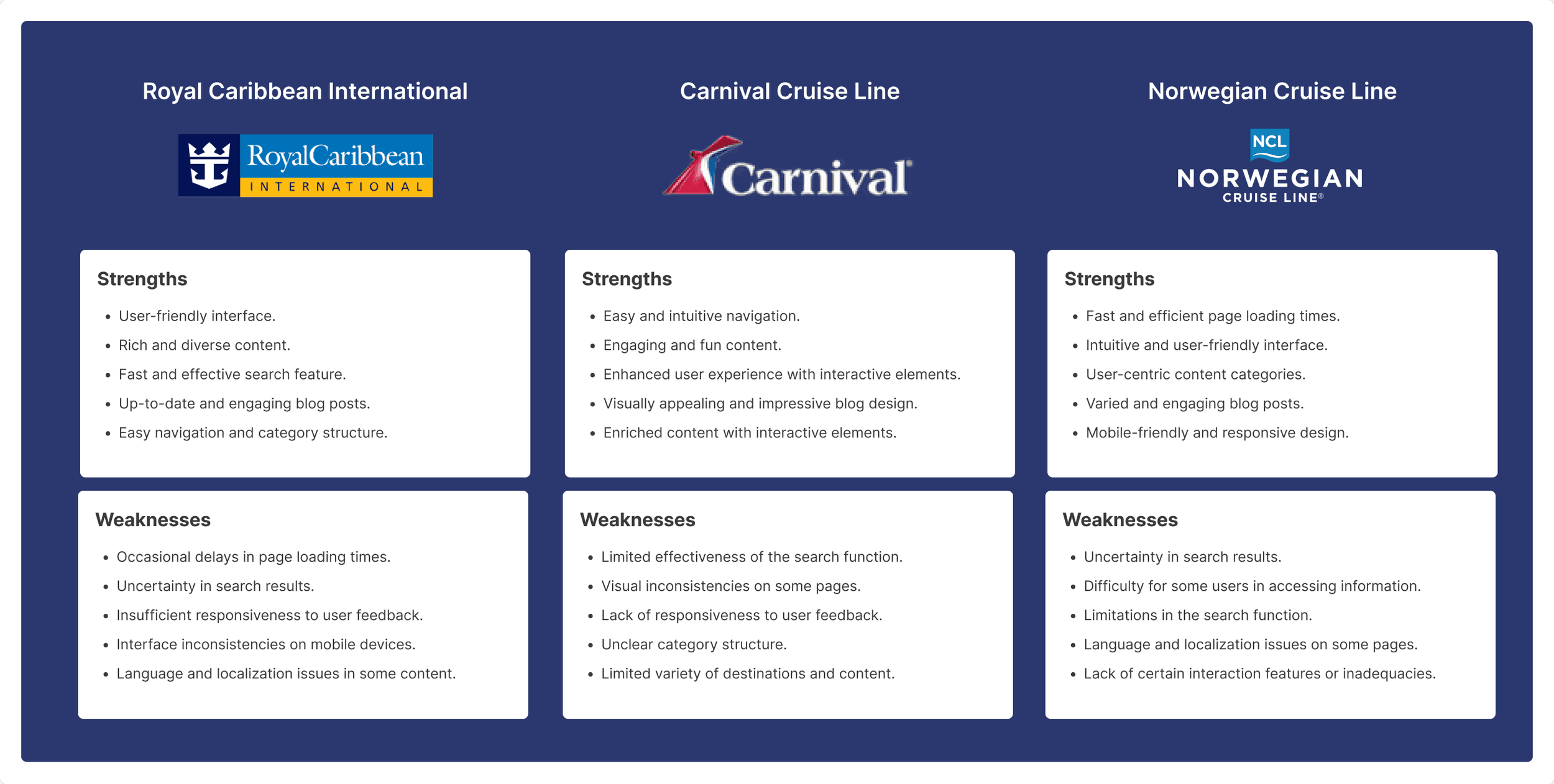
For Holland America Line, I conducted a competitive analysis covering nine different sites. The aim of this analysis, which included a mix of direct and indirect competitors, was to examine how competitors organized their information and presented their content.
For Holland America Line, I conducted a competitive analysis covering nine different sites. The aim of this analysis, which included a mix of direct and indirect competitors, was to examine how competitors organized their information and presented their content.
For Holland America Line, I conducted a competitive analysis covering nine different sites. The aim of this analysis, which included a mix of direct and indirect competitors, was to examine how competitors organized their information and presented their content.


Defining User Profiles
Defining User Profiles
Defining User Profiles
User Persona
User Persona
User Persona
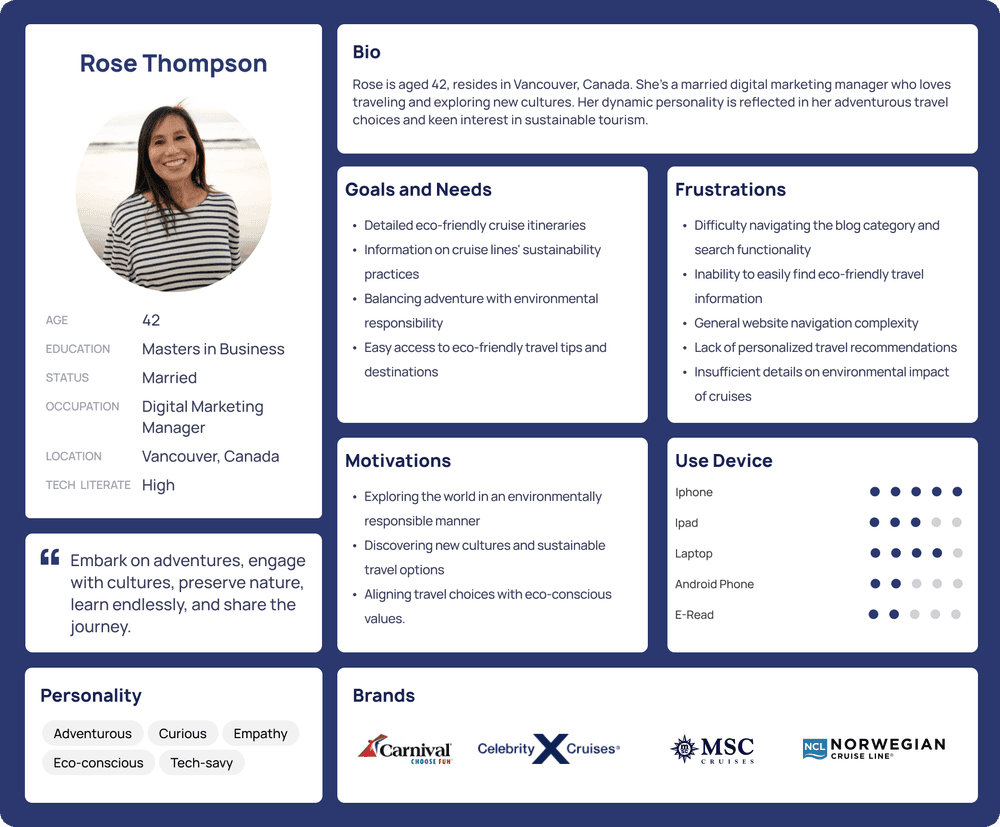
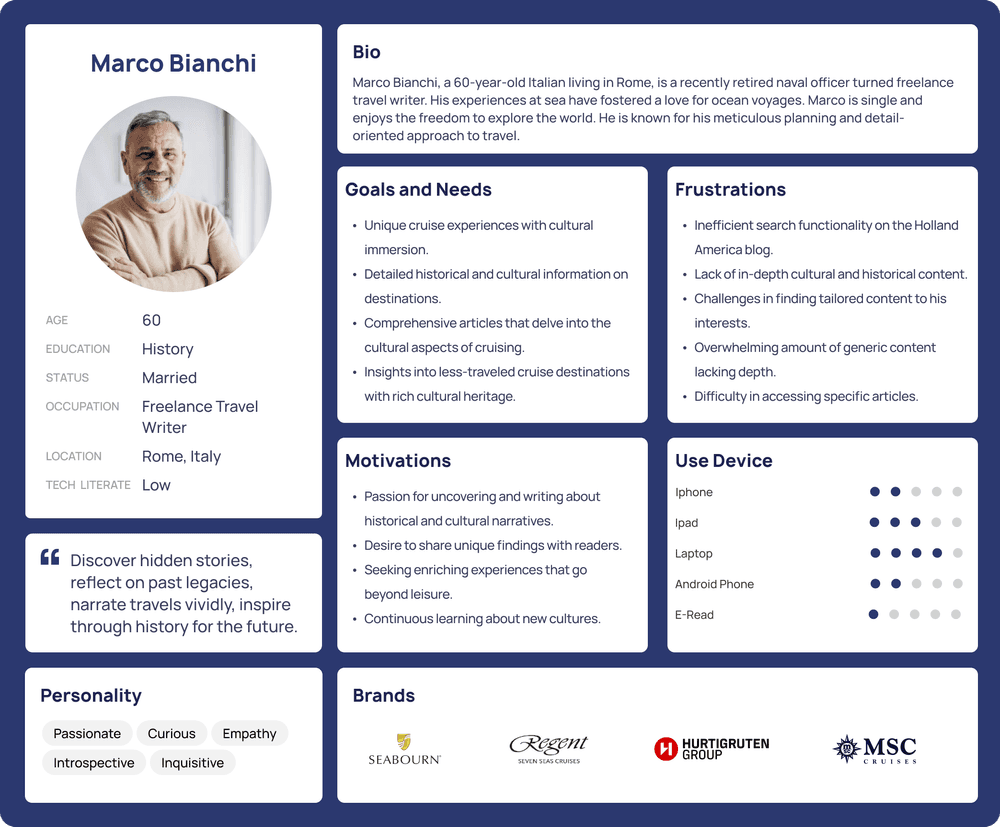
I created the persona based on the characteristics of the primary user group for Holland America Line, which outlines the key goals, frustrations, and content priorities of the users, primarily focusing on users.
I created the persona based on the characteristics of the primary user group for Holland America Line, which outlines the key goals, frustrations, and content priorities of the users, primarily focusing on users.
I created the persona based on the characteristics of the primary user group for Holland America Line, which outlines the key goals, frustrations, and content priorities of the users, primarily focusing on users.




Mapping User Experience
Mapping User Experience
Mapping User Experience
User Flow
User Flow
User Flow
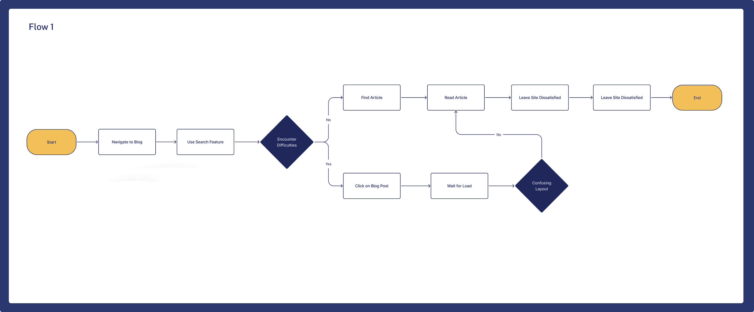
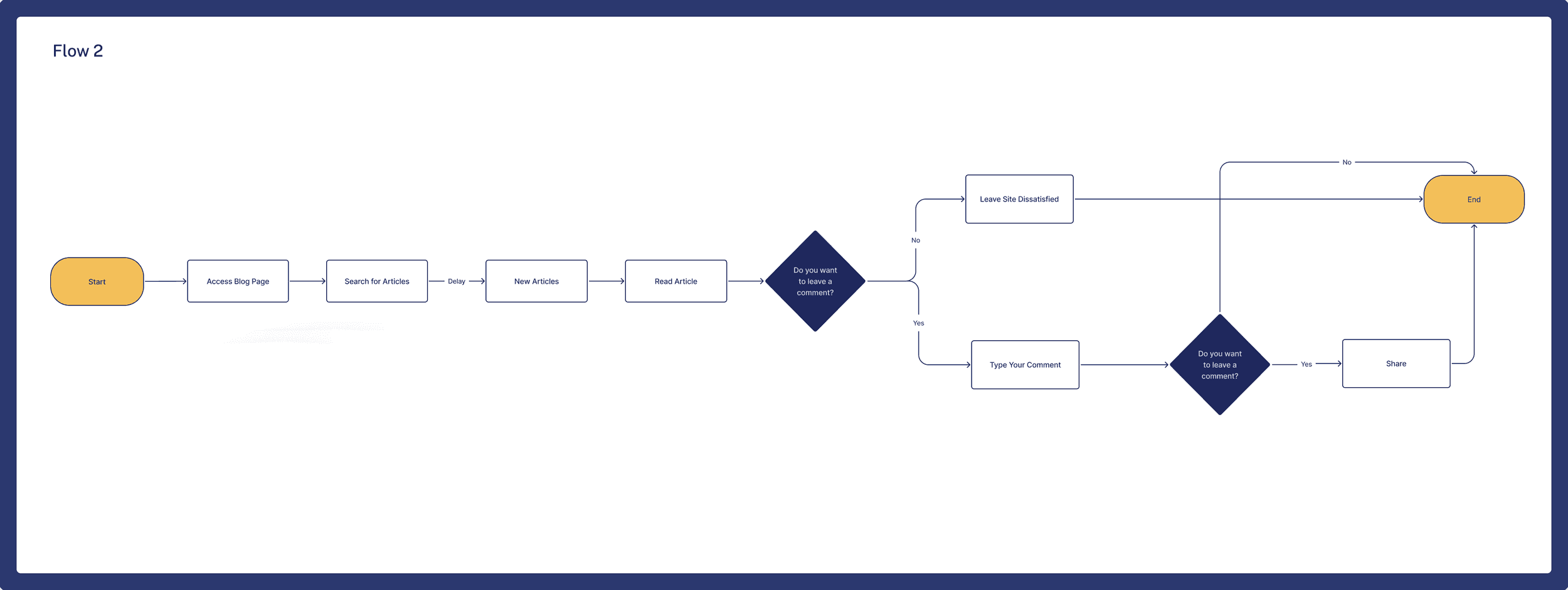
I preferred to create the user flow based on user personas. This allowed me to better understand which path users follow and how I can make it more easier.
I preferred to create the user flow based on user personas. This allowed me to better understand which path users follow and how I can make it more easier.
I preferred to create the user flow based on user personas. This allowed me to better understand which path users follow and how I can make it more easier.




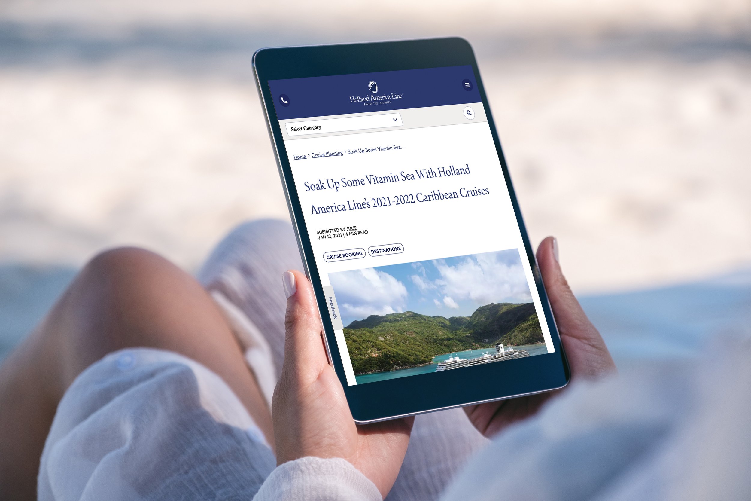
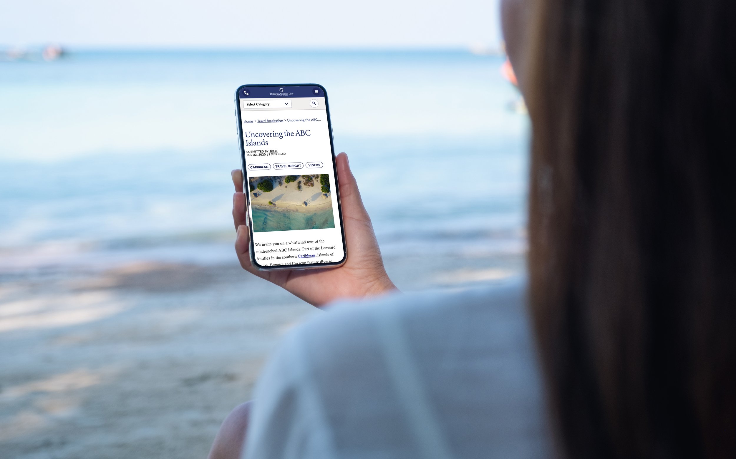


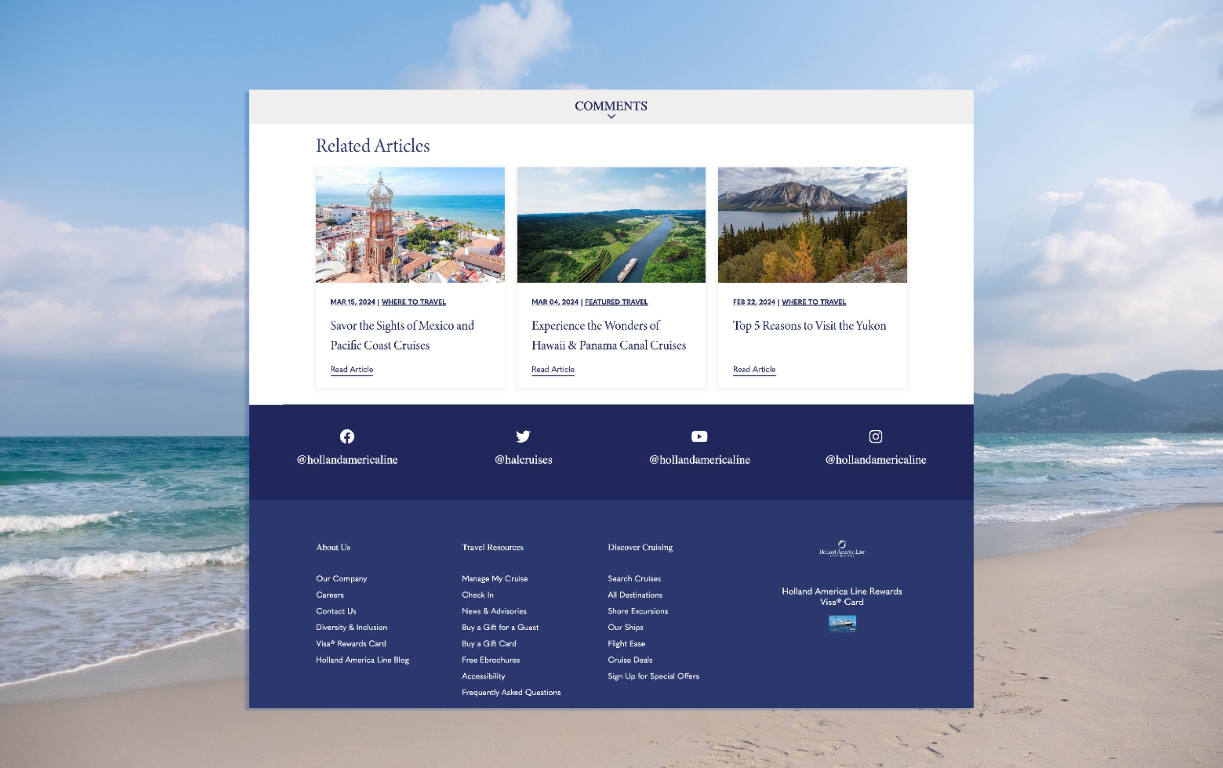


Enhanced Pathway
Enhanced Pathway
Enhanced Pathway
Empathy Map
Empathy Map
Empathy Map
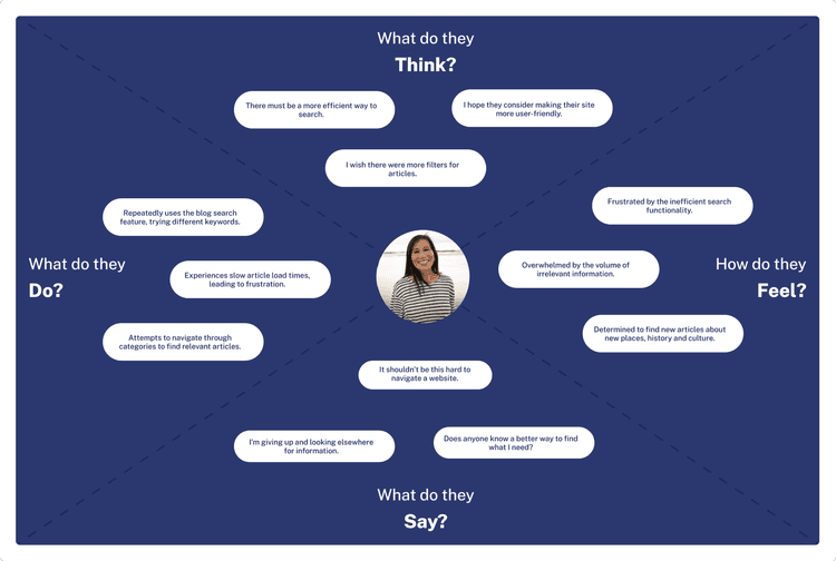
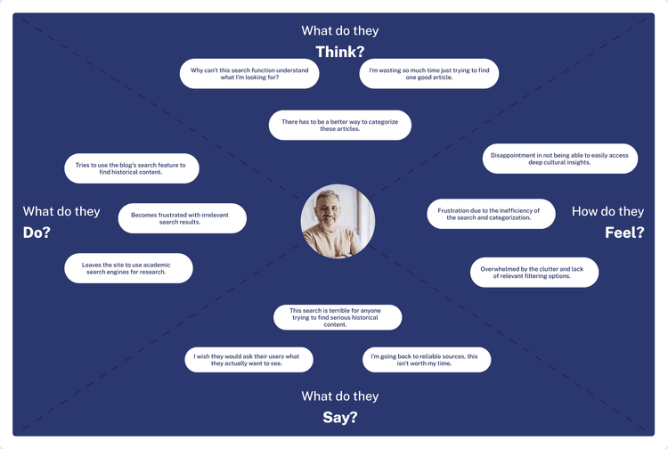
Focusing on user personas, I empathized with their needs, considering their emotions, thoughts, and motivations. This Empathy Map helped me better understand the user experience for the Holland America Line project.
Focusing on user personas, I empathized with their needs, considering their emotions, thoughts, and motivations. This Empathy Map helped me better understand the user experience for the Holland America Line project.
Focusing on user personas, I empathized with their needs, considering their emotions, thoughts, and motivations. This Empathy Map helped me better understand the user experience for the Holland America Line project.




GATHERING IDEAS
GATHERING IDEAS
GATHERING IDEAS
Feature Prioritization Matrix
Feature Prioritization Matrix
Feature Prioritization Matrix
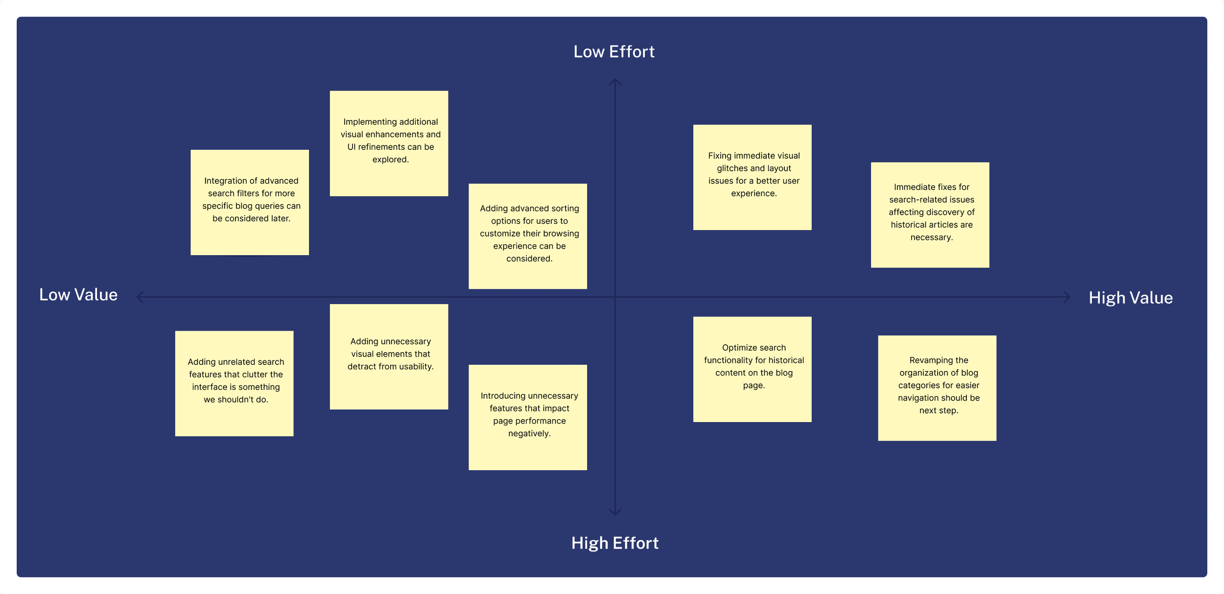
After creating user personas, I created a Feature Prioritization Matrix and took a series of steps to improve the user experience in order to better serve the project's goals.
After creating user personas, I created a Feature Prioritization Matrix and took a series of steps to improve the user experience in order to better serve the project's goals.
After creating user personas, I created a Feature Prioritization Matrix and took a series of steps to improve the user experience in order to better serve the project's goals.

Visualizing Interface Design
Visualizing Interface Design
Visualizing Interface Design
Wireframes
Wireframes
Wireframes
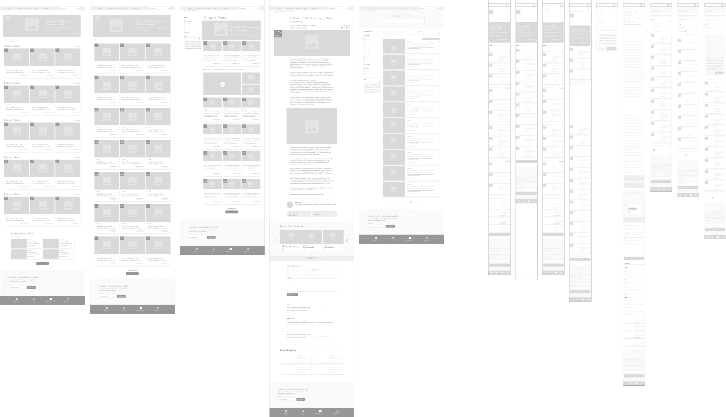
After some initial sketches, I created mid-fi wireframes to build out interactions and flows to test with users. The following showcases both the mobile version and website.
After some initial sketches, I created mid-fi wireframes to build out interactions and flows to test with users. The following showcases both the mobile version and website.
After some initial sketches, I created mid-fi wireframes to build out interactions and flows to test with users. The following showcases both the mobile version and website.


Establishing Design Consistency
Establishing Design Consistency
Establishing Design Consistency
UI Library
UI Library
UI Library
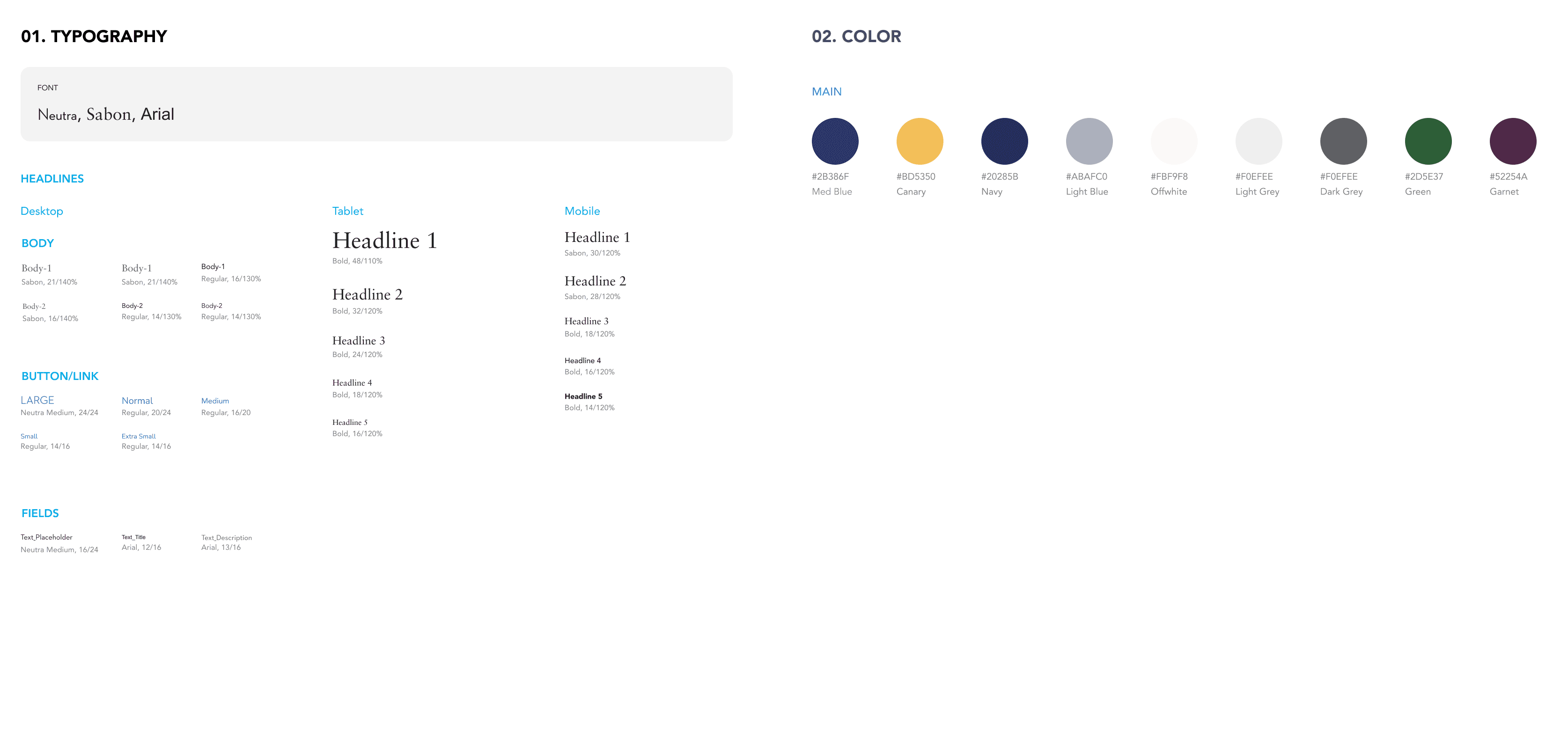
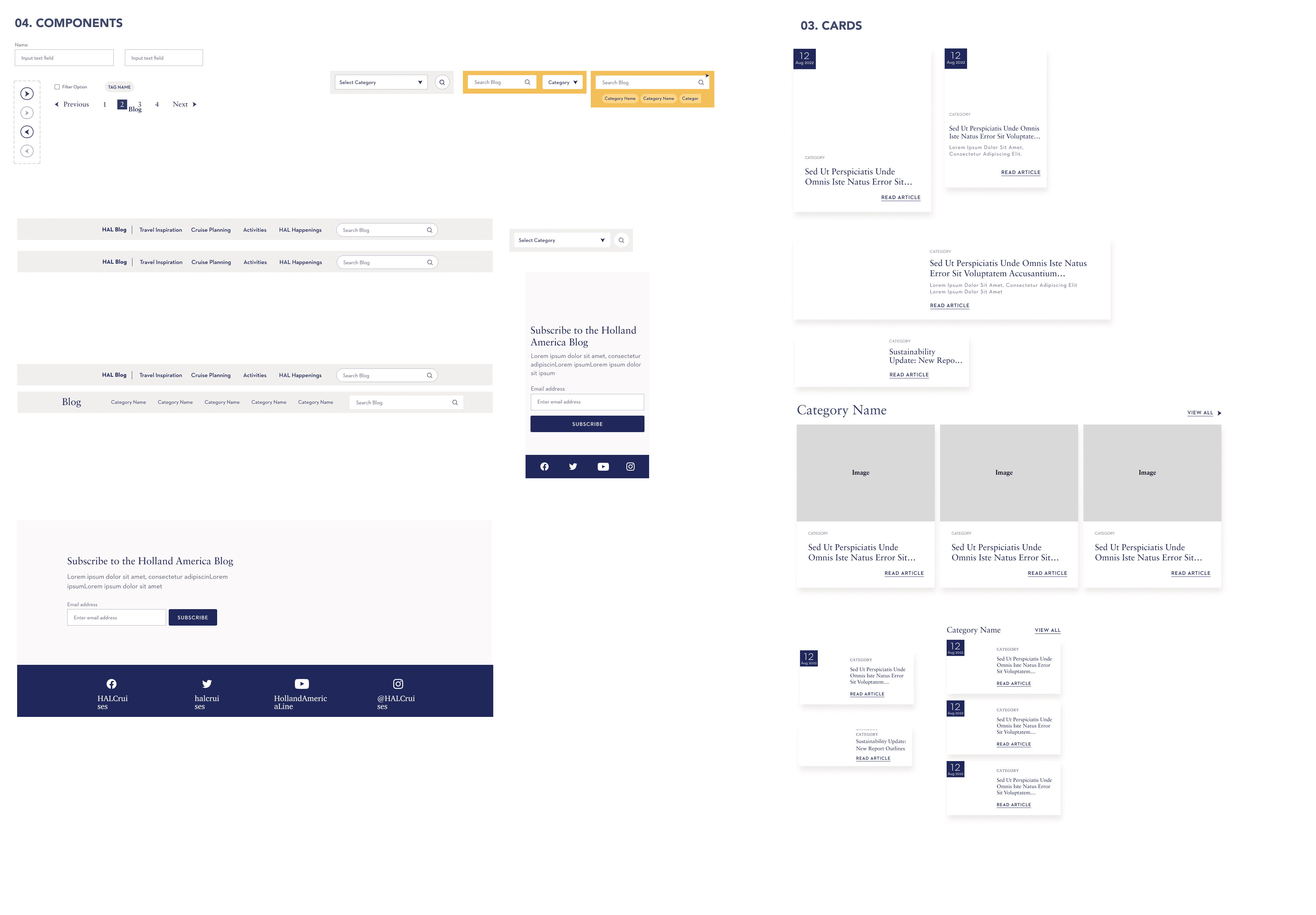
I created a comprehensive design system that goes beyond what is used in the final design. This helped me understand the intricacies of design systems and build screens faster.
I created a comprehensive design system that goes beyond what is used in the final design. This helped me understand the intricacies of design systems and build screens faster.
I created a comprehensive design system that goes beyond what is used in the final design. This helped me understand the intricacies of design systems and build screens faster.



TESTING & ITERATIONS
TESTING & ITERATIONS
TESTING & ITERATIONS
Iteration
Iteration
Iteration
Based on user personas and user flow, I utilized what I knew about users to hypothesize their feelings and thoughts at each decision point, ultimately identifying an opportunity for improvement.
Based on user personas and user flow, I utilized what I knew about users to hypothesize their feelings and thoughts at each decision point, ultimately identifying an opportunity for improvement.
Based on user personas and user flow, I utilized what I knew about users to hypothesize their feelings and thoughts at each decision point, ultimately identifying an opportunity for improvement.

bEFORE
bEFORE
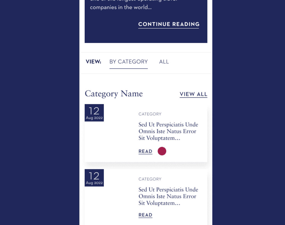
Because the word ''Read'' wasn't sufficiently descriptive, the decision was made to change it to ''Read Article''.
Because the word ''Read'' wasn't sufficiently descriptive, the decision was made to change it to ''Read Article''.

TESTING & ITERATIONS

TESTING & ITERATIONS
bEFORE
Because the word ''Read'' wasn't sufficiently descriptive, the decision was made to change it to ''Read Article'

aFTER
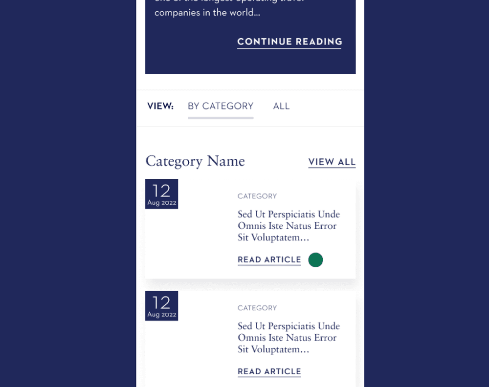
To address this, I have updated the text from simply ''Read'' to ''Read Article''.

TESTING & ITERATIONS

TESTING & ITERATIONS
bEFORE
The arrow buttons were not suitable for the user interface, making it impossible for users to access many articles through the arrows.

aFTER
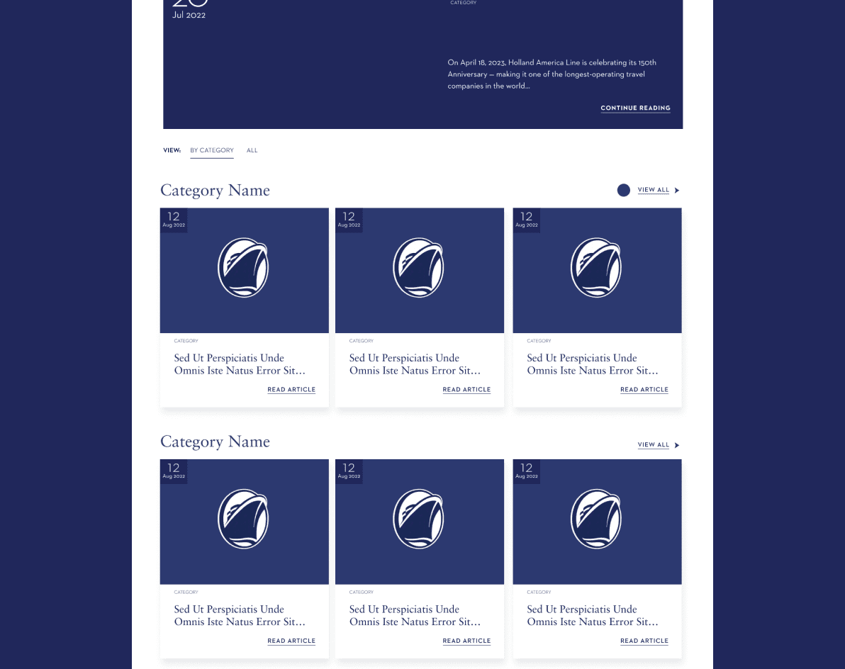
To improve usability and save time, we replaced the arrow buttons with a ''View All'' button.
TESTING & ITERATIONS

TESTING & ITERATIONS
bEFORE
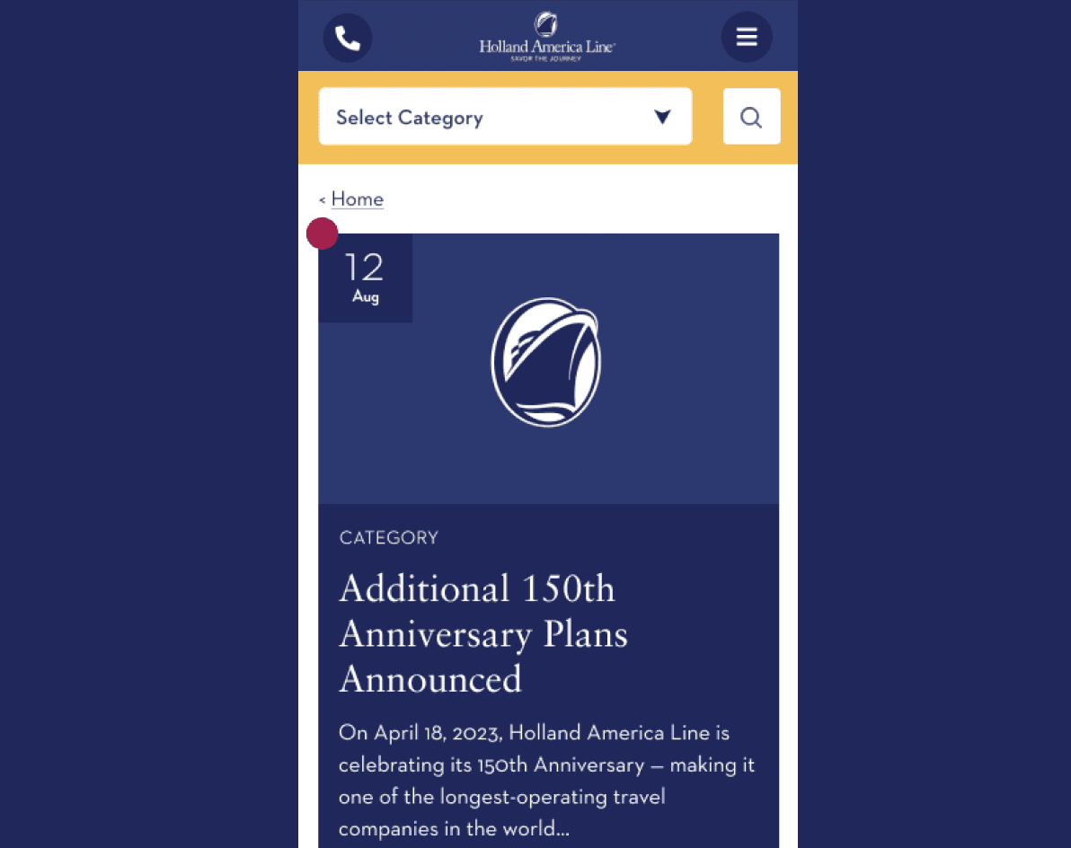
We recognized the importance of including years in addition to days and months.

aFTER
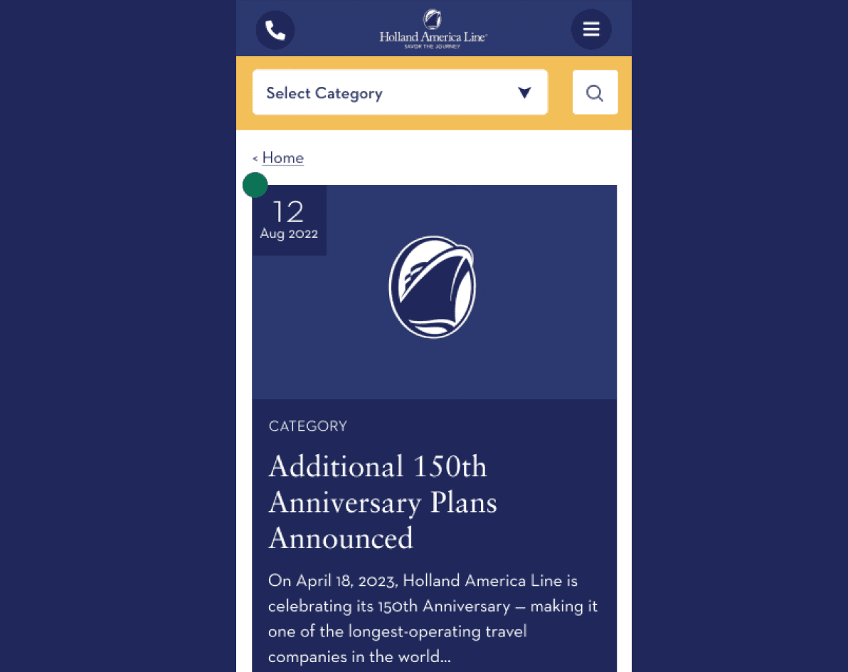
Consequently, full dates, including years, have now been added in the new design.


After
To address this, I have updated the text from simply ''Read'' to ''Read Article''.


Before
The arrow buttons were not suitable for the user interface, making it impossible for users to access many articles through the arrows.


After
To improve usability and save time, we replaced the arrow buttons with a ''View All'' button.


Before
We recognized the importance of including years in addition to days and months.


After
Consequently, full dates, including years, have now been added in the new design.

aFTER
To address this, I have updated the text from simply ''Read'' to ''Read Article''.

bEFORE
The arrow buttons were not suitable for the user interface, making it impossible for users to access many articles through the arrows.

aFTER
To improve usability and save time, we replaced the arrow buttons with a ''View All'' button.

bEFORE
We recognized the importance of including years in addition to days and months.

aFTER
Consequently, full dates, including years, have now been added in the new design.
Test
Test
Test
Prototype
Prototype
Prototype
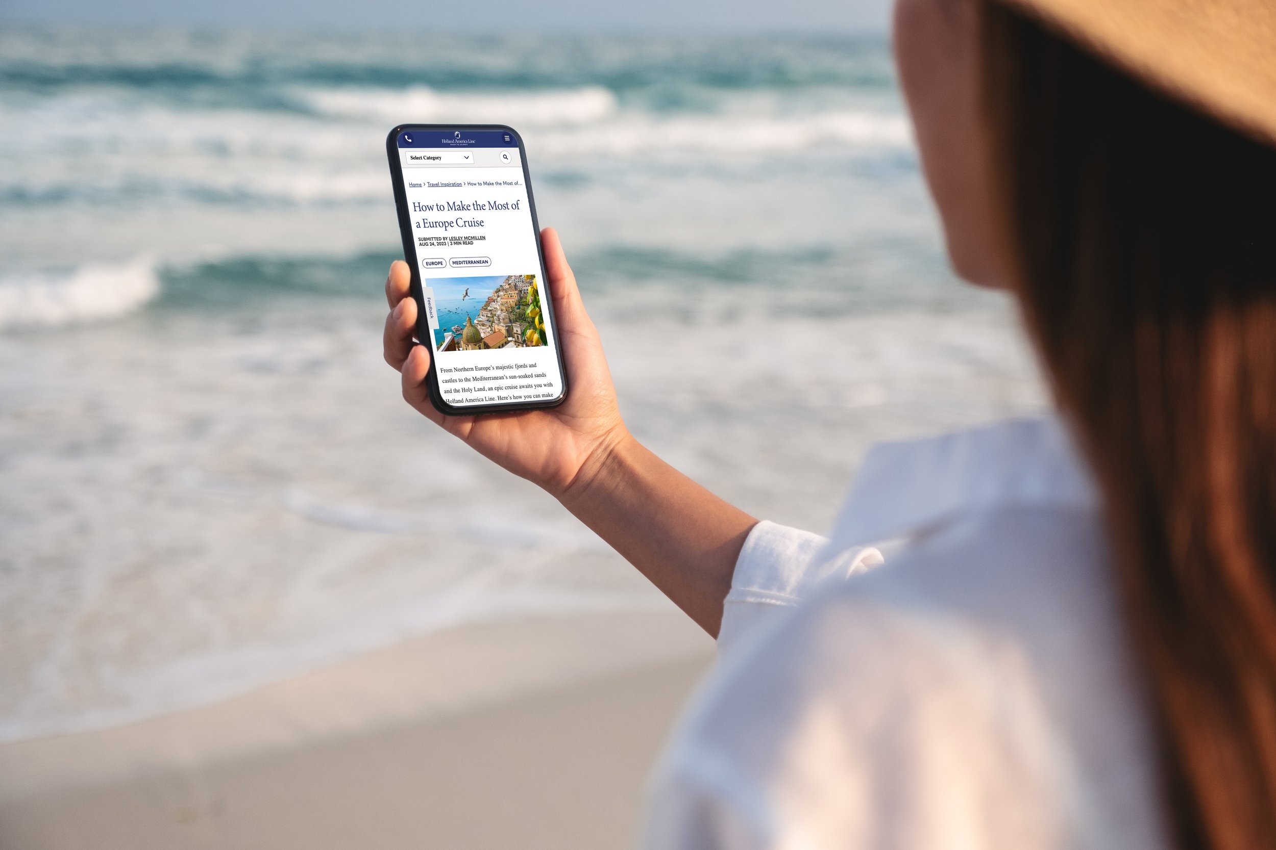
After preparing the UI library and finalizing the high-fidelity mockups and several different iteration sessions, I created the high-fi prototypes for both desktop and mobile, making them ready for testing.
After preparing the UI library and finalizing the high-fidelity mockups and several different iteration sessions, I created the high-fi prototypes for both desktop and mobile, making them ready for testing.
After preparing the UI library and finalizing the high-fidelity mockups and several different iteration sessions, I created the high-fi prototypes for both desktop and mobile, making them ready for testing.
Key Insights
Key Insights
Key Insights
What I have Learned
What I have Learned
What I have Learned
In this project, I learned how to improve the navigation experience on the Holland America Line blog page by leveraging their customer-focused approach and rich experiences. I grasped the significance of user research and feedback, and learned how to incorporate these insights into the design process. Additionally, I gained valuable experience in simplifying the content structure, enhancing search and filtering functionalities, modernizing the design, and effectively collecting user feedback to ensure users could quickly and efficiently access the information they desired.
In this project, I learned how to improve the navigation experience on the Holland America Line blog page by leveraging their customer-focused approach and rich experiences. I grasped the significance of user research and feedback, and learned how to incorporate these insights into the design process. Additionally, I gained valuable experience in simplifying the content structure, enhancing search and filtering functionalities, modernizing the design, and effectively collecting user feedback to ensure users could quickly and efficiently access the information they desired.
In this project, I learned how to improve the navigation experience on the Holland America Line blog page by leveraging their customer-focused approach and rich experiences. I grasped the significance of user research and feedback, and learned how to incorporate these insights into the design process. Additionally, I gained valuable experience in simplifying the content structure, enhancing search and filtering functionalities, modernizing the design, and effectively collecting user feedback to ensure users could quickly and efficiently access the information they desired.


© Teni Melkonyan 2024. All rights reserved.
Designed by Teni Melkonyan
© Teni Melkonyan 2024. All rights reserved.
Designed by Teni Melkonyan
© Teni Melkonyan 2024. All rights reserved.
Designed by Teni Melkonyan


The Problem
The last update to the Holland America Line's blog page occurred in 2022. However, as the company expanded its services and users' expectations changed, the limitations of the current blog platform became more apparent. A series of issues emerged that hindered users from accessing the content they were looking for quickly and effectively:
Content Structure: The layout was too complicated, making it hard for users to find what they needed.
Search and Filter: Limited search tools made it slow to locate specific topics.
Design and Ease of Reading: Old designs and hard-to-use elements made the site less attractive and difficult to read.
Feedback: Not having a way to collect user feedback made it hard to keep improving.
Categories: Missing categories like Recent Articles and Travel Tips made it tough to find information.
Goal
Our general aim was to create a seamless blog page access experience for Holland America, maintaining the integrity of our existing offerings while embracing new possibilities, solving customer issues, and preparing for future innovations.
Content Organization:Making it easier to find things by improving how content is organized and navigated.
Upgrading Search and Filtering:Making search and filtering faster and more effective to quickly get to specific topics or interests.
Modernizing Design:Updating the look and making text easier to read to improve the overall feel and usability.
User Feedback: Creating a strong system to collect and use user feedback for ongoing improvements.
Streamlining Categories: Organizing information into clear groups like Recent Articles and Travel Tips to help find information faster.
Aking Users
Aking Users
Interviews
Interviews
Interviewees were divided into two groups. Two of these groups, consisting of 5 individuals each, are new users, and we aim to learn about their experiences with the Holland America Line blog page. The other 3 individuals are existing users who no longer wish to use the Holland America Line blog page, and we want to understand their reasons. We expect our participants to be aged between 50 and 65 and residing in Canada.
What topics interest you the most when navigating the Holland America Line blog page?
What types of content do you find most appealing on the blog page?
What are the biggest challenges you encounter when using the Holland America Line blog page?
What kind of feedback motivates you and makes you feel engaged?
What suggestions do you have to make the blog page more effective and user-friendly?
What types of incentives could be used to increase your usage of the Holland America Line blog page?

Holland America
Holland America Line is an established cruise company that makes sea voyages special by offering its customers high-quality service and unforgettable experiences.
UI/UX Design


Holland America
Holland America Line is an established cruise company that makes sea voyages special by offering its customers high-quality service and unforgettable experiences.
UI/UX Design

Overview
I improved the navigation experience on Holland America Line's blog page by leveraging their customer-focused approach and rich content. My goal was to help users make informed destination choices. I addressed issues with poor information hierarchy, uncategorized content, and disorganized layout to encourage users to explore the blog more easily.
Challange
The challenge was dealing with a poor information hierarchy, uncategorized content, and the overall disorganized and complex nature of the blog.
Info
Agency
DAC Agency
Year
2022
Tools
Figma
My Role
User Experience and User Interface
Team
Micha Gappolo - Senior Designer
Teni Melkonyan - Designer
The Problem
The last update to the Holland America Line's blog page occurred in 2022. However, as the company expanded its services and users' expectations changed, the limitations of the current blog platform became more apparent. A series of issues emerged that hindered users from accessing the content they were looking for quickly and effectively:
Content Structure: The layout was too complicated, making it hard for users to find what they needed.
Search and Filter: Limited search tools made it slow to locate specific topics.
Design and Ease of Reading: Old designs and hard-to-use elements made the site less attractive and difficult to read.
Feedback: Not having a way to collect user feedback made it hard to keep improving.
Categories: Missing categories like Recent Articles and Travel Tips made it tough to find information.
Goal
Our general aim was to create a seamless blog page access experience for Holland America, maintaining the integrity of our existing offerings while embracing new possibilities, solving customer issues, and preparing for future innovations.
Our Approach
Content Organization:Making it easier to find things by improving how content is organized and navigated.
Upgrading Search and Filtering:Making search and filtering faster and more effective to quickly get to specific topics or interests.
Modernizing Design:Updating the look and making text easier to read to improve the overall feel and usability.
User Feedback: Creating a strong system to collect and use user feedback for ongoing improvements.
Streamlining Categories: Organizing information into clear groups like Recent Articles and Travel Tips to help find information faster.


UNDERSTAND THE PROBLEM
User Research
I began research to answer questions such as how to improve the user experience of the Holland America Line blog page and where users encounter issues. Following research, I observed that many users struggled to access desired content due to small text sizes and lack of categorized content.
ASking Users
Interviews
Interviewees were divided into two groups. Two of these groups, consisting of 5 individuals each, are new users, and we aim to learn about their experiences with the Holland America Line blog page. The other 3 individuals are existing users who no longer wish to use the Holland America Line blog page, and we want to understand their reasons. We expect our participants to be aged between 50 and 65 and residing in Canada.
Our Approach
What topics interest you the most when navigating the Holland America Line blog page?
What types of content do you find most appealing on the blog page?
What are the biggest challenges you encounter when using the Holland America Line blog page?
What kind of feedback motivates you and makes you feel engaged?
What suggestions do you have to make the blog page more effective and user-friendly?
What types of incentives could be used to increase your usage of the Holland America Line blog page?
of new users reported experiencing difficulties with the search functionality on the blog page, indicating it wasn't intuitive enough for their needs
of existing users acknowledged improvements in article navigation on the blog page, but suggested further enhancements in search efficiency and layout design.
tHE Problem
How can we create a blog page for Holland America Line that allows users to navigate seamlessly, ensuring easy access to accurate information in a hierarchical structure, facilitating their search for desired information?
Evaluating Market Landscape
Competitive Analysis
For Holland America Line, I conducted a competitive analysis covering nine different sites. The aim of this analysis, which included a mix of direct and indirect competitors, was to examine how competitors organized their information and presented their content.


Defining User Profiles
User Persona & Journey
Based on our own user research findings and authoritative media sources about the logistics sector in Europe, such as interviews, news reports, and industry reports published in Logistics Manager and The Loadstar, I created two user personas, one for the shipper and one for the carrier.


Mapping User Experience
User Flow
I preferred to create the user flow based on user personas. This allowed me to better understand which path users follow and how I can make it more easier.


Enhanced Pathway
Empathy Map
Focusing on user personas, I empathized with their needs, considering their emotions, thoughts, and motivations. This Empathy Map helped me better understand the user experience for the Holland America Line project.


GATHERING IDEAS
Feature Prioritization Matrix
I created the "Likes, Wishes, If Possible" chart. Afterwards, I invited people to vote for their most positive traits. Based on the voting results, I further analyzed to list the following matrix. This allowed prioritizing features with High Impact and Low Complexity.


Visualizing Interface Design
Wireframes
After some initial sketches, I created mid-fi wireframes to build out interactions and flows to test with users. The following showcases both the mobile version and website.


Establishing Design Consistency
UI Library
I created a comprehensive design system that goes beyond what is used in the final design. This helped me understand the intricacies of design systems and build screens faster.


TESTING & ITERATIONS
Iteration
Based on user personas and user flow, I utilized what I knew about users to hypothesize their feelings and thoughts at each decision point, ultimately identifying an opportunity for improvement.


Before
Because the word ''Read'' wasn't sufficiently descriptive, the decision was made to change it to ''Read Article''.


After
To address this, I have updated the text from simply ''Read'' to ''Read Article''.


before
The arrow buttons were not suitable for the user interface, making it impossible for users to access many articles through the arrows.


After
To improve usability and save time, we replaced the arrow buttons with a ''View All'' button.


BEFORE
We recognized the importance of including years in addition to days and months.


AFTER
Consequently, full dates, including years, have now been added in the new design.
Test
Prototype
After preparing the UI library and finalizing the high-fidelity mockups and several different iteration sessions, I created the high-fi prototypes for both desktop and mobile, making them ready for testing.
Key Insights
What I have Learned
In this project, I learned how to design a user-friendly blog page by leveraging Holland America Line's customer-centric approach and experiences. Additionally, I grasped the significance of user research and feedback, and learned how to incorporate these insights into the design process.
© Teni Melkonyan 2024. All rights reserved.
Designed by Teni Melkonyan
© Teni Melkonyan 2024. All rights reserved.
Designed by Teni Melkonyan
