UI/UX Design
UI/UX Design
UI/UX Design
Tennders
Tennders
Tennders is a company located in the city of Barcelona, Spain, providing logistical access within Europe.
Tennders is a company located in the city of Barcelona, Spain, providing logistical access within Europe.

Overview
Overview
Overview
Overview
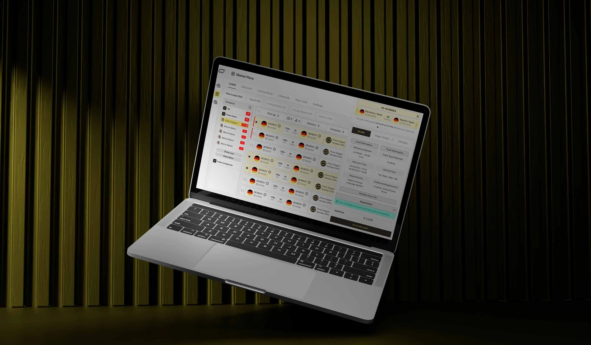
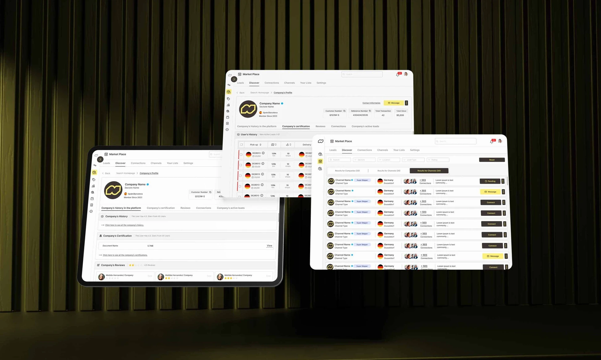
The website allowed customers, carriers, and themselves to communicate and see the status of loads. However, users experienced difficulties accessing entry, load creation, and carrier and shipper profile information starting from the homepage on the Tennders website. Additionally, significant issues were present in the UI portion of the Tennders website, especially as some UI elements were not designed according to WCAG (Web Accessibility Standards).
The website allowed customers, carriers, and themselves to communicate and see the status of loads. However, users experienced difficulties accessing entry, load creation, and carrier and shipper profile information starting from the homepage on the Tennders website. Additionally, significant issues were present in the UI portion of the Tennders website, especially as some UI elements were not designed according to WCAG (Web Accessibility Standards).
The website allowed customers, carriers, and themselves to communicate and see the status of loads. However, users experienced difficulties accessing entry, load creation, and carrier and shipper profile information starting from the homepage on the Tennders website. Additionally, significant issues were present in the UI portion of the Tennders website, especially as some UI elements were not designed according to WCAG (Web Accessibility Standards).
The website allowed customers, carriers, and themselves to communicate and see the status of loads. However, users experienced difficulties accessing entry, load creation, and carrier and shipper profile information starting from the homepage on the Tennders website. Additionally, significant issues were present in the UI portion of the Tennders website, especially as some UI elements were not designed according to WCAG (Web Accessibility Standards).
Challenge
Challenge
Challenge
Challenge
The challenge in the Tennders project was to create a user-friendly and efficient logistics website from scratch, addressing issues like complex navigation, user-unfriendly design, prolonged task completion times, and lack of profile details, while adhering to web accessibility standards.
The challenge in the Tennders project was to create a user-friendly and efficient logistics website from scratch, addressing issues like complex navigation, user-unfriendly design, prolonged task completion times, and lack of profile details, while adhering to web accessibility standards.
The challenge in the Tennders project was to create a user-friendly and efficient logistics website from scratch, addressing issues like complex navigation, user-unfriendly design, prolonged task completion times, and lack of profile details, while adhering to web accessibility standards.
The challenge in the Tennders project was to create a user-friendly and efficient logistics website from scratch, addressing issues like complex navigation, user-unfriendly design, prolonged task completion times, and lack of profile details, while adhering to web accessibility standards.
Info
Info
Info
Info
Agency
Agency
Agency
JoyPad Studio
JoyPad Studio
JoyPad Studio
Year
Year
Year
2024
2024
2024
Tools
Tools
Tools
Figma
Figma
Figma
My Role
My Role
My Role
User Experience and User Interface
User Experience and User Interface
User Experience and User Interface
Team
Team
Team
Muhammad Jabbar - Project Manager
Teni Melkonyan - User Experience Designer
Muhammad Jabbar - Project Manager
Teni Melkonyan - User Experience Designer
Muhammad Jabbar - Project Manager
Teni Melkonyan - User Experience Designer
Google Analytics
Google Analytics
Google Analytics
Google Analytics
In the old website user satisfaction rate
In the old website user satisfaction rate
In the old website user satisfaction rate
New website, user satisfaction increased to
New website, user satisfaction increased to
New website, user satisfaction increased to
New re-website gained new users
New re-website gained new users
New re-website gained new users
The Problem
Tennders committed to offering innovative and effective solutions in the logistics sector. However, its online platform was not fully in line with these principles. A current situation analysis revealed an interface lacking style and consistency, with a confusing information architecture, which negatively affected user experience:
Decreased User Engagement: The complex navigation prevented users from utilizing the service to its full capacity.
Increased Frustration and Errors: The user-unfriendly design led to frequent mistakes and complicated the logistics process.
Extended Time to Complete Tasks: Users unnecessarily spent a lot of time trying to understand the site features.
Lack of Detail in Profiles Reduces Credibility: The missing information in carrier and shipper profiles led to trust issues.
Goal
Our High-Level Goal was to create a customized web with a thoughtful, seamless, and distinctive design that meets user needs and is compatible with the Tennders digital ecosystem.
Our Approach
Simplifying Navigation: To enable users to use the service at its full capacity.
Reducing Error Rate: To facilitate the logistics process by making the design user-friendly.
Decreasing Usage Time: To ensure the site features are understandable and efficiently used.
Enhancing Profile Details: To increase trust by enriching the information in carrier and shipper profiles.
Improving the UI: To enhance the user interface in terms of accessibility and aesthetics.

Tennders
Tennders is a company located in the city of Barcelona, Spain, providing logistical access within Europe.
UI/UX Design


Agile Methodology
Agile Methodology
Agile Methodology
Agile Methodology
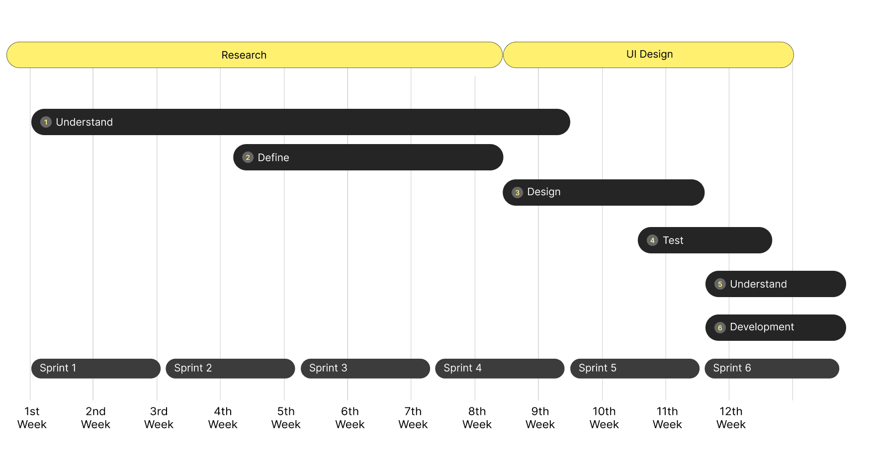
Time Line
Time Line
Time Line
Time Line


Process
Process
Process
Process
Design Thinking
Design Thinking
Design Thinking
Design Thinking
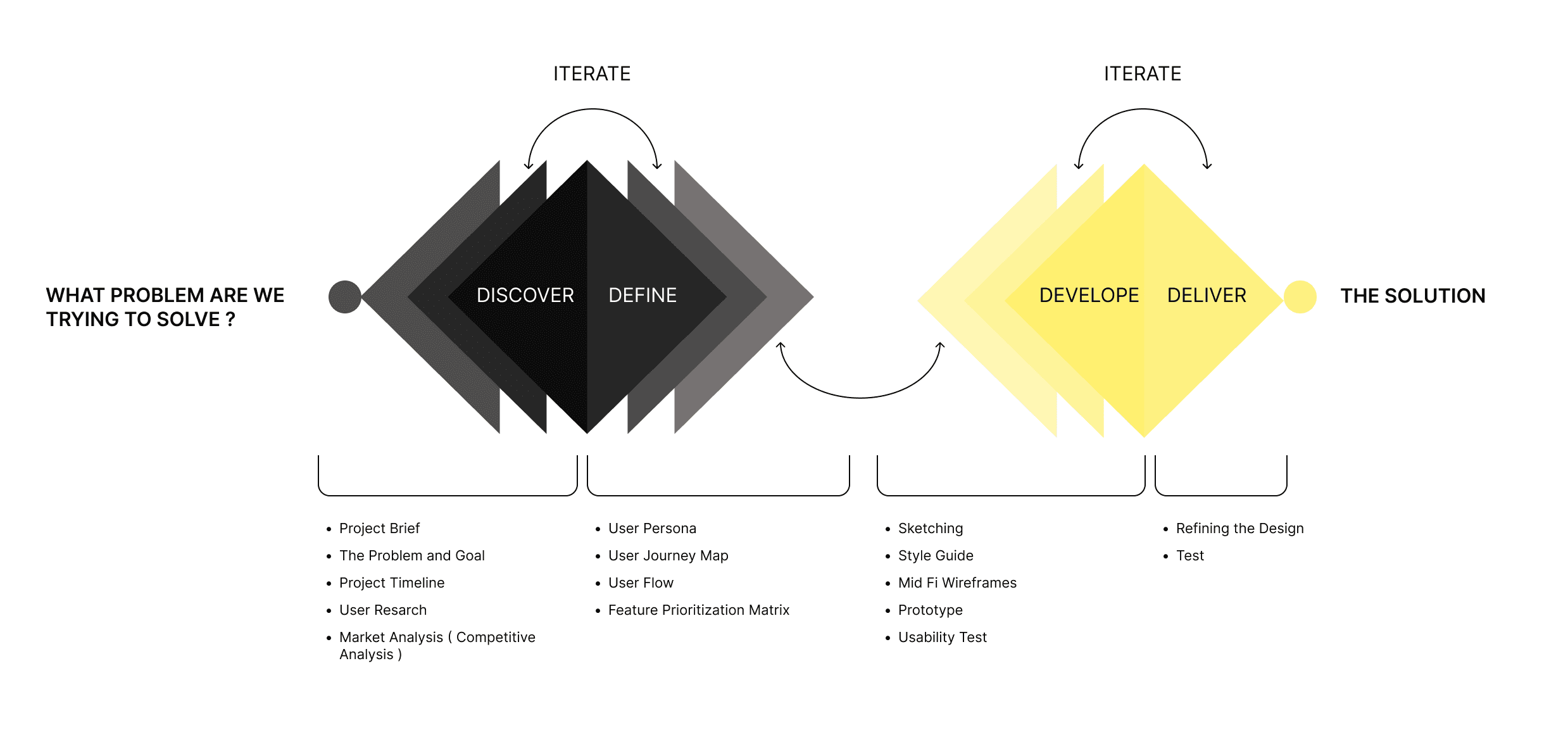
I have adopted the Double Diamond Strategy which breaks the design process into four stages: Discover, Define, Deliver & Develop. I found this process particularly powerful in validating design decisions, allowing enough space for creative exploration while giving a focus point to come back to.
I have adopted the Double Diamond Strategy which breaks the design process into four stages: Discover, Define, Deliver & Develop. I found this process particularly powerful in validating design decisions, allowing enough space for creative exploration while giving a focus point to come back to.
I have adopted the Double Diamond Strategy which breaks the design process into four stages: Discover, Define, Deliver & Develop. I found this process particularly powerful in validating design decisions, allowing enough space for creative exploration while giving a focus point to come back to.
I have adopted the Double Diamond Strategy which breaks the design process into four stages: Discover, Define, Deliver & Develop. I found this process particularly powerful in validating design decisions, allowing enough space for creative exploration while giving a focus point to come back to.


UNDERSTAND THE PROBLEM
UNDERSTAND THE PROBLEM
UNDERSTAND THE PROBLEM
UNDERSTAND THE PROBLEM
User Research
User Research
User Research
User Research
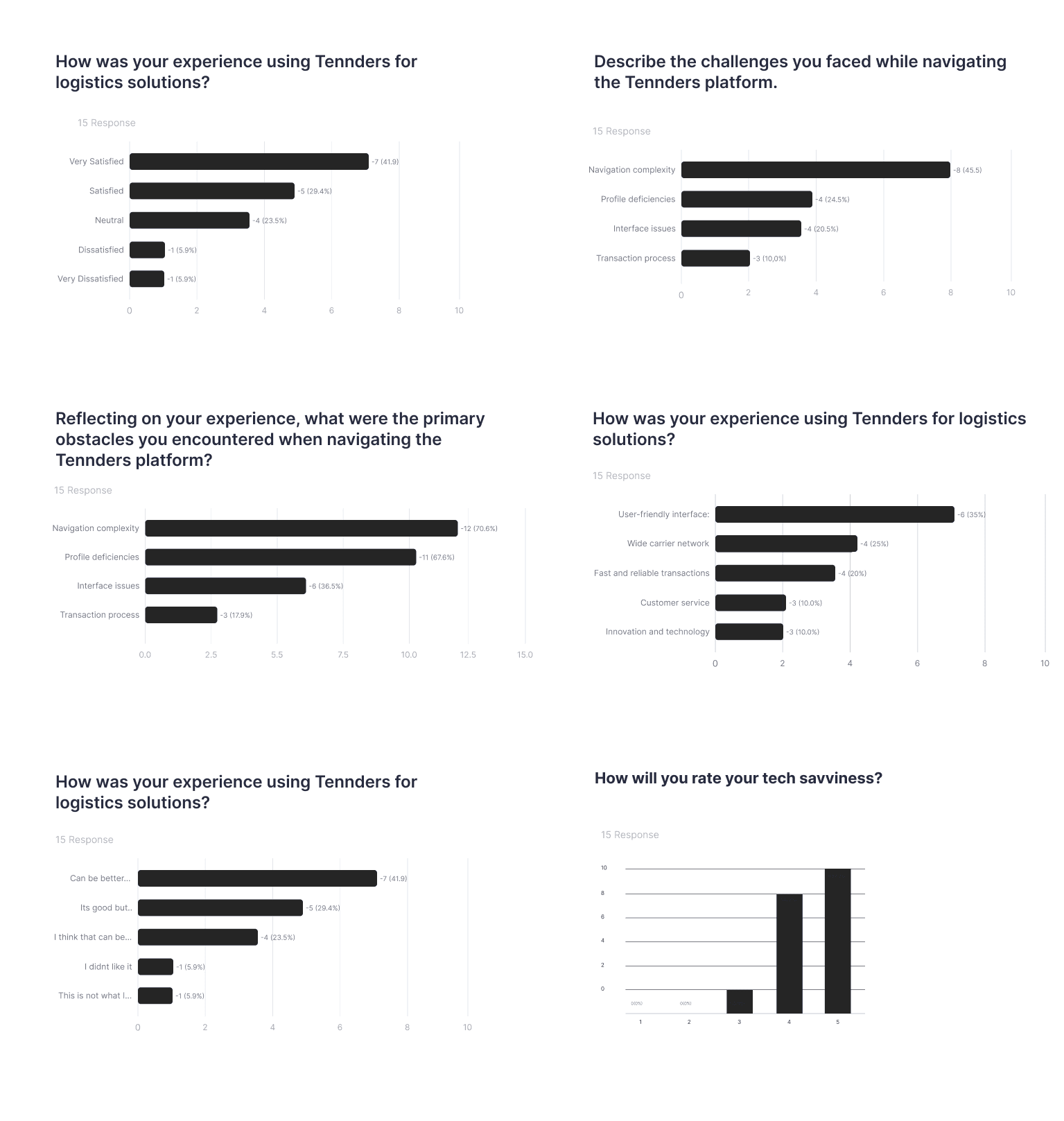
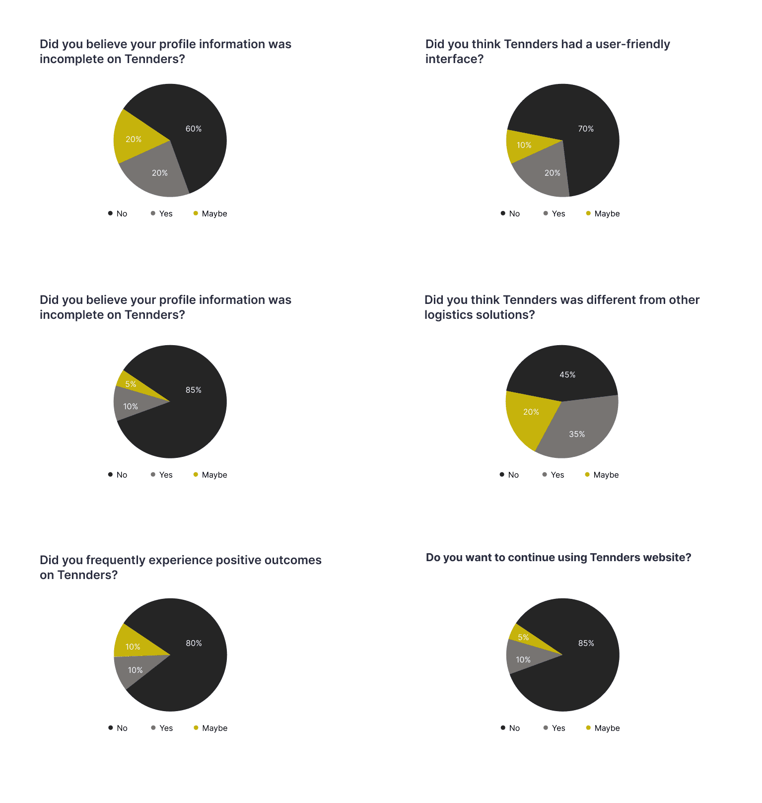
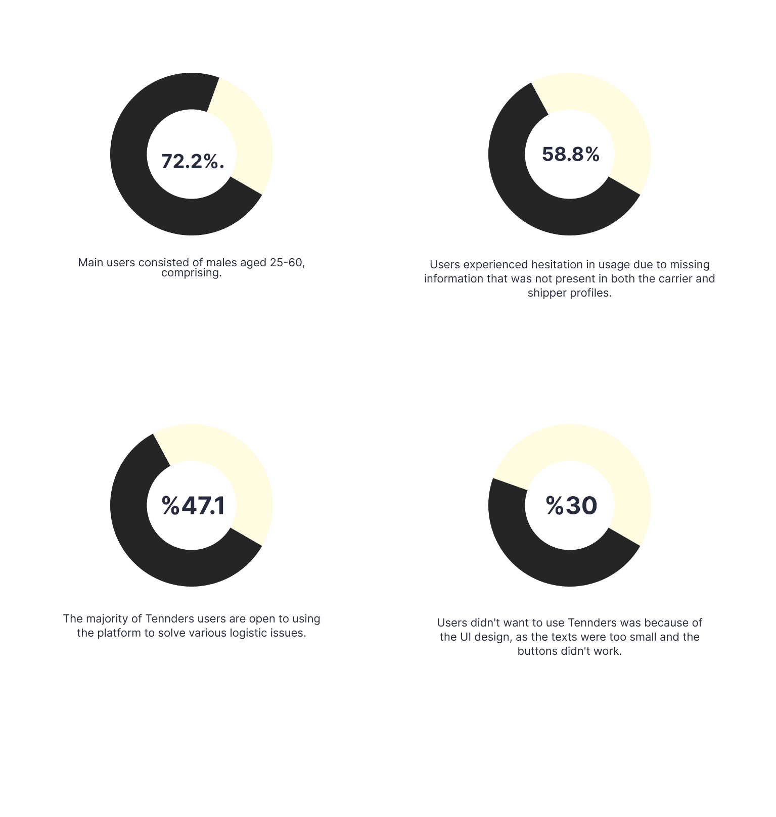
To confirm our hypothesis and due to limited resources, I decided to conduct an online survey to understand the issues users were experiencing. I developed my own questionnaire and identified several Facebook logistics groups where I could reach target users.
The survey contained 15 questions focusing on customers' shipping experiance. This survey enabled me to find answers to questions such as who the users are, what they wanted, and where they encountered problems.




wHAT USERS WANT ?
Tennders users, both shippers and carriers,
wanted an easy way to provide them with real confidence in the logistics website.
Tennders users, both shippers and carriers, wanted an easy way to provide them with real confidence in the logistics website.
SWOT
SWOT
SWOT
SWOT
Competitive Analysis
Competitive Analysis
Competitive Analysis
Competitive Analysis
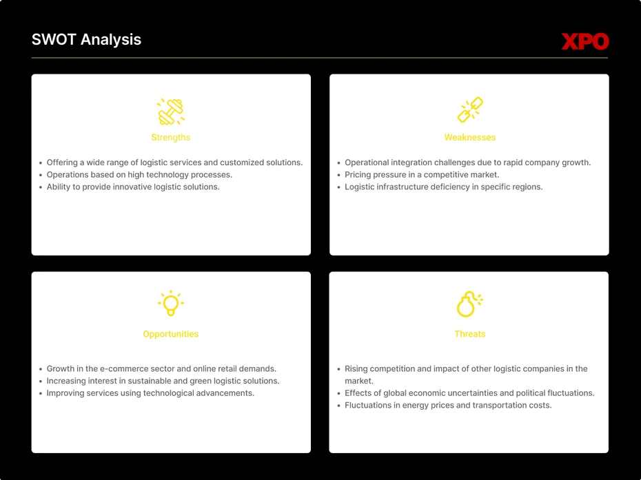
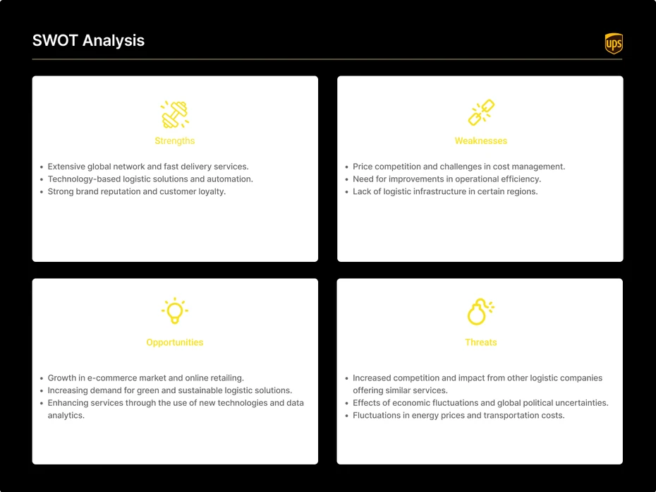
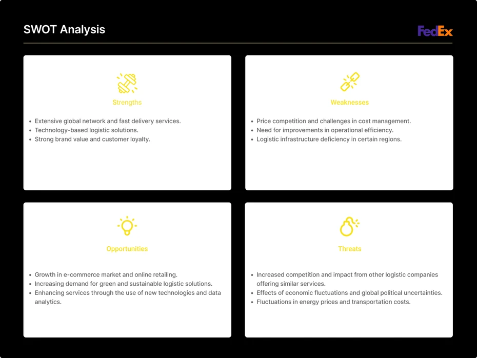
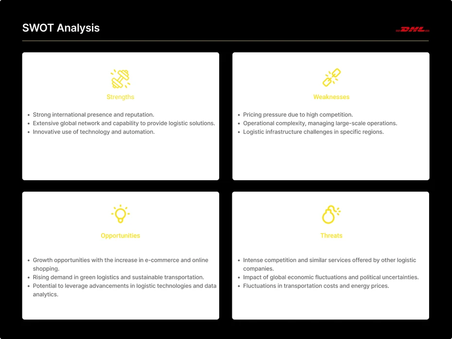
Interviews and data helped me identify four competitors or sources of inspiration that either had a similar business model or matched the aesthetic preference of the team for the Tennders logistics website. I analyzed the homepage designs of competitor firms, their processes for gaining logistics partners, and the consistencies and differences between desktop and mobile experiences.
Interviews and data helped me identify four competitors or sources of inspiration that either had a similar business model or matched the aesthetic preference of the team for the Tennders logistics website. I analyzed the homepage designs of competitor firms, their processes for gaining logistics partners, and the consistencies and differences between desktop and mobile experiences.
Interviews and data helped me identify four competitors or sources of inspiration that either had a similar business model or matched the aesthetic preference of the team for the Tennders logistics website. I analyzed the homepage designs of competitor firms, their processes for gaining logistics partners, and the consistencies and differences between desktop and mobile experiences.
Interviews and data helped me identify four competitors or sources of inspiration that either had a similar business model or matched the aesthetic preference of the team for the Tennders logistics website. I analyzed the homepage designs of competitor firms, their processes for gaining logistics partners, and the consistencies and differences between desktop and mobile experiences.





Defining User Profiles
Defining User Profiles
Defining User Profiles
Defining User Profiles
User Persona & Journey
User Persona & Journey
User Persona & Journey
User Persona & Journey
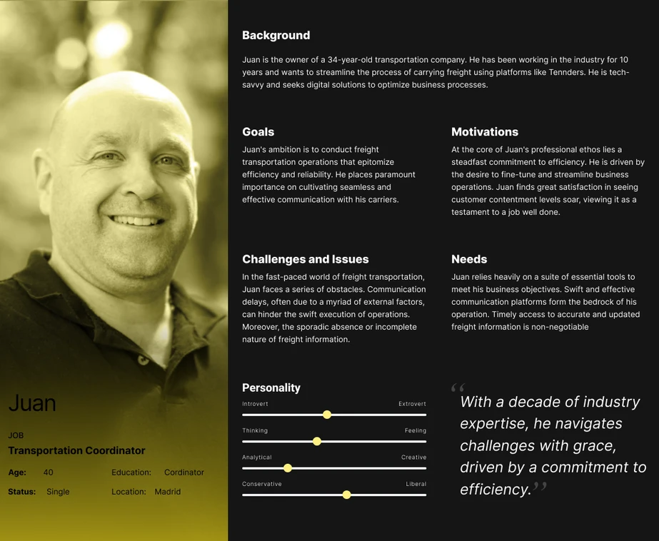
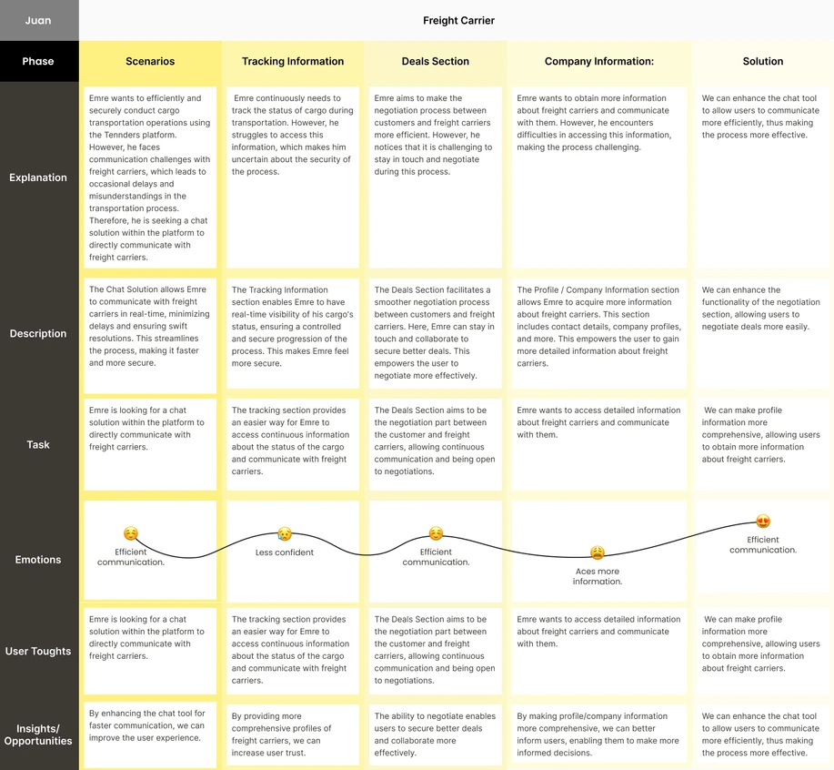
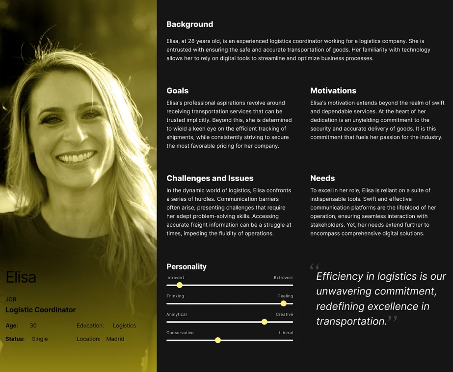
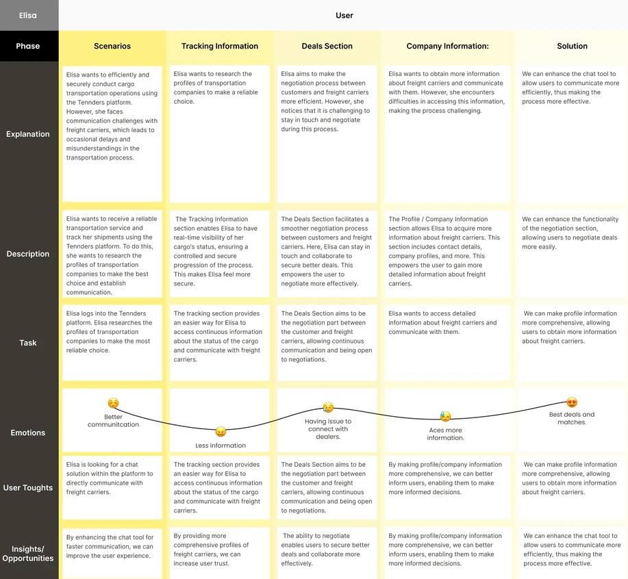
Based on our own user research findings and authoritative media sources about the logistics sector in Europe, such as interviews, news reports, and industry reports published in Logistics Manager and The Loadstar, I created two user personas, one for the shipper and one for the carrier.
Based on our own user research findings and authoritative media sources about the logistics sector in Europe, such as interviews, news reports, and industry reports published in Logistics Manager and The Loadstar, I created two user personas, one for the shipper and one for the carrier.
Based on our own user research findings and authoritative media sources about the logistics sector in Europe, such as interviews, news reports, and industry reports published in Logistics Manager and The Loadstar, I created two user personas, one for the shipper and one for the carrier.
Based on our own user research findings and authoritative media sources about the logistics sector in Europe, such as interviews, news reports, and industry reports published in Logistics Manager and The Loadstar, I created two user personas, one for the shipper and one for the carrier.





Mapping User Experience
Mapping User Experience
Mapping User Experience
Mapping User Experience
User Flow
User Flow
User Flow
User Flow
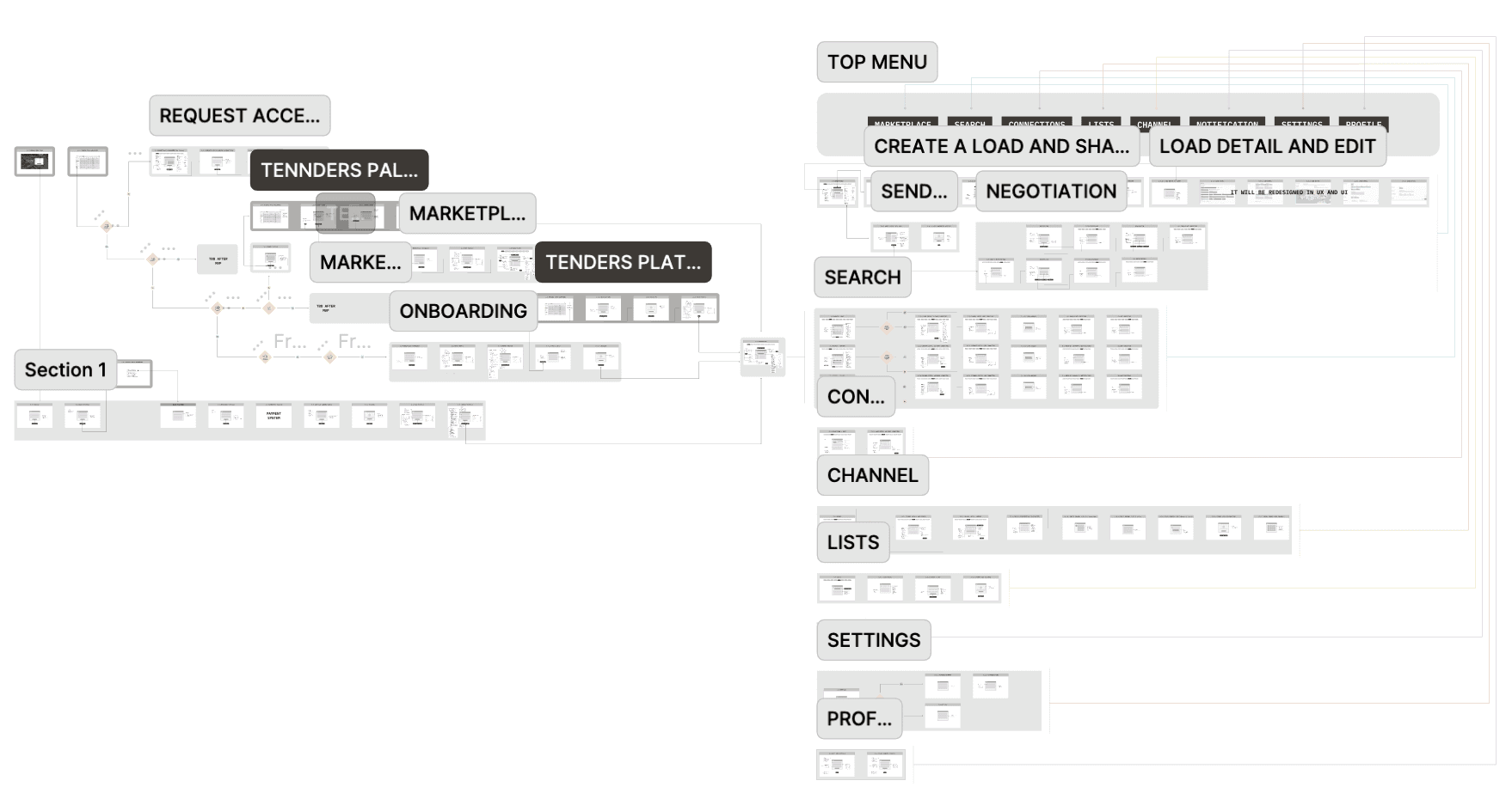
To address a website issue, I segmented the user flow, facilitating the examination of users' interactions with the site, including logging in, creating loads, contacting carriers, and navigating the site. This approach enhanced seamless communication and trust-building between users by allowing them to access each other's information easily.
To address a website issue, I segmented the user flow, facilitating the examination of users' interactions with the site, including logging in, creating loads, contacting carriers, and navigating the site. This approach enhanced seamless communication and trust-building between users by allowing them to access each other's information easily.
To address a website issue, I segmented the user flow, facilitating the examination of users' interactions with the site, including logging in, creating loads, contacting carriers, and navigating the site. This approach enhanced seamless communication and trust-building between users by allowing them to access each other's information easily.
To address a website issue, I segmented the user flow, facilitating the examination of users' interactions with the site, including logging in, creating loads, contacting carriers, and navigating the site. This approach enhanced seamless communication and trust-building between users by allowing them to access each other's information easily.






GATHERING IDEAS
GATHERING IDEAS
GATHERING IDEAS
GATHERING IDEAS
Feature Prioritization Matrix
Feature Prioritization Matrix
Feature Prioritization Matrix
Feature Prioritization Matrix
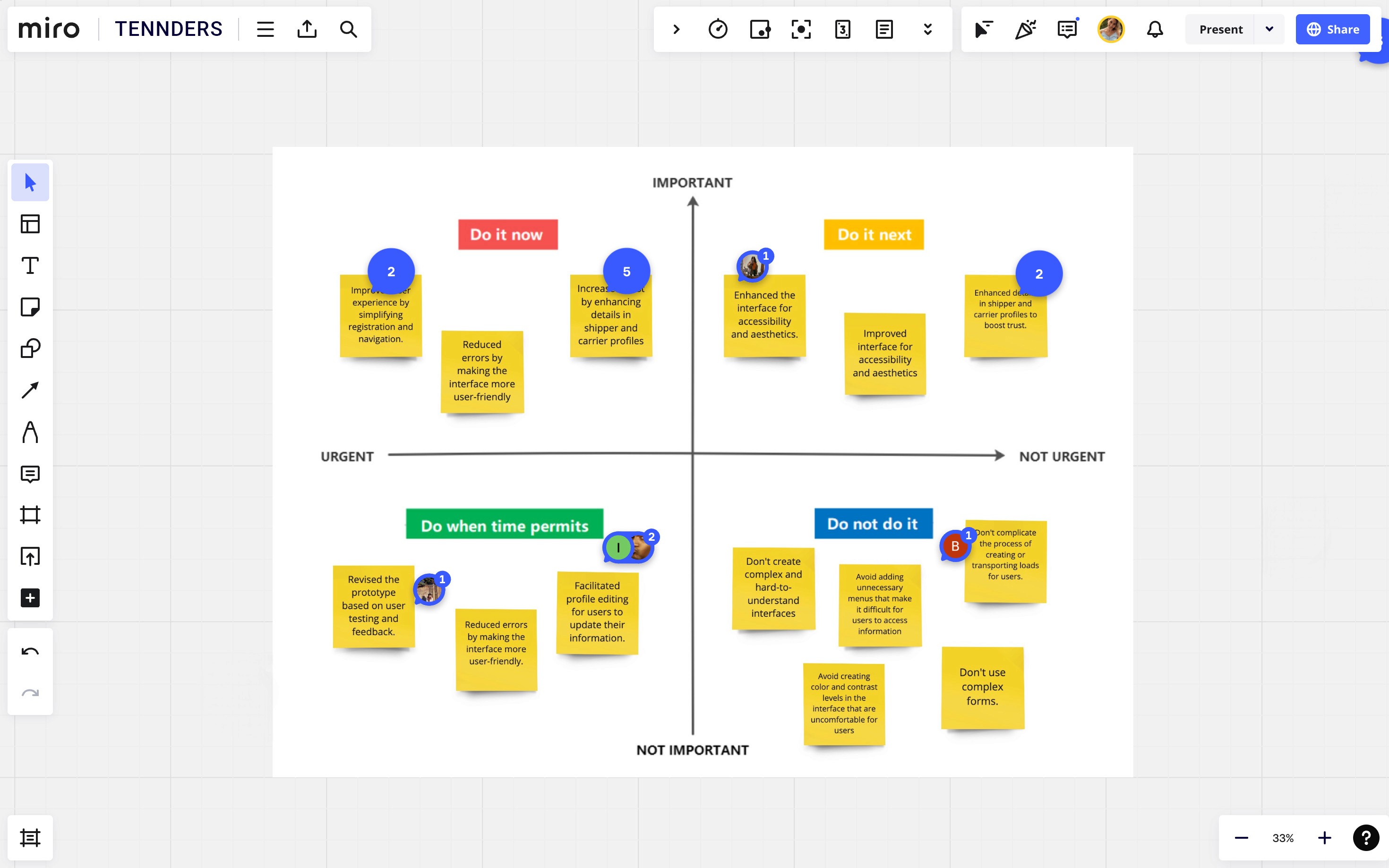
I created the "Likes, Wishes, If Possible" chart. Afterwards, I invited people to vote for their most positive traits. Based on the voting results, I further analyzed to list the following matrix. This allowed prioritizing features with High Impact and Low Complexity.
I created the "Likes, Wishes, If Possible" chart. Afterwards, I invited people to vote for their most positive traits. Based on the voting results, I further analyzed to list the following matrix. This allowed prioritizing features with High Impact and Low Complexity.
I created the "Likes, Wishes, If Possible" chart. Afterwards, I invited people to vote for their most positive traits. Based on the voting results, I further analyzed to list the following matrix. This allowed prioritizing features with High Impact and Low Complexity.
I created the "Likes, Wishes, If Possible" chart. Afterwards, I invited people to vote for their most positive traits. Based on the voting results, I further analyzed to list the following matrix. This allowed prioritizing features with High Impact and Low Complexity.


Visualizing Interface Design
Visualizing Interface Design
Visualizing Interface Design
Visualizing Interface Design
Wireframes
Wireframes
Wireframes
Wireframes
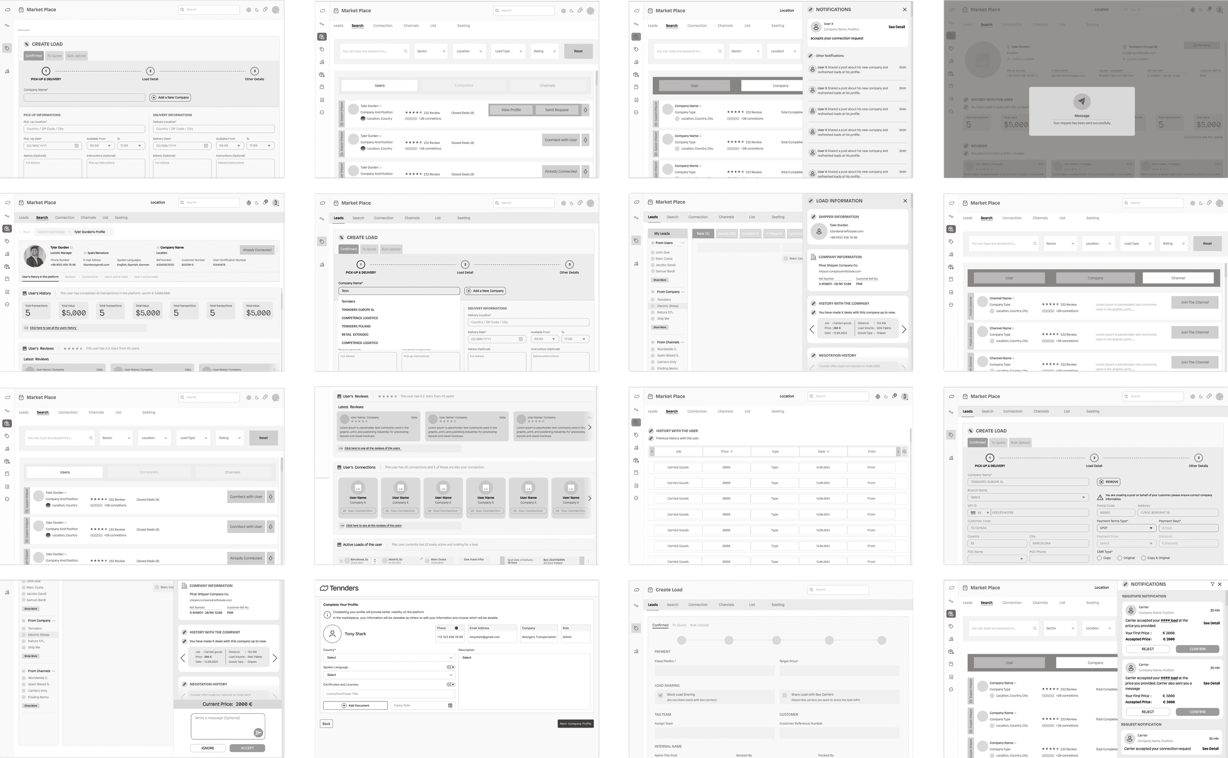
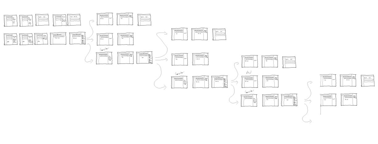
I made sketches on paper to determine the best practices. Although the desktop and mobile versions were designed separately, they were developed simultaneously. After reaching an agreement with the project manager on paper, I started creating digital prototypes.
I made sketches on paper to determine the best practices. Although the desktop and mobile versions were designed separately, they were developed simultaneously. After reaching an agreement with the project manager on paper, I started creating digital prototypes.
I made sketches on paper to determine the best practices. Although the desktop and mobile versions were designed separately, they were developed simultaneously. After reaching an agreement with the project manager on paper, I started creating digital prototypes.
I made sketches on paper to determine the best practices. Although the desktop and mobile versions were designed separately, they were developed simultaneously. After reaching an agreement with the project manager on paper, I started creating digital prototypes.



Establishing Design Consistency
Establishing Design Consistency
Establishing Design Consistency
Establishing Design Consistency
UI Library
UI Library
UI Library
UI Library
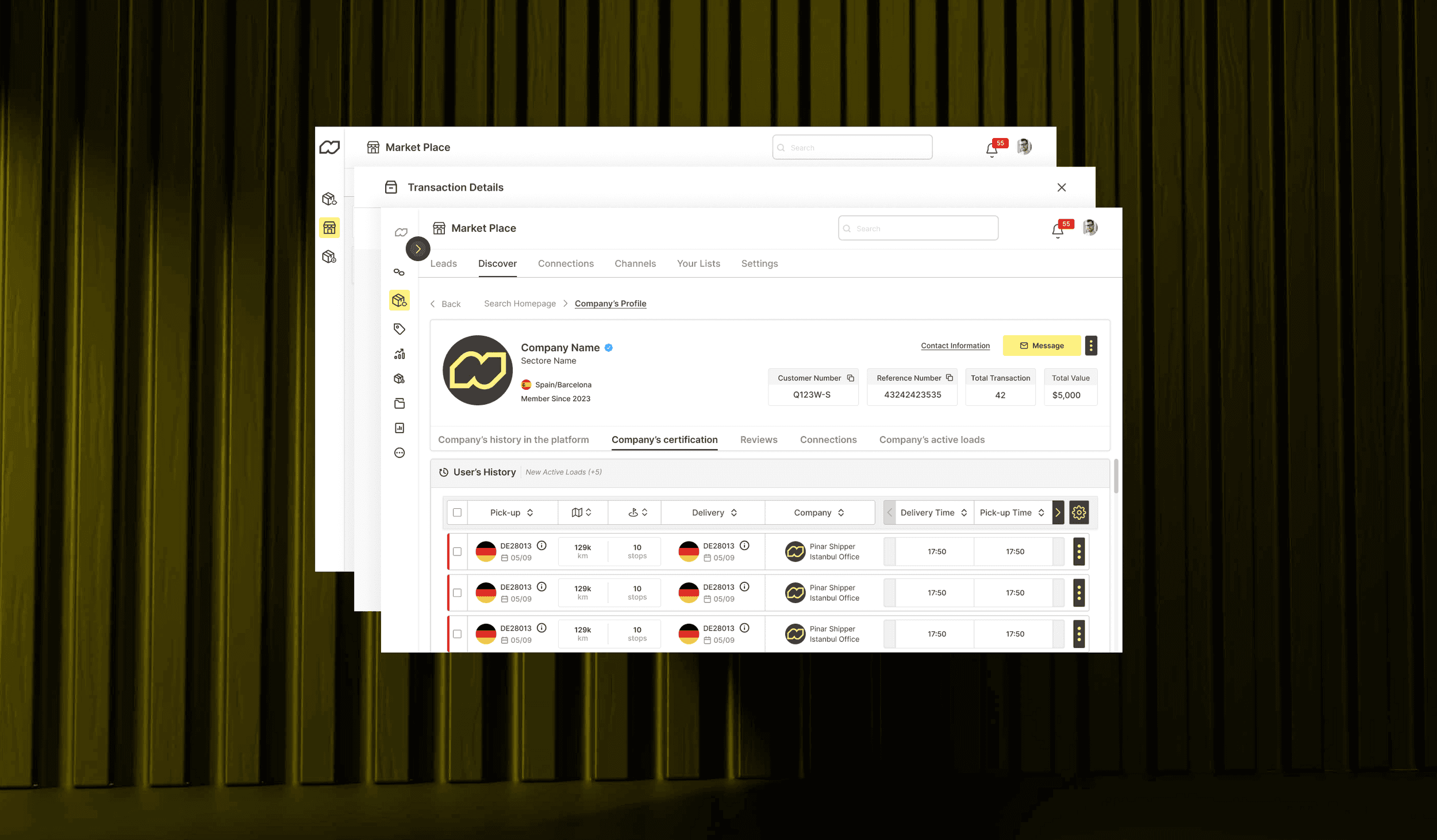
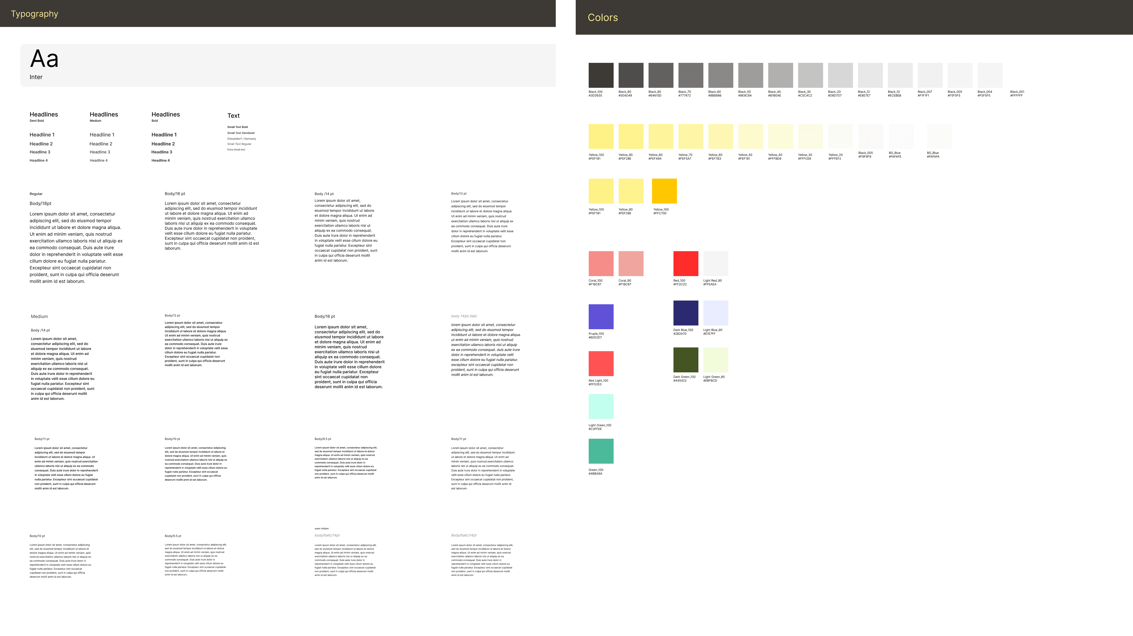
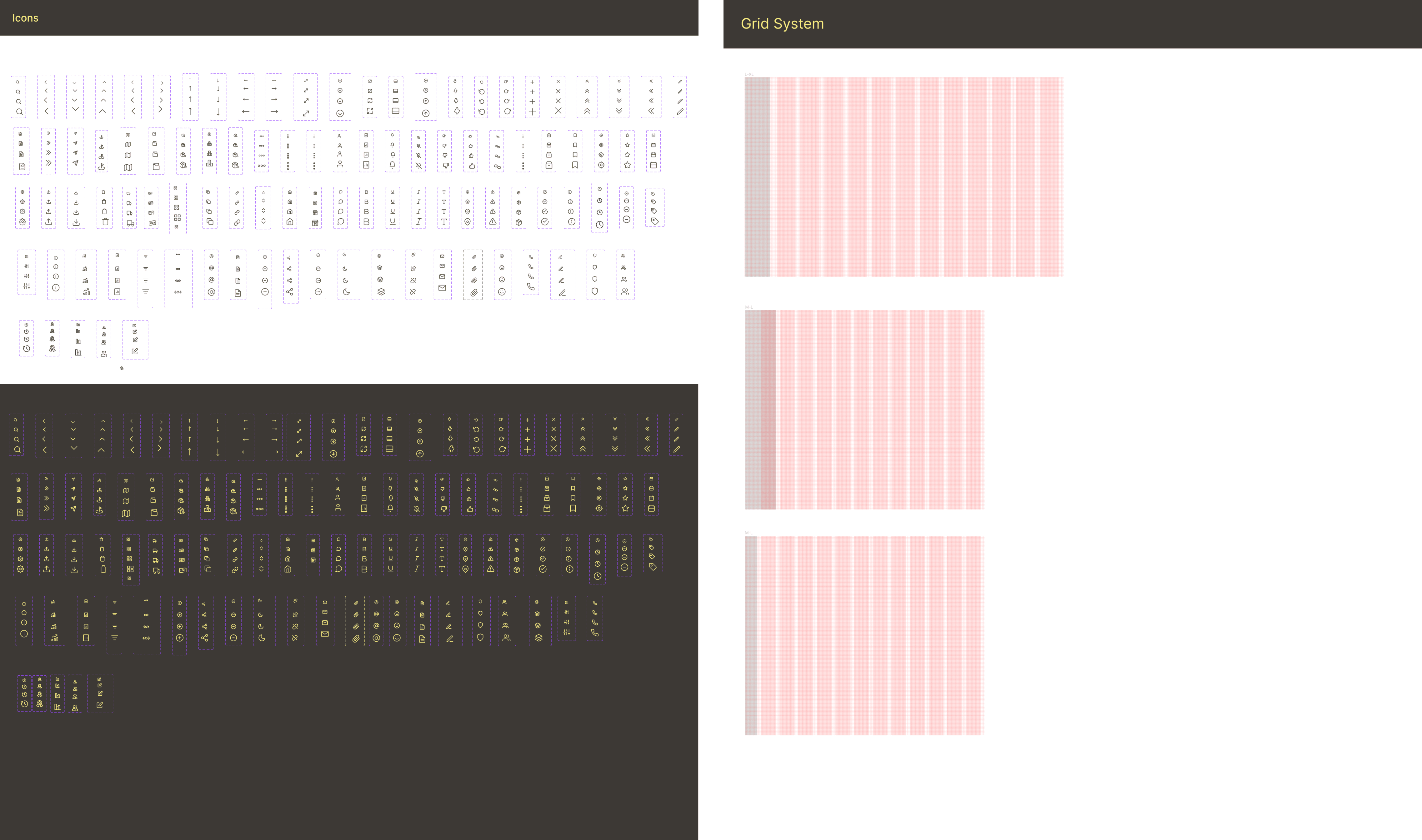
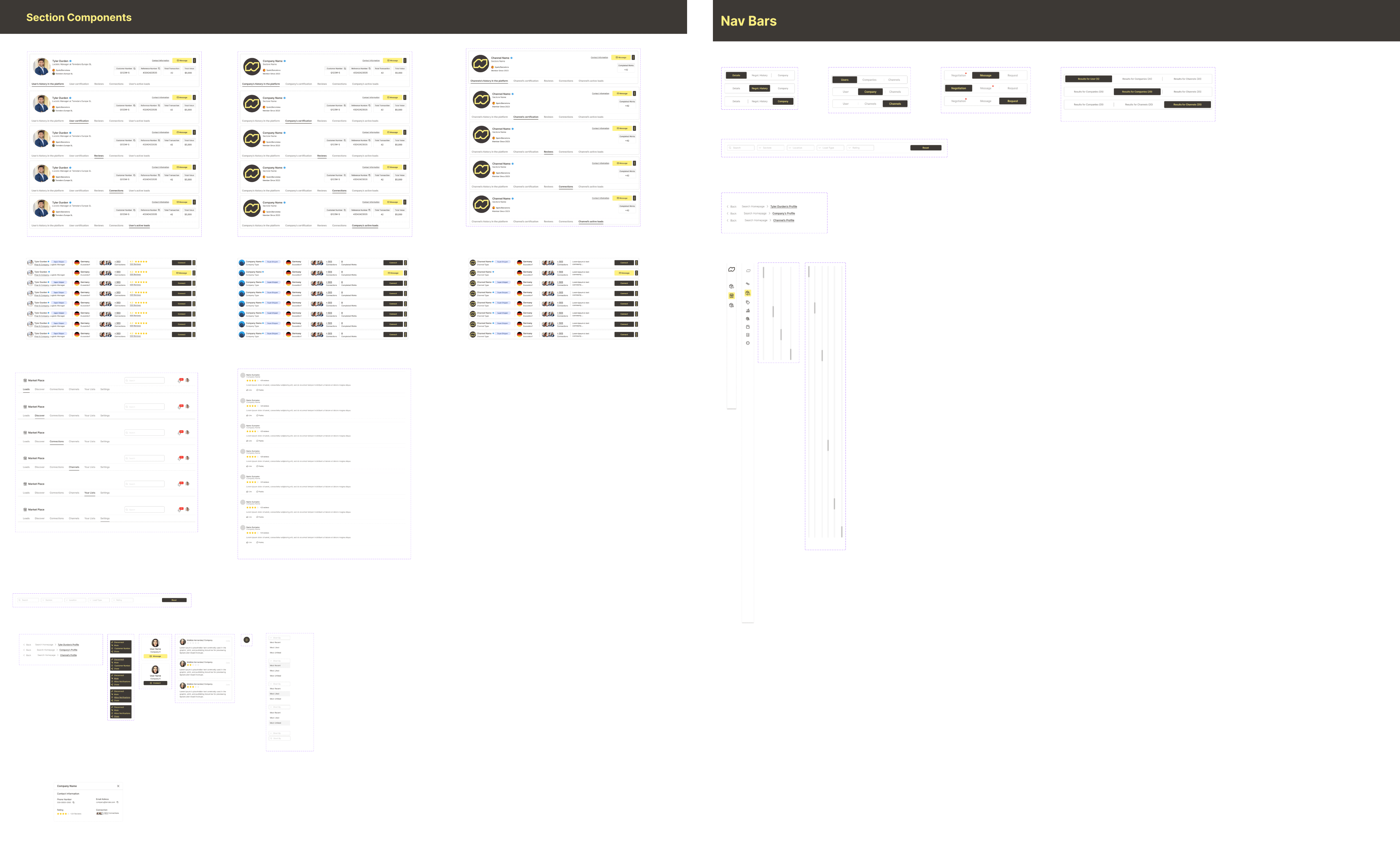
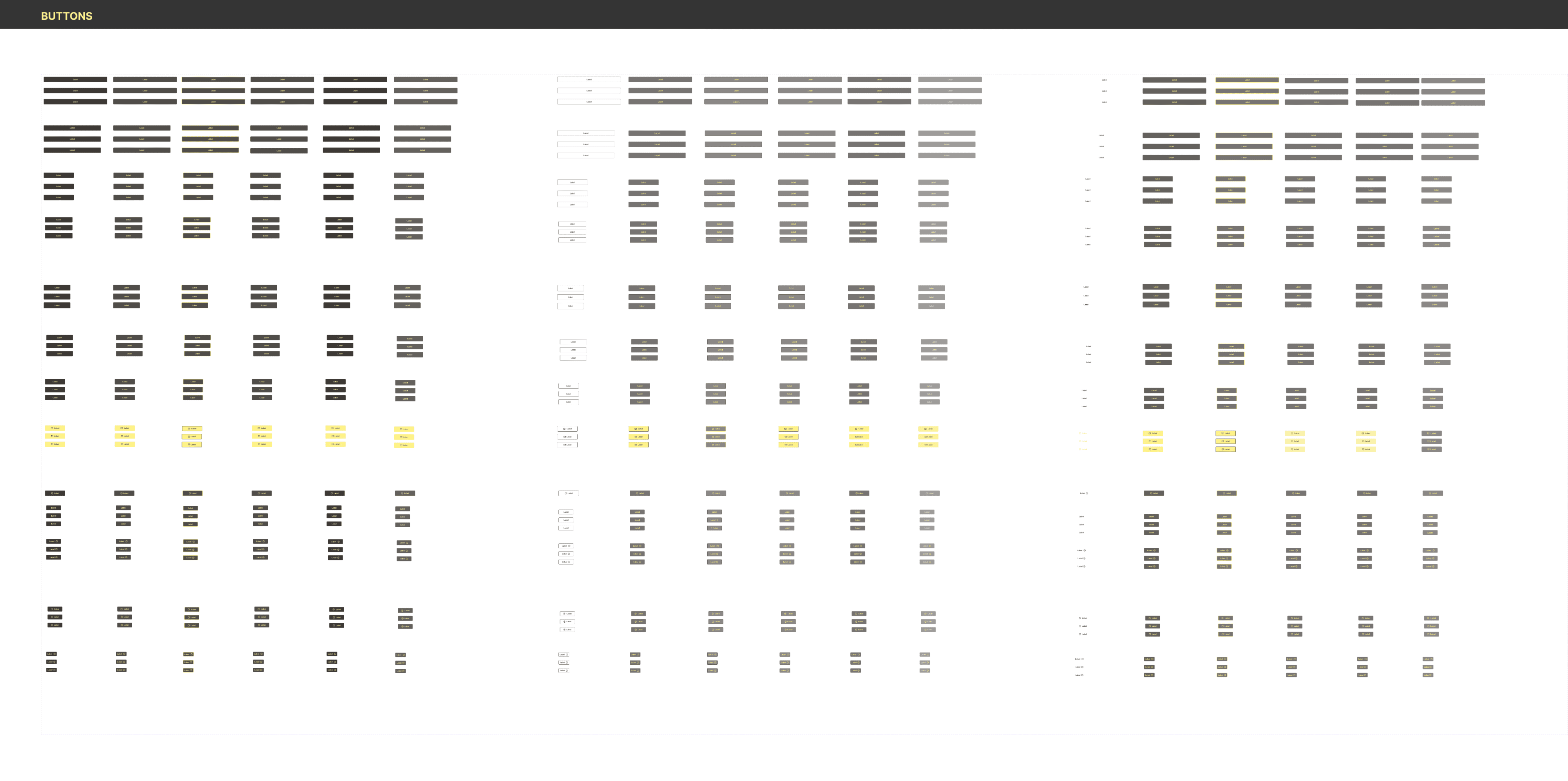
I developed a comprehensive design system, crafting UI elements like typography, colors, buttons, icons, and components. This effort streamlined the development team's workflow and maintained a consistent and efficient design language throughout the project.
I developed a comprehensive design system, crafting UI elements like typography, colors, buttons, icons, and components. This effort streamlined the development team's workflow and maintained a consistent and efficient design language throughout the project.
I developed a comprehensive design system, crafting UI elements like typography, colors, buttons, icons, and components. This effort streamlined the development team's workflow and maintained a consistent and efficient design language throughout the project.
I developed a comprehensive design system, crafting UI elements like typography, colors, buttons, icons, and components. This effort streamlined the development team's workflow and maintained a consistent and efficient design language throughout the project.





Optimizing Information Flow
Optimizing Information Flow
Optimizing Information Flow
Iteration
Iteration
Iteration
We went through several iterations in terms of how the information would progress and which information would be added or removed. We focused on better utilizing space, and as a result, we created a more efficient user interface.
We went through several iterations in terms of how the information would progress and which information would be added or removed. We focused on better utilizing space, and as a result, we created a more efficient user interface.
We went through several iterations in terms of how the information would progress and which information would be added or removed. We focused on better utilizing space, and as a result, we created a more efficient user interface.
bEFORE
bEFORE
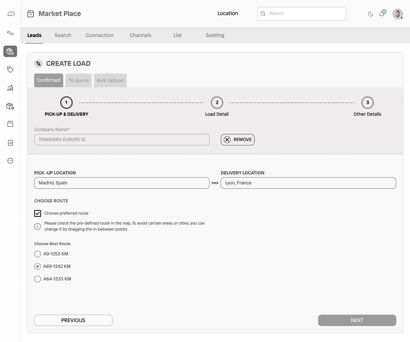
The map was missing in the delivery location section.
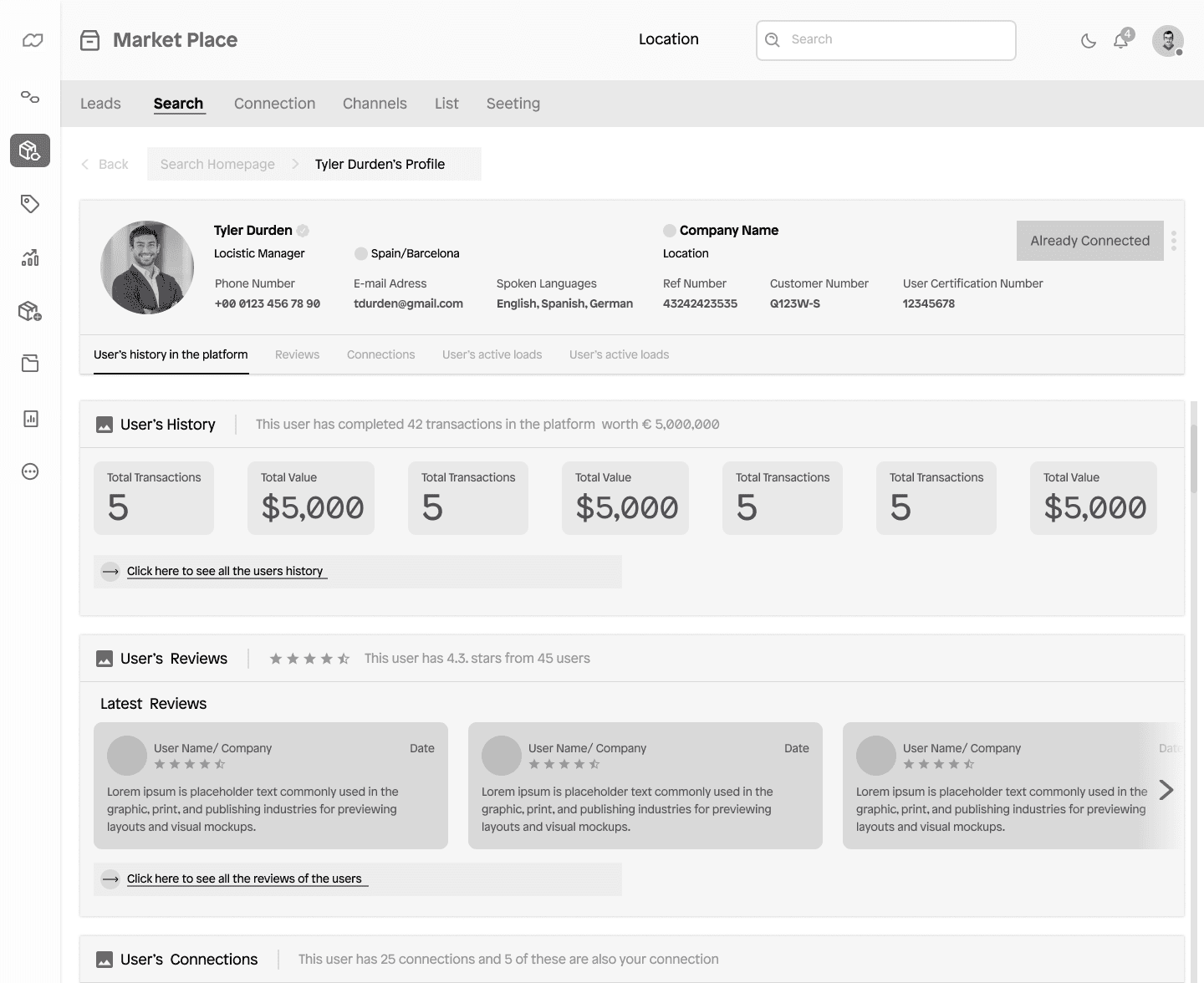
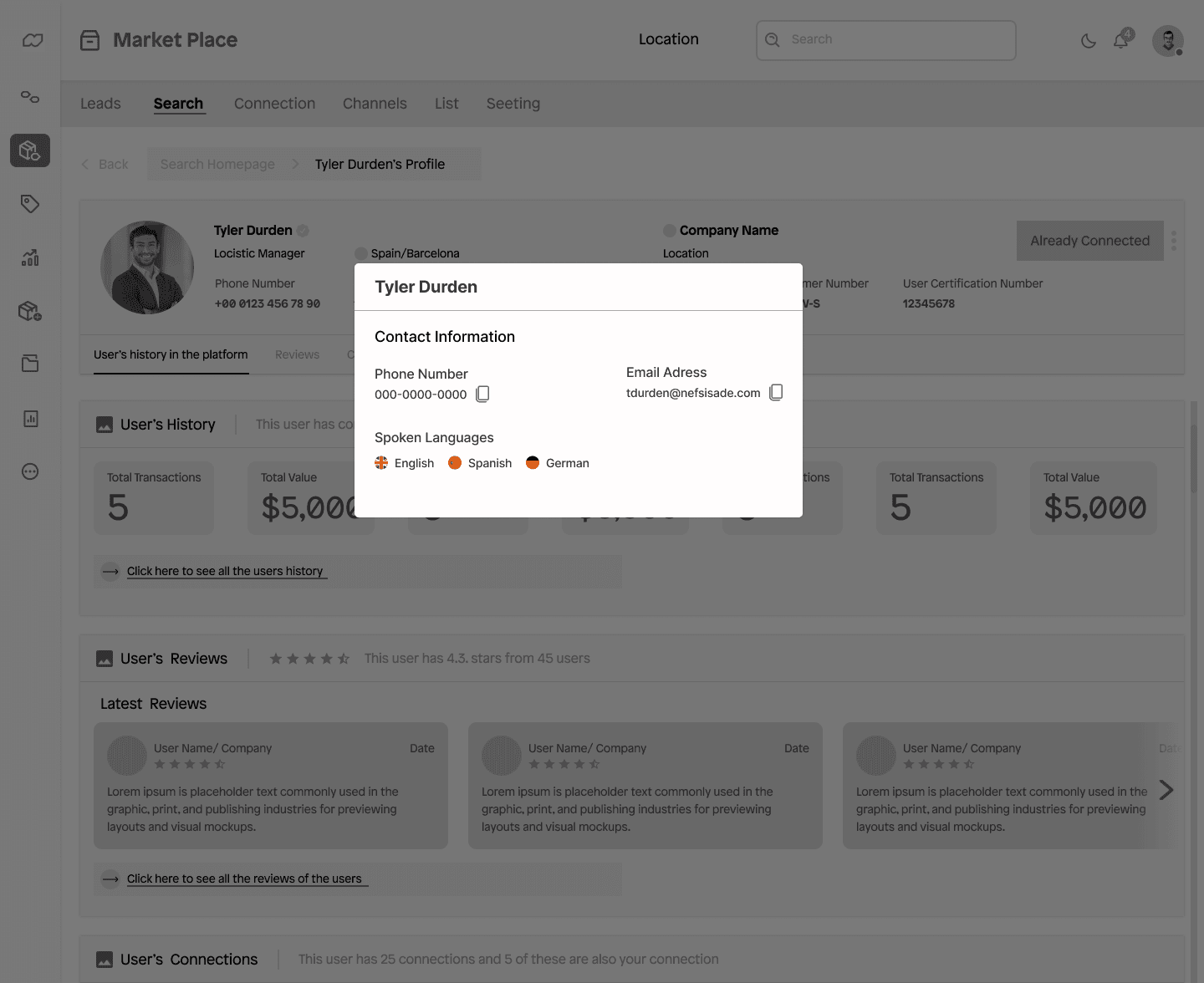
In order to address the lack of profile information both in users and shippers, we created a section where personal information was included.

TESTING & ITERATIONS

TESTING & ITERATIONS
bEFORE
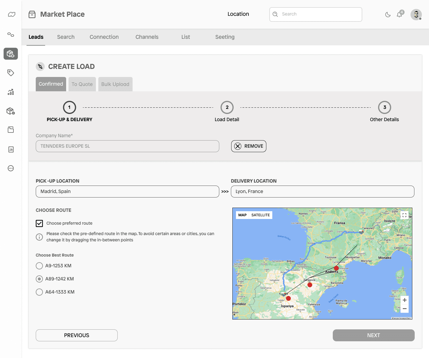
The map was missing in the delivery location section. We added a map to this section because it allowed users to see where the items were going to be delivered.

aFTER
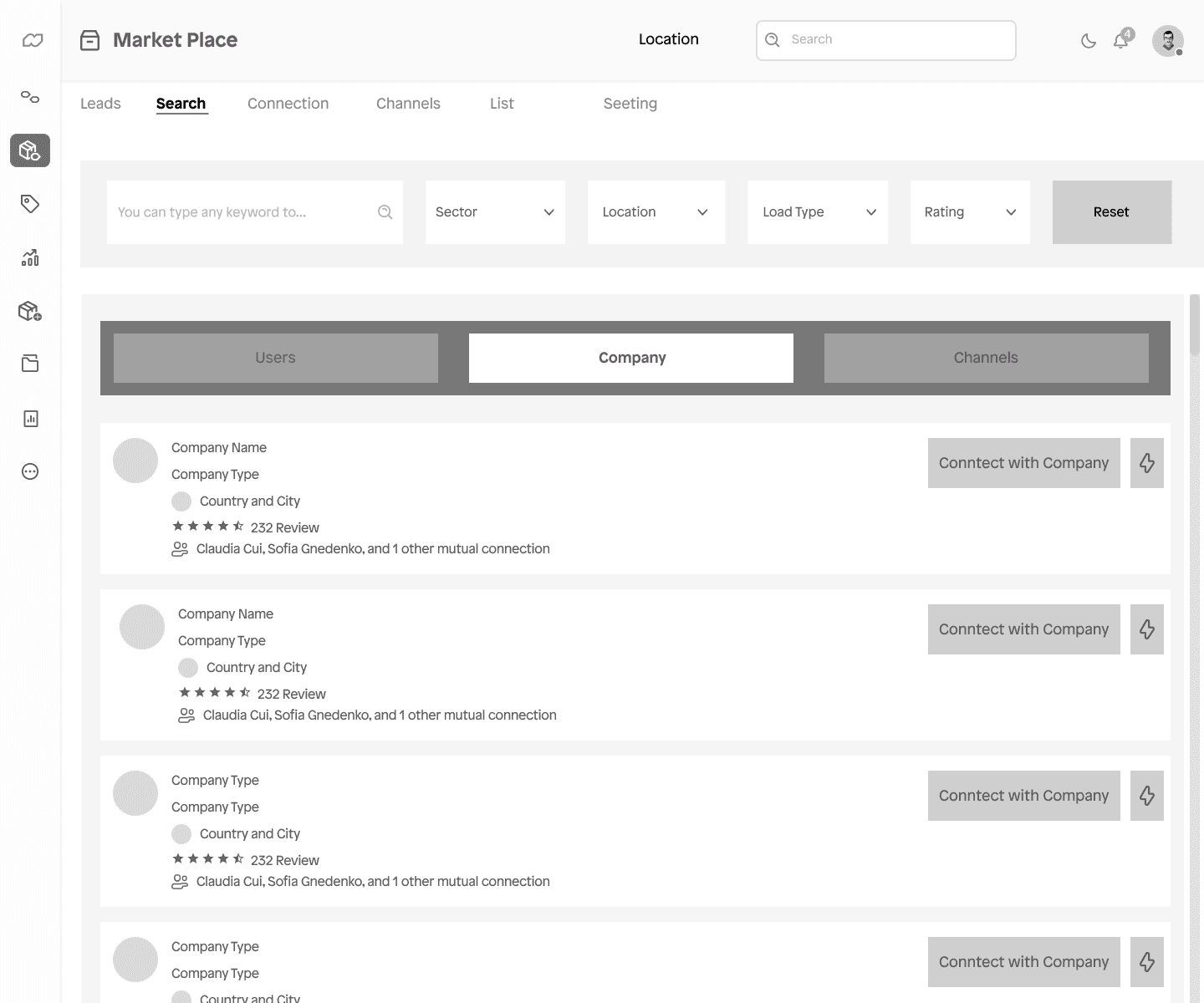
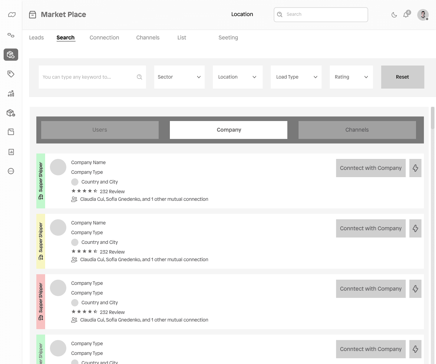
Buttons were missing in the user, company, and channels sections to indicate which ones were active for communication.
TESTING & ITERATIONS

TESTING & ITERATIONS
bEFORE
Buttons were missing in the user, company, and channels sections to indicate which ones were active for communication.

aFTER
This way, users can see locations that are not available in their region and start searching for locations elsewhere.

TESTING & ITERATIONS

TESTING & ITERATIONS
bEFORE
In order to address the lack of profile information both in users and shippers, we created a section where personal information was included.

aFTER
This section featured a panel that provided clearer information about the individual's details.


After
This section featured a panel that provided clearer information about the individual's details.

aFTER
We added a map to this section because it allowed users to see where the items were going to be delivered.


bEFORE
bEFORE
Buttons were missing in the user, company, and channels sections to indicate which ones were active for communication.
The map was missing in the delivery location section. We added a map to this section because it allowed users to see where the items were going to be delivered.


After
Buttons were missing in the user, company, and channels sections to indicate which ones were active for communication.


Before
Buttons were missing in the user, company, and channels sections to indicate which ones were active for communication.


After
To save space and create a fresher look, we added green color to the available ones, yellow to the busy ones, and red to the very busy ones.

aFTER
To save space and create a fresher look, we added green color to the available ones, yellow to the busy ones, and red to the very busy ones.

bEFORE
In order to address the lack of profile information both in users and shippers, we created a section where personal information was included.

aFTER
This section featured a panel that provided clearer information about the individual's details.
Real-World Validation
Real-World Validation
Real-World Validation
Real-World Validation
User Testing
User Testing
User Testing
User Testing
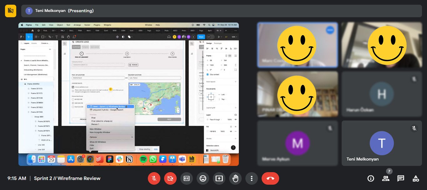
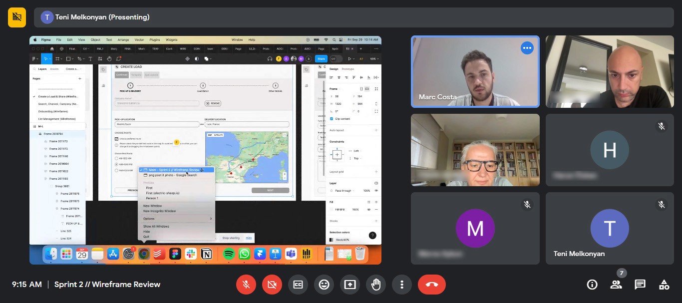
After the iteration, I requested user testing with real users. Among these users were individuals from the design team, and also Marc Costa, Head of Product at Tennders. Through this test, we saw that we improved and enhanced user experience.
After the iteration, I requested user testing with real users. Among these users were individuals from the design team, and also Marc Costa, Head of Product at Tennders. Through this test, we saw that we improved and enhanced user experience.
After the iteration, I requested user testing with real users. Among these users were individuals from the design team, and also Marc Costa, Head of Product at Tennders. Through this test, we saw that we improved and enhanced user experience.
After the iteration, I requested user testing with real users. Among these users were individuals from the design team, and also Marc Costa, Head of Product at Tennders. Through this test, we saw that we improved and enhanced user experience.



Test
Test
Test
Test
Prototype
Prototype
Prototype
Prototype
Based on the feedback from user testing, I revised the prototype to make it more usable and desirable.
Based on the feedback from user testing, I revised the prototype to make it more usable and desirable.
Based on the feedback from user testing, I revised the prototype to make it more usable and desirable.
Based on the feedback from user testing, I revised the prototype to make it more usable and desirable.
Future Directions
Future Directions
Future Directions
Future Directions
Next Steps
Next Steps
Next Steps
Next Steps
Although the project progressed and customer satisfaction was high, there were many areas that needed future development. While the current desktop version has been completed, issues with the mobile part need to be addressed and simplified. Additionally, preparations have begun for both desktop and mobile to undergo an A/B test.
Although the project progressed and customer satisfaction was high, there were many areas that needed future development. While the current desktop version has been completed, issues with the mobile part need to be addressed and simplified. Additionally, preparations have begun for both desktop and mobile to undergo an A/B test.
Although the project progressed and customer satisfaction was high, there were many areas that needed future development. While the current desktop version has been completed, issues with the mobile part need to be addressed and simplified. Additionally, preparations have begun for both desktop and mobile to undergo an A/B test.
Although the project progressed and customer satisfaction was high, there were many areas that needed future development. While the current desktop version has been completed, issues with the mobile part need to be addressed and simplified. Additionally, preparations have begun for both desktop and mobile to undergo an A/B test.
Key Insights
Key Insights
Key Insights
Key Insights
What I have Learned
What I have Learned
What I have Learned
What I have Learned
From this project, I've come to understand the significance of focusing on the user in the design process and the power of iterative enhancements. By putting user needs and feedback at the forefront, we were able to refine the location page significantly, boosting both its accessibility and its overall functionality. Furthermore, this experience has enriched my skills in developing user personas, wireframing, and prototyping, all of which have been instrumental in creating a smoother and more intuitive user experience.
From this project, I've come to understand the significance of focusing on the user in the design process and the power of iterative enhancements. By putting user needs and feedback at the forefront, we were able to refine the location page significantly, boosting both its accessibility and its overall functionality. Furthermore, this experience has enriched my skills in developing user personas, wireframing, and prototyping, all of which have been instrumental in creating a smoother and more intuitive user experience.
From this project, I've come to understand the significance of focusing on the user in the design process and the power of iterative enhancements. By putting user needs and feedback at the forefront, we were able to refine the location page significantly, boosting both its accessibility and its overall functionality. Furthermore, this experience has enriched my skills in developing user personas, wireframing, and prototyping, all of which have been instrumental in creating a smoother and more intuitive user experience.
From this project, I've come to understand the significance of focusing on the user in the design process and the power of iterative enhancements. By putting user needs and feedback at the forefront, we were able to refine the location page significantly, boosting both its accessibility and its overall functionality. Furthermore, this experience has enriched my skills in developing user personas, wireframing, and prototyping, all of which have been instrumental in creating a smoother and more intuitive user experience.


© Teni Melkonyan 2024. All rights reserved.
Designed by Teni Melkonyan
© Teni Melkonyan 2024. All rights reserved.
Designed by Teni Melkonyan
© Teni Melkonyan 2024. All rights reserved.
Designed by Teni Melkonyan
© Teni Melkonyan 2024. All rights reserved.
Designed by Teni Melkonyan


The Problem
Tennders committed to offering innovative and effective solutions in the logistics sector. However, its online platform was not fully in line with these principles. A current situation analysis revealed an interface lacking style and consistency, with a confusing information architecture, which negatively affected user experience:
Decreased User Engagement: The complex navigation prevented users from utilizing the service to its full capacity.
Increased Frustration and Errors: The user-unfriendly design led to frequent mistakes and complicated the logistics process.
Extended Time to Complete Tasks: Users unnecessarily spent a lot of time trying to understand the site features.
Lack of Detail in Profiles Reduces Credibility: The missing information in carrier and shipper profiles led to trust issues.
Goal
Our High-Level Goal was to create a customized web with a thoughtful, seamless, and distinctive design that meets user needs and is compatible with the Tennders digital ecosystem.
Simplifying Navigation: To enable users to use the service at its full capacity.
Reducing Error Rate: To facilitate the logistics process by making the design user-friendly.
Decreasing Usage Time: To ensure the site features are understandable and efficiently used.
Enhancing Profile Details: To increase trust by enriching the information in carrier and shipper profiles.
Improving the UI: To enhance the user interface in terms of accessibility and aesthetics.
Our Approach


tHE Problem
How could we improve the user experience of the Tennders website and increase users' loyalty to the site, encouraging them to use it and ensure their retention?
tHE Problem
Users did not follow up or return when they encountered incorrect location addresses on the website; instead, they completely abandoned the website.

Tennders
Tennders is a company located in the city of Barcelona, Spain, providing logistical access within Europe.
UI/UX Design


Tennders
Tennders is a company located in the city of Barcelona, Spain, providing logistical access within Europe.
UI/UX Design

Overview
The website allowed customers, carriers, and themselves to communicate and see the status of loads. However, users experienced difficulties accessing entry, load creation, and carrier and shipper profile information starting from the homepage on the Tennders website. Additionally, significant issues were present in the UI portion of the Tennders website, especially as some UI elements were not designed according to WCAG (Web Accessibility Standards).
Challange
Designing a product from scratch in an unfamiliar field.
Info
Agency
JoyPad Studio
Year
2024
Tools
Figma
My Role
User Experience and User Interface
Team
Muhammad Jabbar-Project Manager
Teni Melkonyan- User Experience Designer
In the old website user satisfaction rate
New website, user satisfaction increased to
New re-website gained new users
The Problem
Tennders committed to offering innovative and effective solutions in the logistics sector. However, its online platform was not fully in line with these principles. A current situation analysis revealed an interface lacking style and consistency, with a confusing information architecture, which negatively affected user experience:
Decreased User Engagement: The complex navigation prevented users from utilizing the service to its full capacity.
Increased Frustration and Errors: The user-unfriendly design led to frequent mistakes and complicated the logistics process.
Extended Time to Complete Tasks: Users unnecessarily spent a lot of time trying to understand the site features.
Lack of Detail in Profiles Reduces Credibility: The missing information in carrier and shipper profiles led to trust issues.
Google Analytics
Goal
Our High-Level Goal was to create a customized web with a thoughtful, seamless, and distinctive design that meets user needs and is compatible with the Tennders digital ecosystem.
Our Approach
Simplifying Navigation: To enable users to use the service at its full capacity.
Reducing Error Rate: To facilitate the logistics process by making the design user-friendly.
Decreasing Usage Time: To ensure the site features are understandable and efficiently used.
Enhancing Profile Details: To increase trust by enriching the information in carrier and shipper profiles.
Improving the UI: To enhance the user interface in terms of accessibility and aesthetics.


tHE Problem
Users did not follow up or return when they encountered incorrect location addresses on the website; instead, they completely abandoned the website.
User Research
To confirm our hypothesis and due to limited resources, I decided to conduct an online survey to understand the issues users were experiencing. I developed my own questionnaire and identified several Facebook logistics groups where I could reach target users.
The survey contained 15 questions focusing on customers' purchasing behaviors. This survey enabled me to find answers to questions such as who the users are, what they wanted, and where they encountered problems.
UNDERSTAND THE PROBLEM
Design Thinking
I have adopted the Double Diamond Strategy which breaks the design process into four stages: Discover, Define, Deliver & Develop. I found this process particularly powerful in validating design decisions, allowing enough space for creative exploration while giving a focus point to come back to.
Process
Time Line
Agile Methodology
Competitive Analysis
Interviews with stakeholders helped me identify four competitors or sources of inspiration that either had a similar business model or matched the aesthetic preference of the team for the Tennders logistics website. I analyzed the homepage designs of competitor firms, their processes for gaining logistics partners, and the consistencies and differences between desktop and mobile experiences.
SWOT


User Persona & Journey
Based on our own user research findings and authoritative media sources about the logistics sector in Europe, such as interviews, news reports, and industry reports published in Logistics Manager and The Loadstar, I created two user personas, one for the shipper and one for the carrier.
Defining User Profiles


User Flow
To address a website issue, I segmented the user flow, facilitating the examination of users' interactions with the site, including logging in, creating loads, contacting carriers, and navigating the site. This approach enhanced seamless communication and trust-building between users by allowing them to access each other's information easily.
Mapping User Experience


Feature Prioritization Matrix
I created the "Likes, Wishes, If Possible" chart. Afterwards, I invited people to vote for their most positive traits. Based on the voting results, I further analyzed to list the following matrix. This allowed prioritizing features with High Impact and Low Complexity.
GATHERING IDEAS


Wireframes
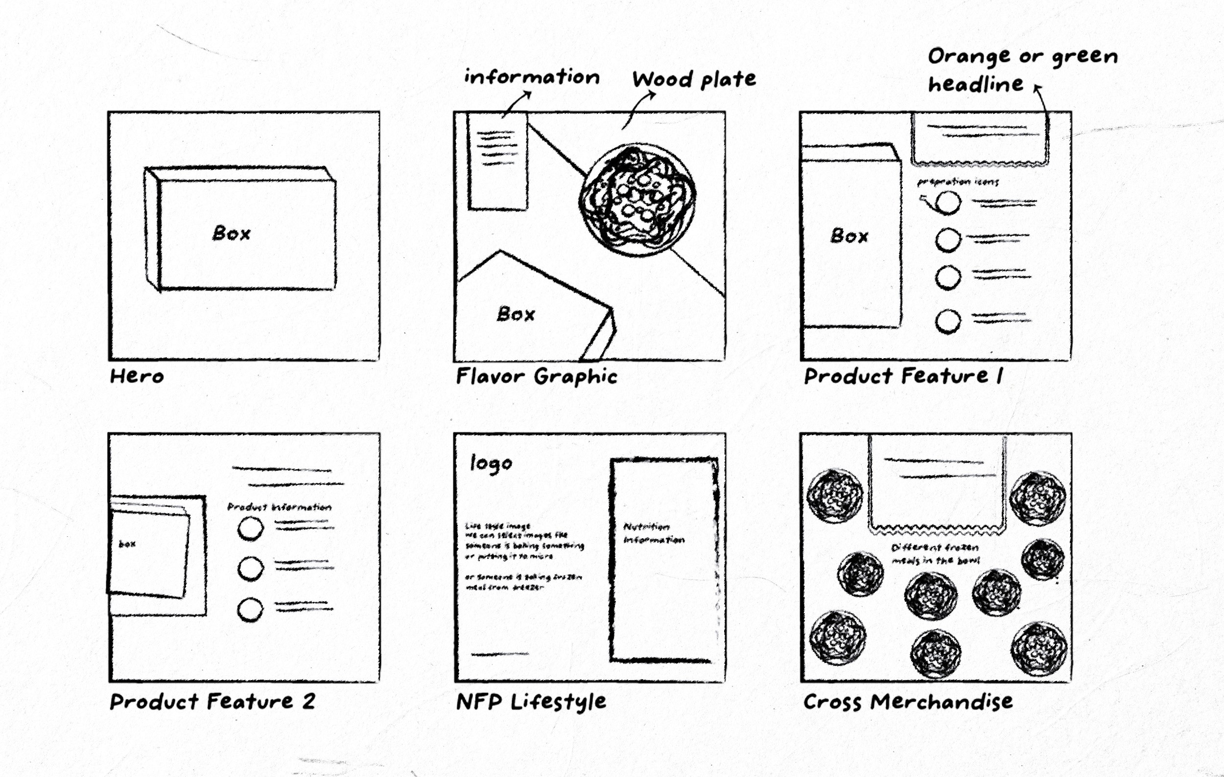
I made sketches on paper to determine the best practices. Although the desktop and mobile versions were designed separately, they were developed simultaneously. After reaching an agreement with the project manager on paper, I started creating digital prototypes.
Visualizing Interface Design
UI Library
I developed a comprehensive design system, crafting UI elements like typography, colors, buttons, icons, and components. This effort streamlined the development team's workflow and maintained a consistent and efficient design language throughout the project.
Establishing Design Consistency



User Testing
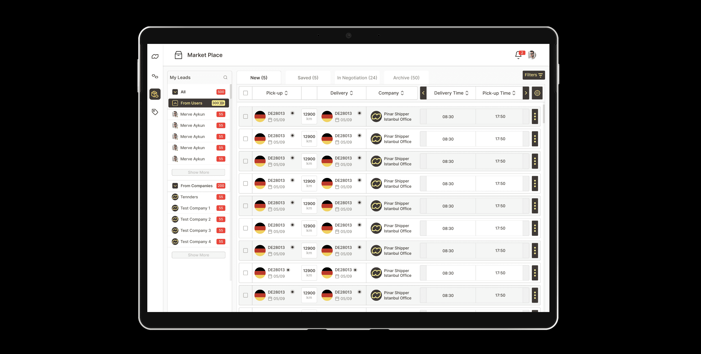
After integrating the UI library into digital wireframes and conducting internal iterations, I requested user testing with real users. With Tennders' help, I organized two sessions with a carrier and a shipper.
Optimizing Information Flow
The map was missing in the delivery location section. We added a map to this section because it allowed users to see where the items were going to be delivered.
Before
Buttons were missing in the user, company, and channels sections to indicate which ones were active for communication.
After
Buttons were missing in the user, company, and channels sections to indicate which ones were active for communication.
Before
After integrating the UI library into digital wireframes and conducting internal iterations, I requested user testing with real users. With Tennders' help, I organized two sessions with a carrier and a shipper.
After
In order to address the lack of profile information both in users and shippers, we created a section where personal information was included.
Before
This section featured a panel that provided clearer information about the individual's details.
After
User Testing
After integrating the UI library into digital wireframes and conducting internal iterations, I requested user testing with real users. With Tennders' help, I organized two sessions with a carrier and a shipper.
Real-World Validation
Prototype
Based on the feedback from user testing, I revised the prototype to make it more usable and desirable.
Test
Next Steps
Although the project progressed and customer satisfaction was high, there were many areas that needed future development. While the current desktop version has been completed, issues with the mobile part need to be addressed and simplified. Additionally, preparations have begun for both desktop and mobile to undergo an A/B test.
Future Directions
What I have Learned
From this project, I've come to understand the significance of focusing on the user in the design process and the power of iterative enhancements. By putting user needs and feedback at the forefront, we were able to refine the location page significantly, boosting both its accessibility and its overall functionality. Furthermore, this experience has enriched my skills in developing user personas, wireframing, and prototyping, all of which have been instrumental in creating a smoother and more intuitive user experience.
Key Insights
© Teni Melkonyan 2024. All rights reserved.
Designed by Teni Melkonyan
© Teni Melkonyan 2024. All rights reserved.
Designed by Teni Melkonyan