UI/UX Design
Wings And Rings
Wings and Rings, deeply entrenched in both the restaurant and sports events industries.
Wings and Rings, deeply entrenched in both the restaurant and sports events industries.

Overview
Overview
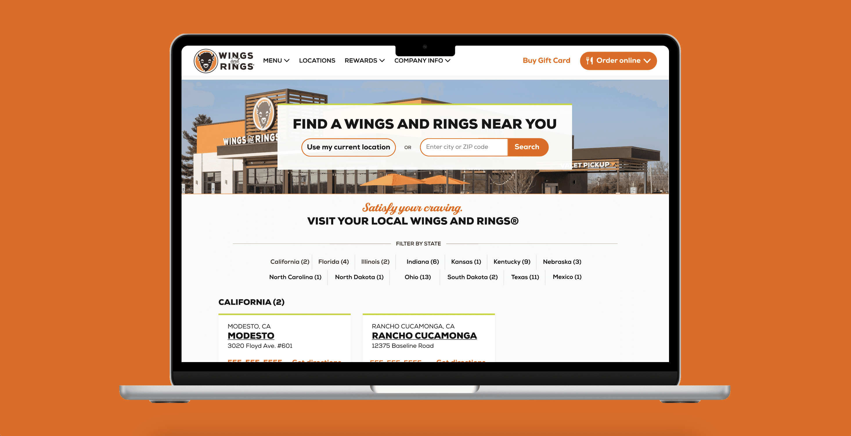
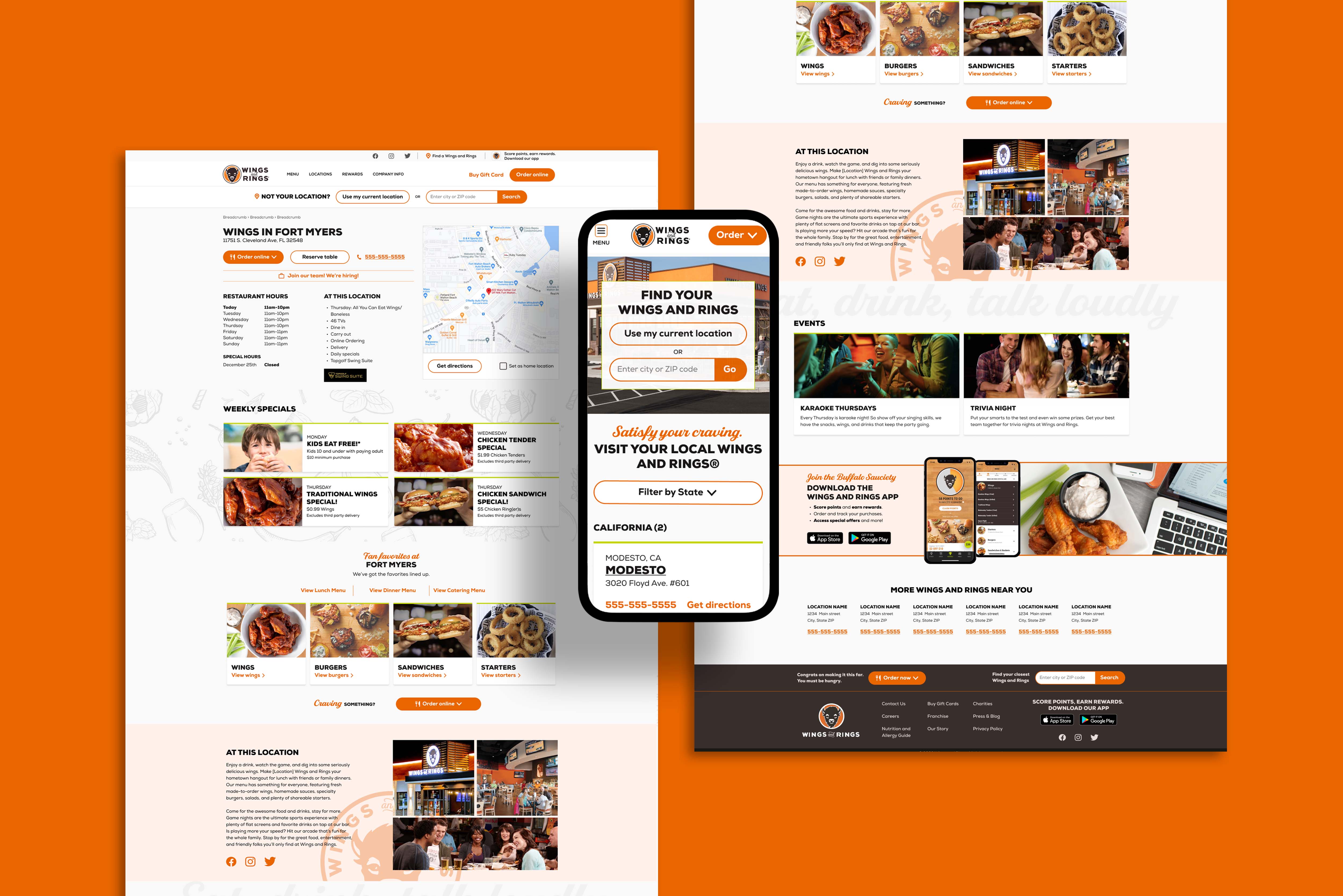
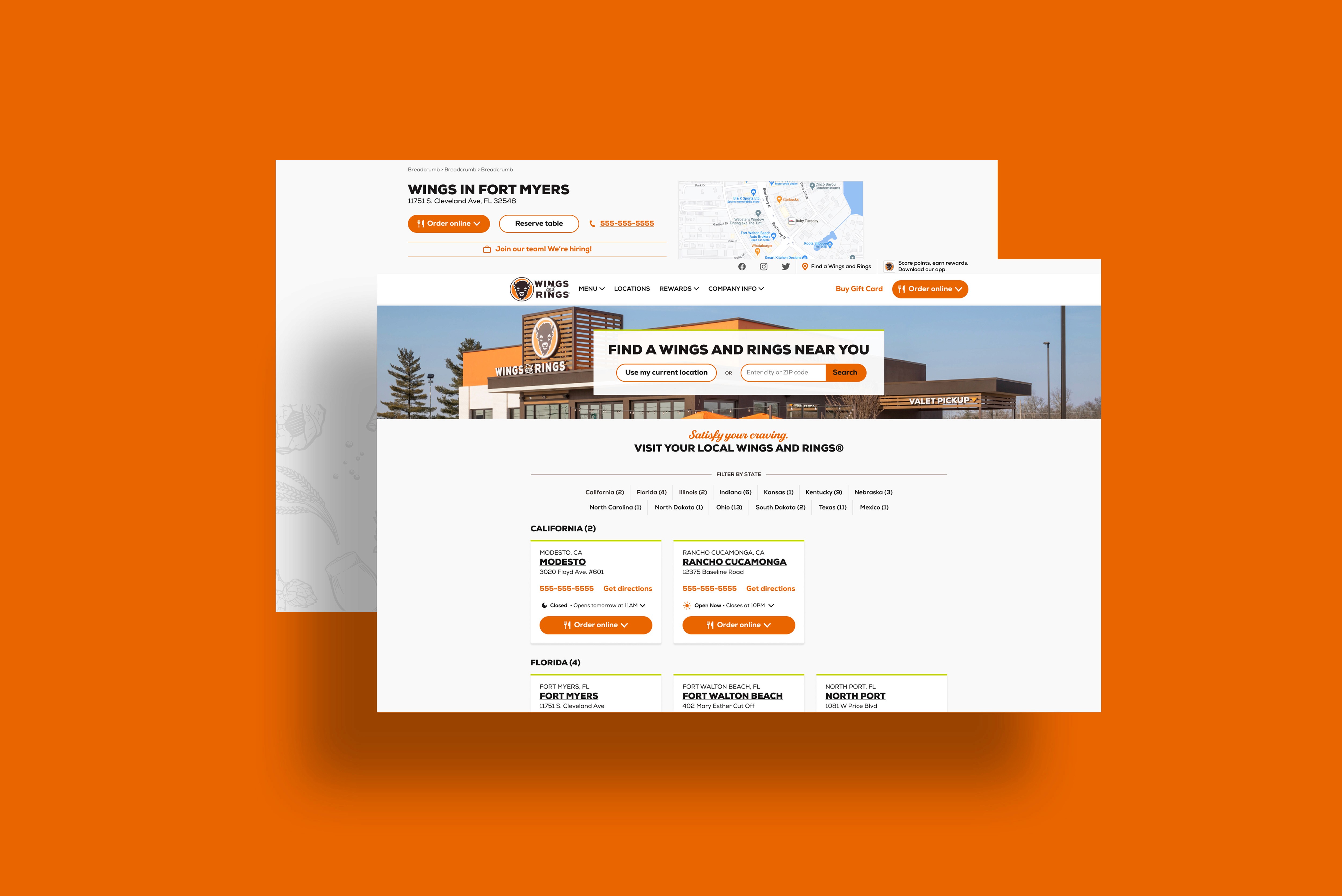
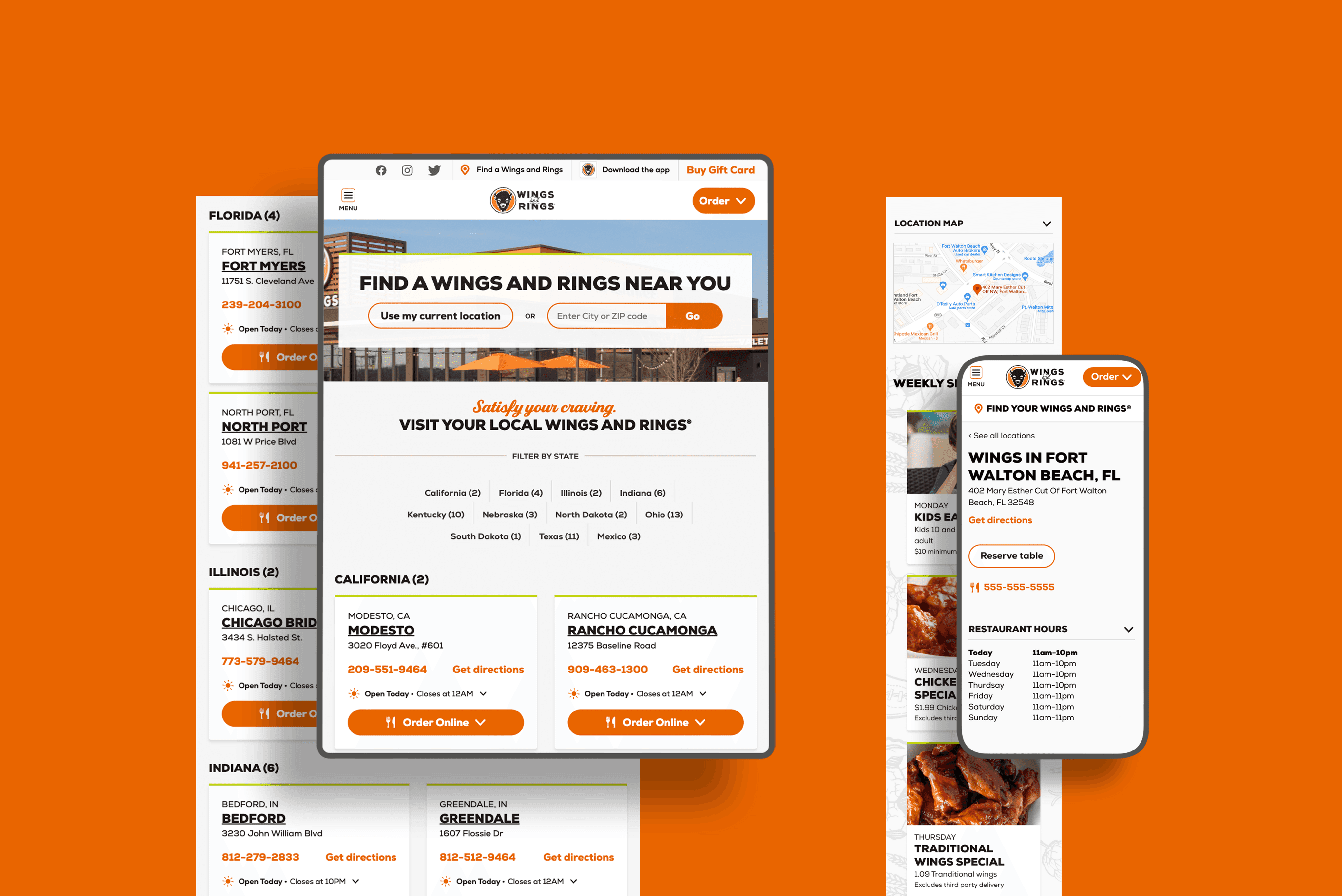
The project aimed to revamp the Wings and Rings website's location page to elevate user experience, boost accessibility, and bolster brand loyalty. The focus was on rectifying navigation hurdles and integrating missing features while preserving the brand's essence.
The project aimed to revamp the Wings and Rings website's location page to elevate user experience, boost accessibility, and bolster brand loyalty. The focus was on rectifying navigation hurdles and integrating missing features while preserving the brand's essence.
Challenge
Challenge
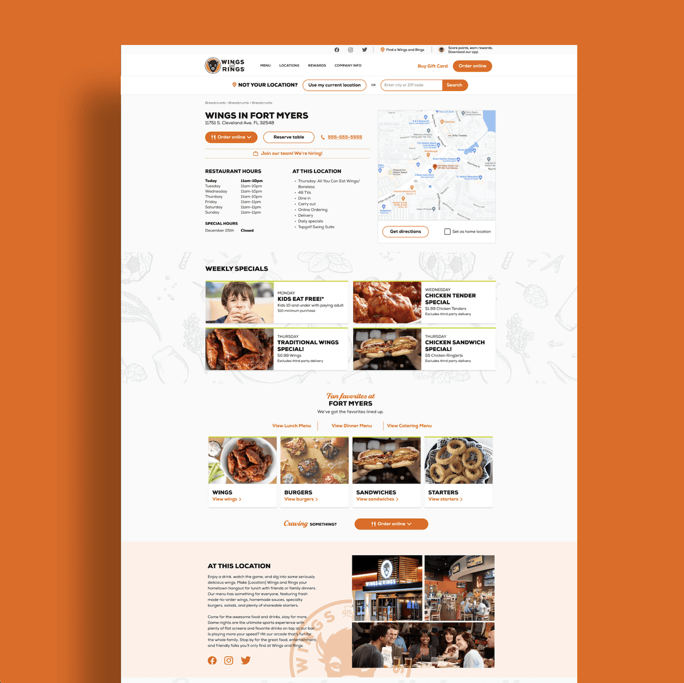
Upon joining, the team faced low traffic on the Wings and Rings website's location page, necessitating a redesign to attract more visitors and enhance brand affinity. The challenge lay in addressing navigation issues, missing features, and visual inconsistencies while aligning with the brand's identity.
Upon joining, the team faced low traffic on the Wings and Rings website's location page, necessitating a redesign to attract more visitors and enhance brand affinity. The challenge lay in addressing navigation issues, missing features, and visual inconsistencies while aligning with the brand's identity.
Info
Info
Agency
Pound & Grain
Year
2023
Tools
Figma
My Role
User Experience and User Interface
Team
Oleg Portnoy - Creative Director
Teni Melkonyan - Designer
Google Analytics
Google Analytics
Wings and Rings users were having difficulty accessing the correct location of the restaurants.
As a result of the improvements made, this rate decreased.
The Problem
Upon entering the Wings and Rings website, users encountered issues with locating, impeding access to location-based details, prompting the recognition for a redesign due to previously underestimated limitations.
Selecting a location took 10 minutes to access and gather information.
Upon reaching the location info, sections like Weekly Specials, Fan favorites at Fort Myers, At This Location (Amenities), Download the Wings and Rings App were missing.
Visually, it wasn't as strong as other restaurant websites, with some colors not meeting web accessibility guidelines.
Goal
My main goal was to maintain the essence of our current system while seizing opportunities on the location page, addressing problematic areas, and laying the groundwork for future advancements. This way, we aimed to provide a holistic and seamless location experience.
We optimized the existing location layout to facilitate quicker and easier access to desired information for users.
With the redesign, we planned to add a "Search Within" section for users to easily find the nearest locations on the location page.
We also aimed to correct elements that were not compliant with web accessibility standards on the Wings and Rings location page, such as low-contrast color combinations or missing alternative texts.

Process
Process
Design Thinking
Design Thinking
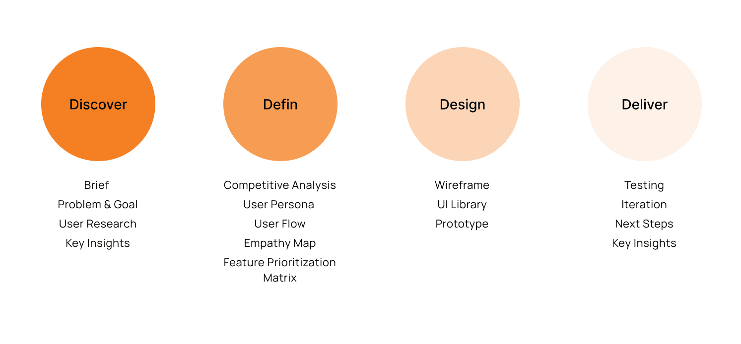
In the Wings And Rings x project, the design thinking steps provided me with crucial guidance to understand, define, ideate, design, and iteratively advance the process. These steps were important for me to understand user needs and develop satisfactory solutions.
In the Wings And Rings x project, the design thinking steps provided me with crucial guidance to understand, define, ideate, design, and iteratively advance the process. These steps were important for me to understand user needs and develop satisfactory solutions.

UNDERSTAND THE PROBLEM
UNDERSTAND THE PROBLEM
User Research
User Research
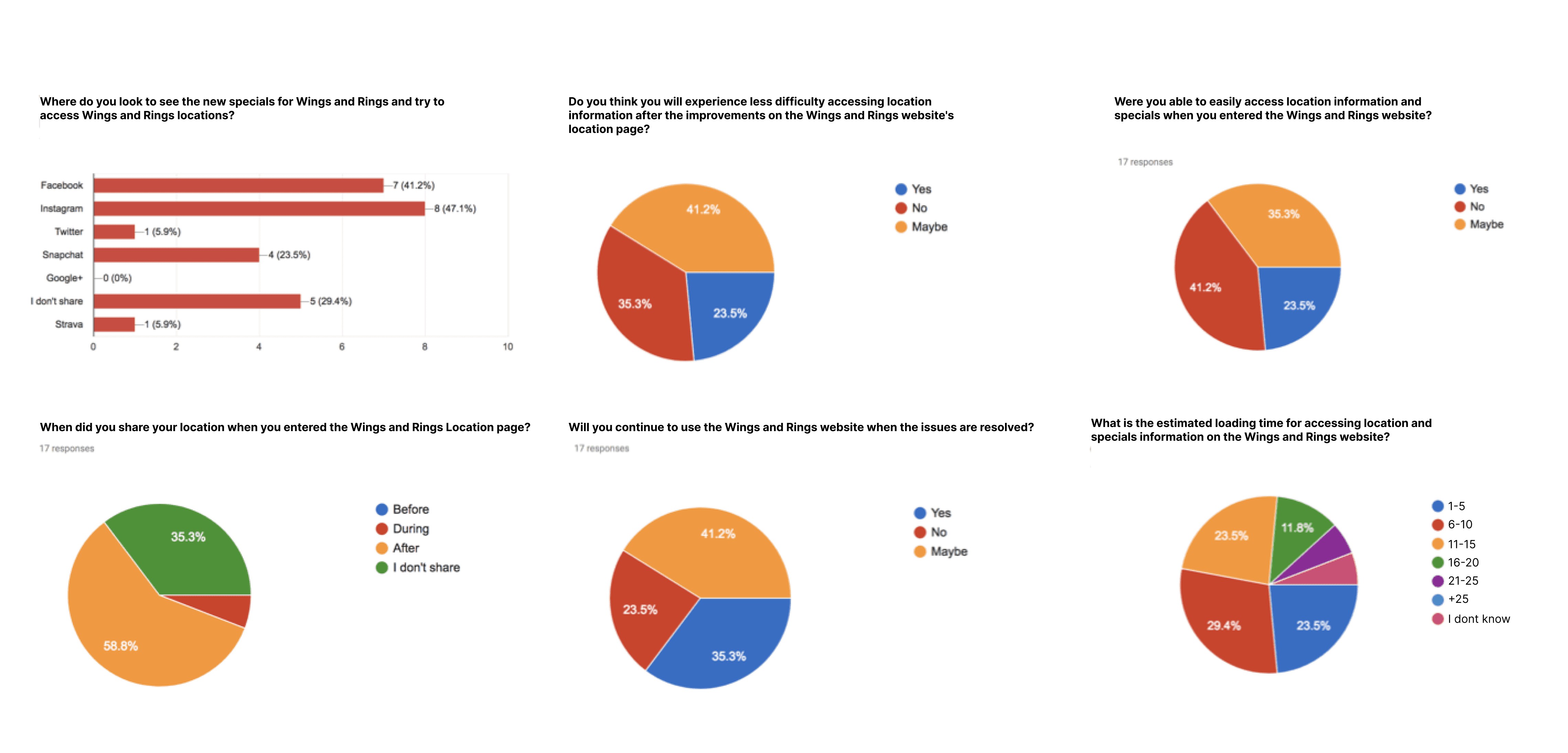
I further analyzed the research data collected by the marketing team and found that users found the Wings and Rings brand sincere, but they mentioned drifting away due to issues on the website. New users expressed satisfaction when using the website, but hesitated to continue using it when navigating to the location page.
I further analyzed the research data collected by the marketing team and found that users found the Wings and Rings brand sincere, but they mentioned drifting away due to issues on the website. New users expressed satisfaction when using the website, but hesitated to continue using it when navigating to the location page.


Points
Points
Key Research Insights
Key Research Insights
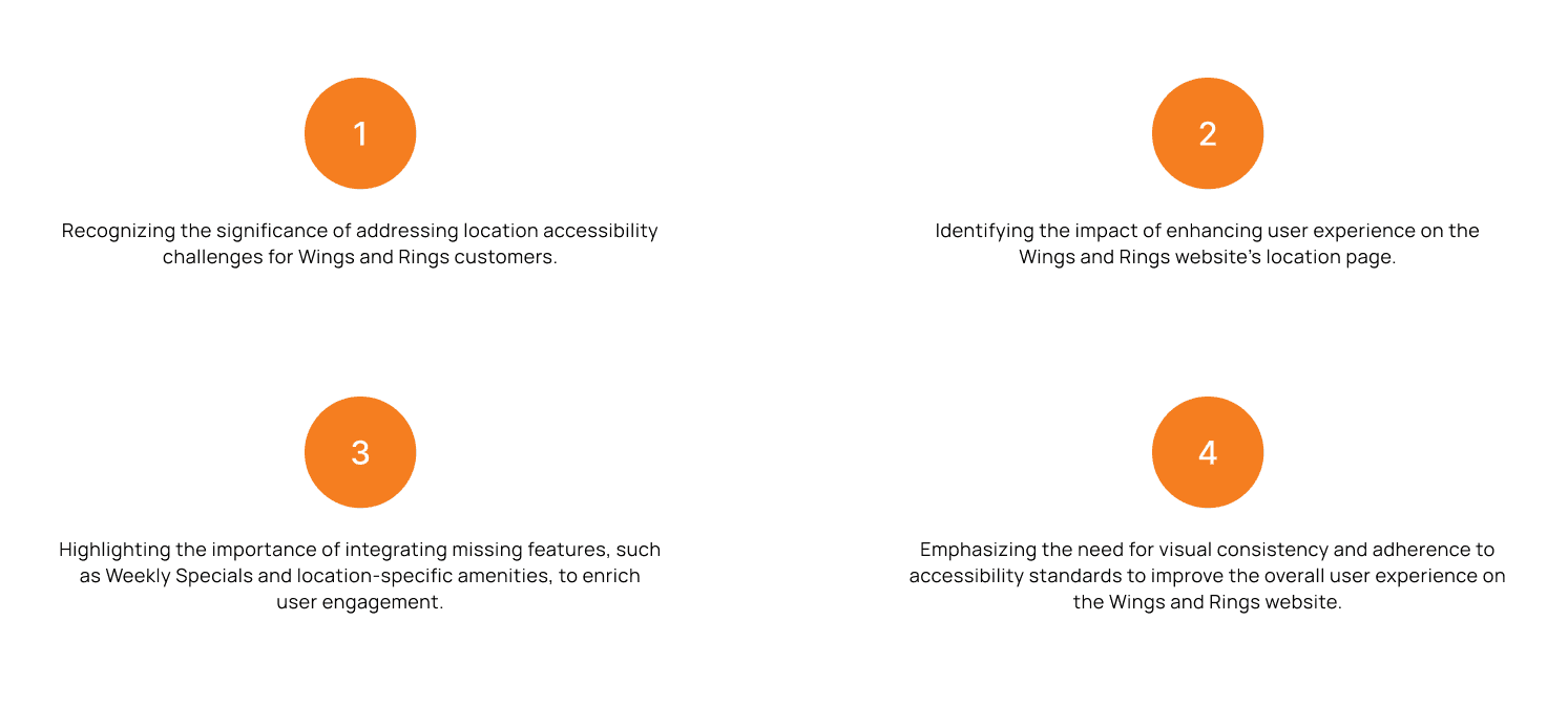
After conducting a more detailed secondary research following our initial investigation, the outcome remained unchanged. As a result of these studies, we gathered four key insights to guide the project.
After conducting a more detailed secondary research following our initial investigation, the outcome remained unchanged. As a result of these studies, we gathered four key insights to guide the project.


Evaluating Market Landscape
Evaluating Market Landscape
Competitive Analysis
Competitive Analysis
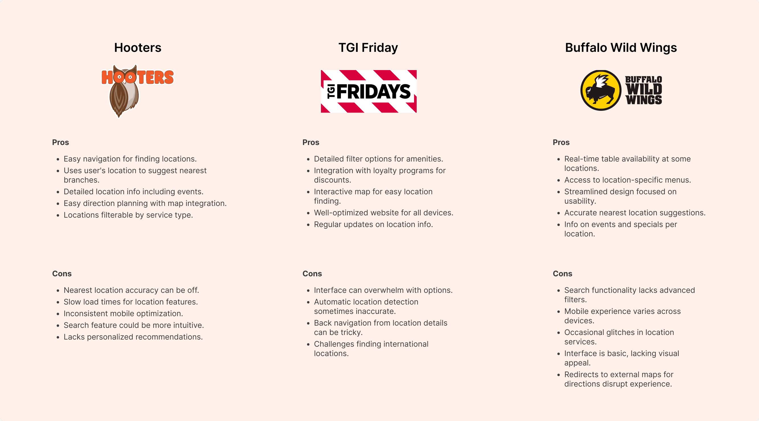
I chose and compared the three major competitors which has similar services and business models with Wings and Rings, aiming to find out what’s unique about Wings and Rings and what its website should improve.
I chose and compared the three major competitors which has similar services and business models with Wings and Rings, aiming to find out what’s unique about Wings and Rings and what its website should improve.






Defining User Profiles
Defining User Profiles
User Persona
User Persona
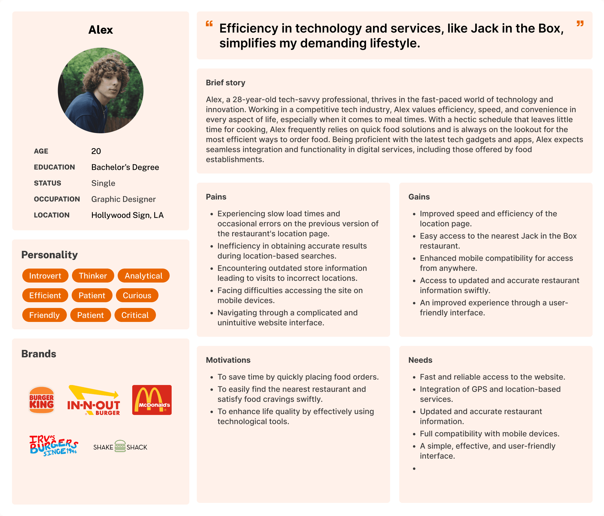
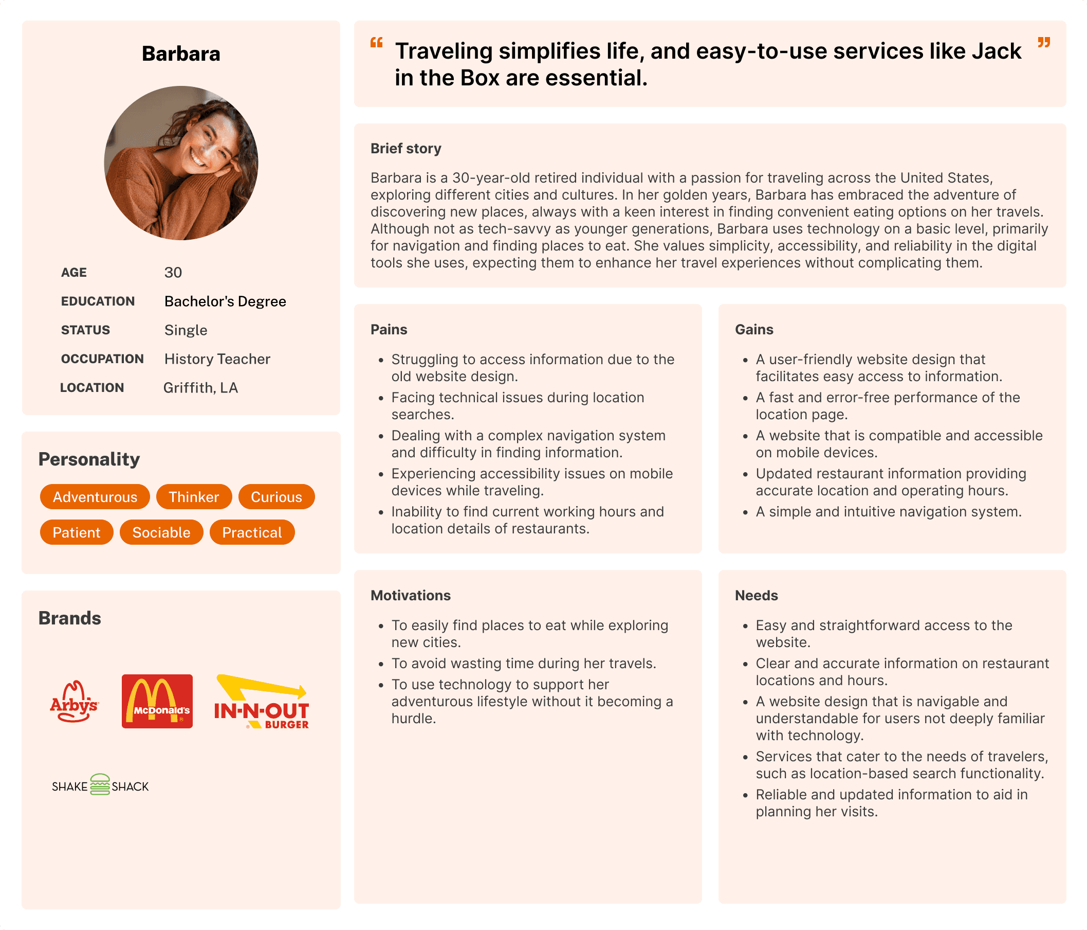
Based on user research and feedback, I created a two different personas that helped me identify the goals and frustrations of the users I had in mind throughout the design process.
Based on user research and feedback, I created a two different personas that helped me identify the goals and frustrations of the users I had in mind throughout the design process.




Mapping User Experience
Mapping User Experience
User Flow
User Flow
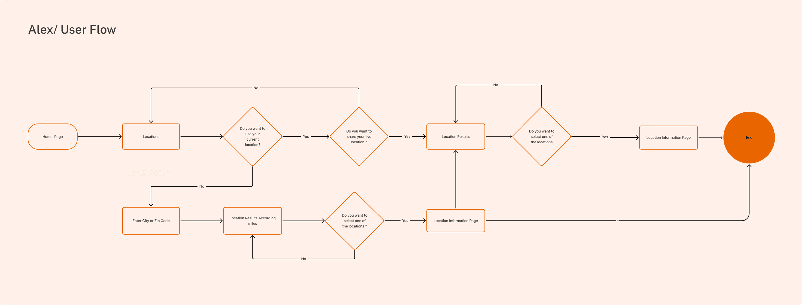
After creating user personas, I chose to create a user flow because it allowed me to detail the steps users took to complete specific tasks, optimizing the user experience.
After creating user personas, I chose to create a user flow because it allowed me to detail the steps users took to complete specific tasks, optimizing the user experience.


Understanding User Needs
Understanding User Needs
Empthy Map
Empthy Map
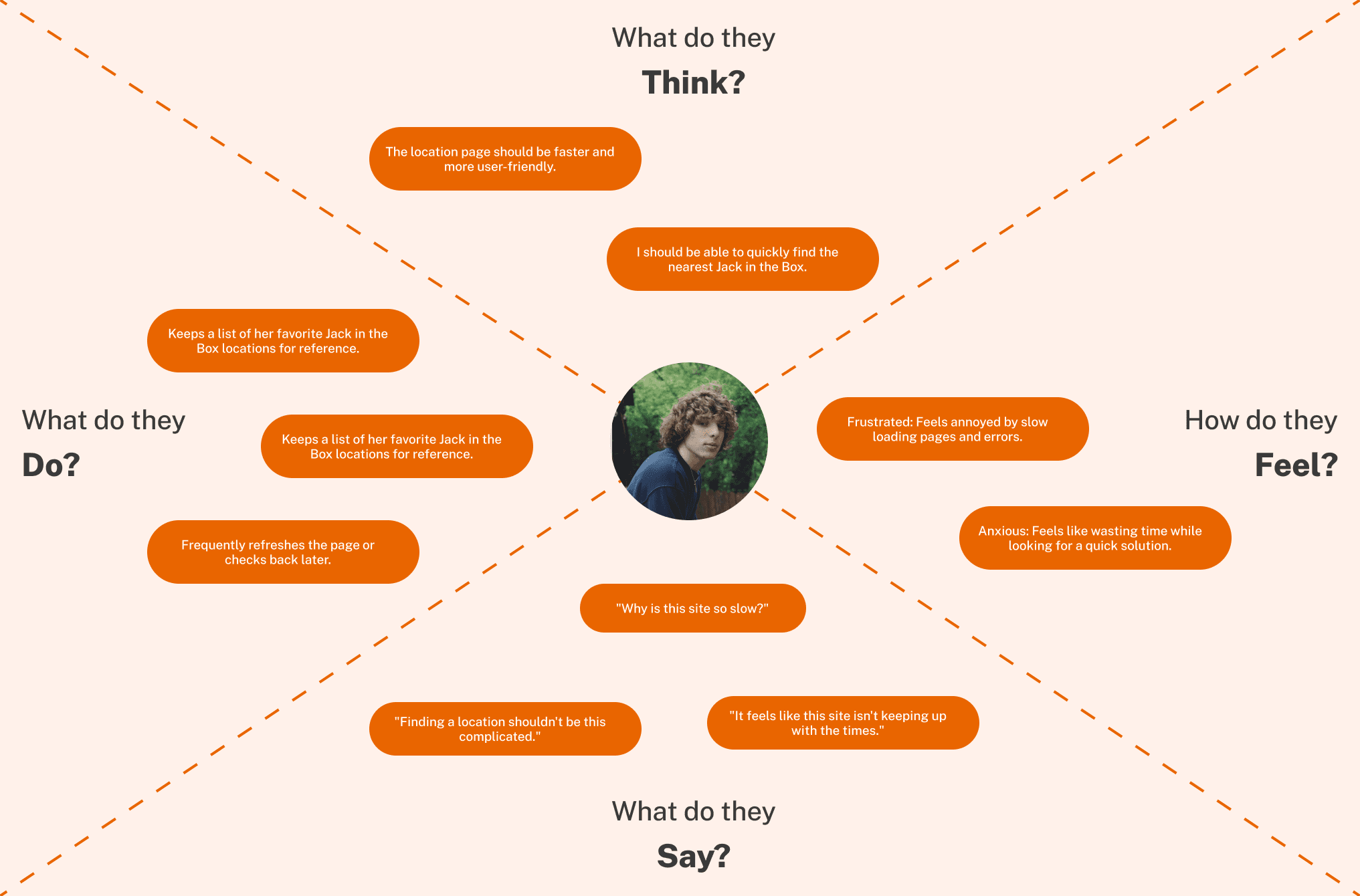
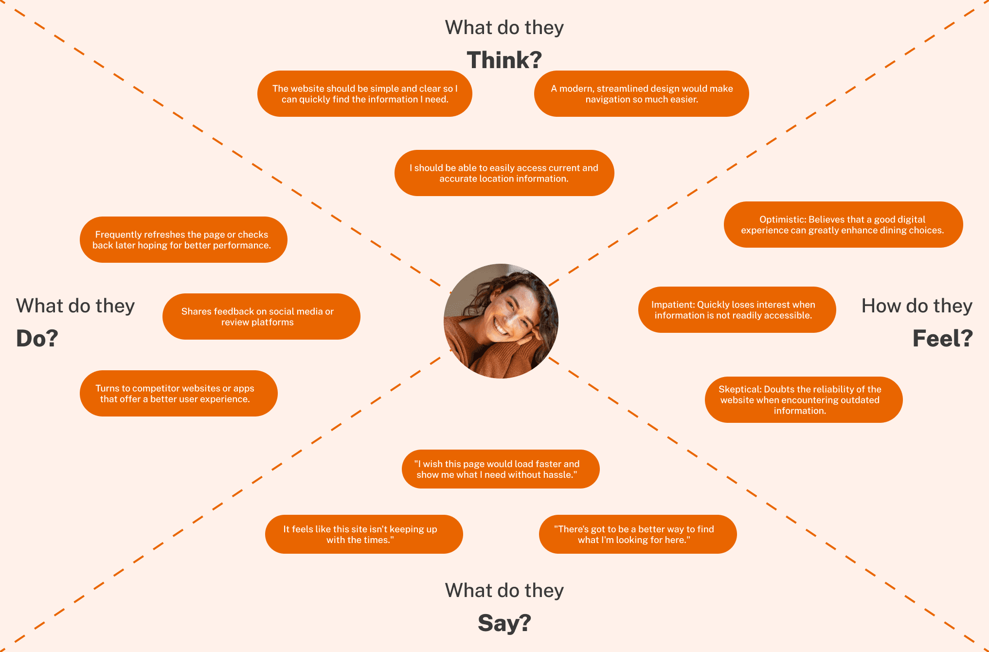
I created an empathy map focusing on user personas, incorporating the see, hear, think, feel, and do sections, as it allowed me to delve into the depths of the users' minds and better understand their expectations.
I created an empathy map focusing on user personas, incorporating the see, hear, think, feel, and do sections, as it allowed me to delve into the depths of the users' minds and better understand their expectations.




GATHERING IDEAS
GATHERING IDEAS
Feature Prioritization Matrix
Feature Prioritization Matrix
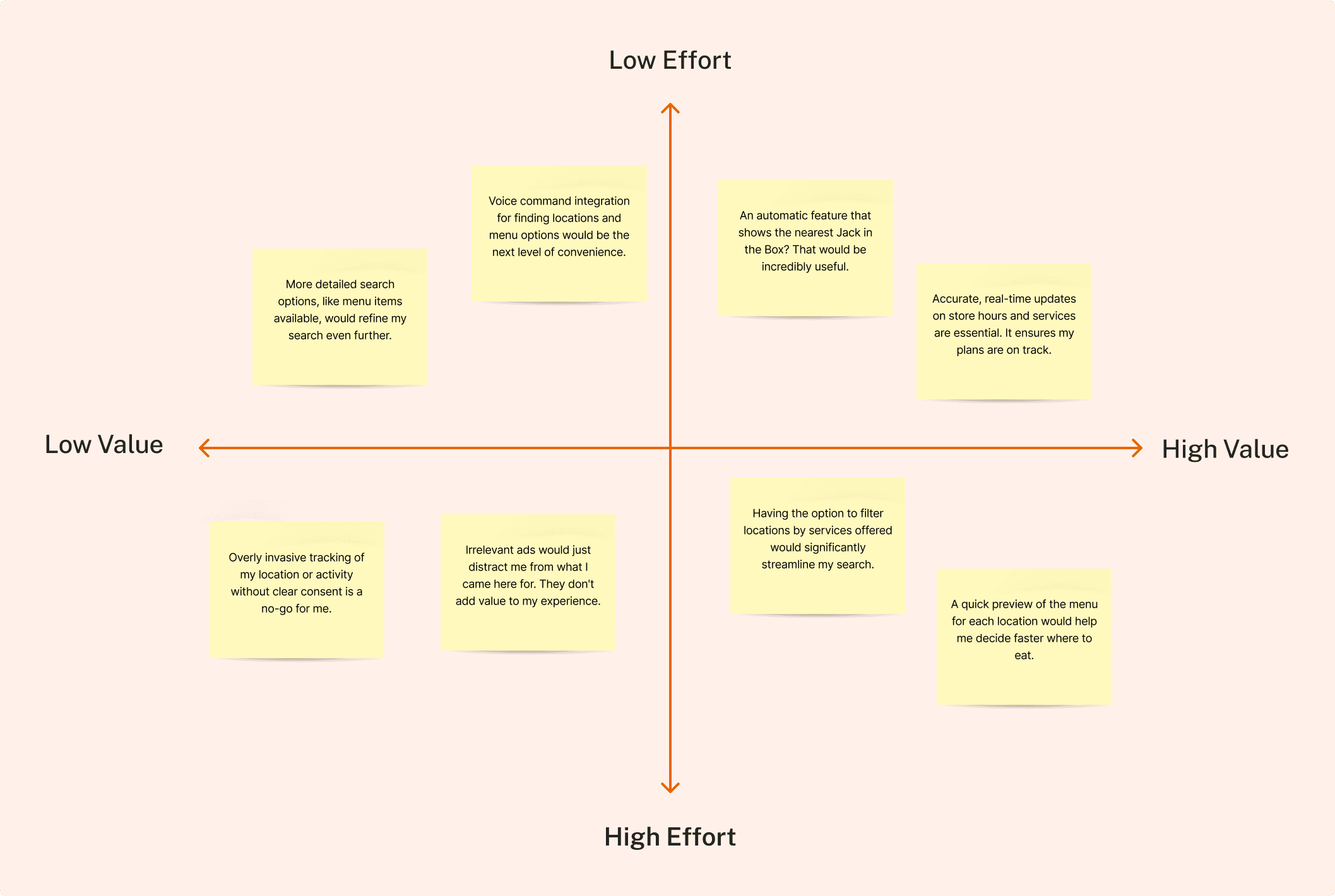
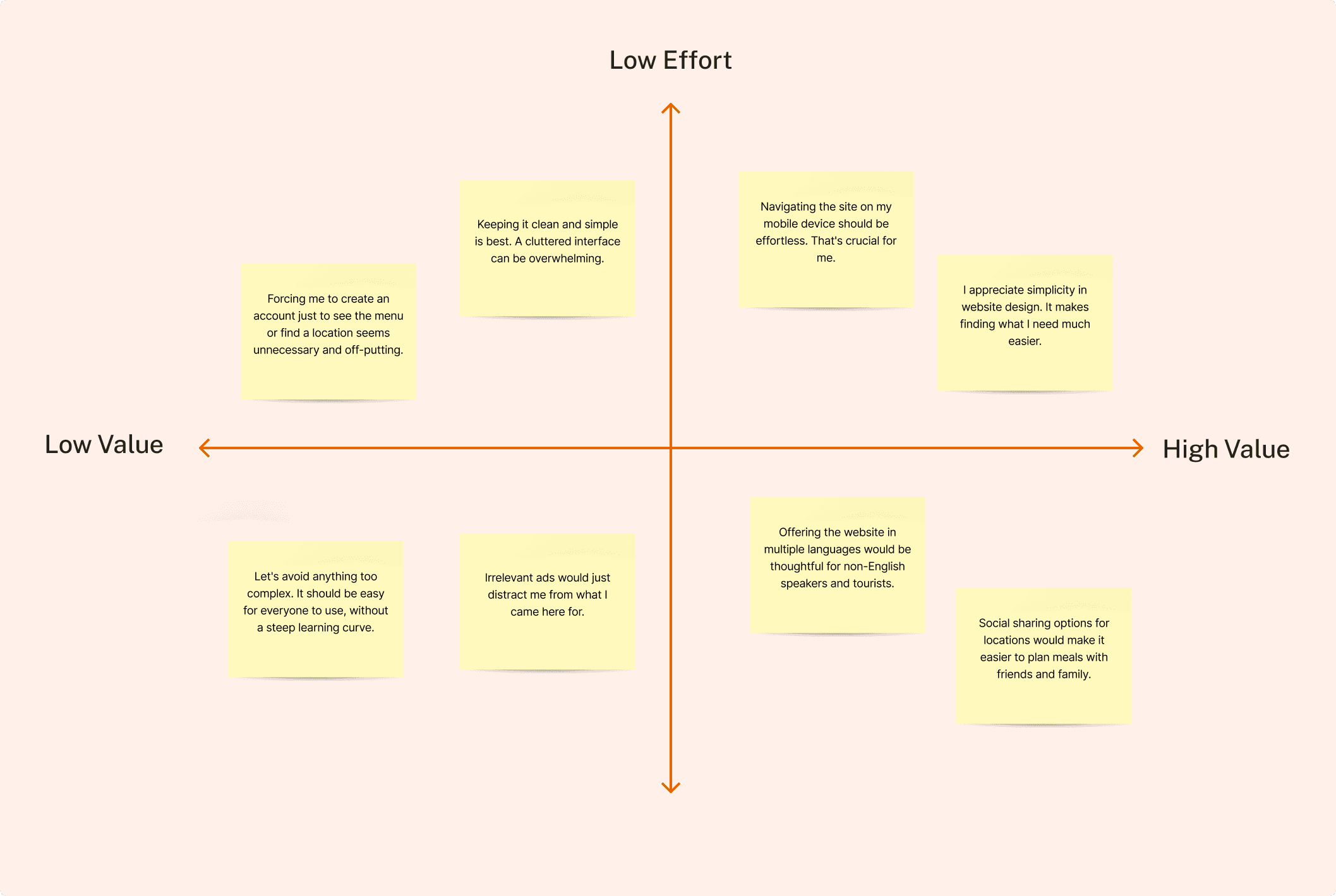
After creating user personas, I created a Feature Prioritization Matrix and took a series of steps to improve the user experience in order to better serve the project's goals.
After creating user personas, I created a Feature Prioritization Matrix and took a series of steps to improve the user experience in order to better serve the project's goals.
Visualizing Interface Design
Visualizing Interface Design
Wireframes
Wireframes
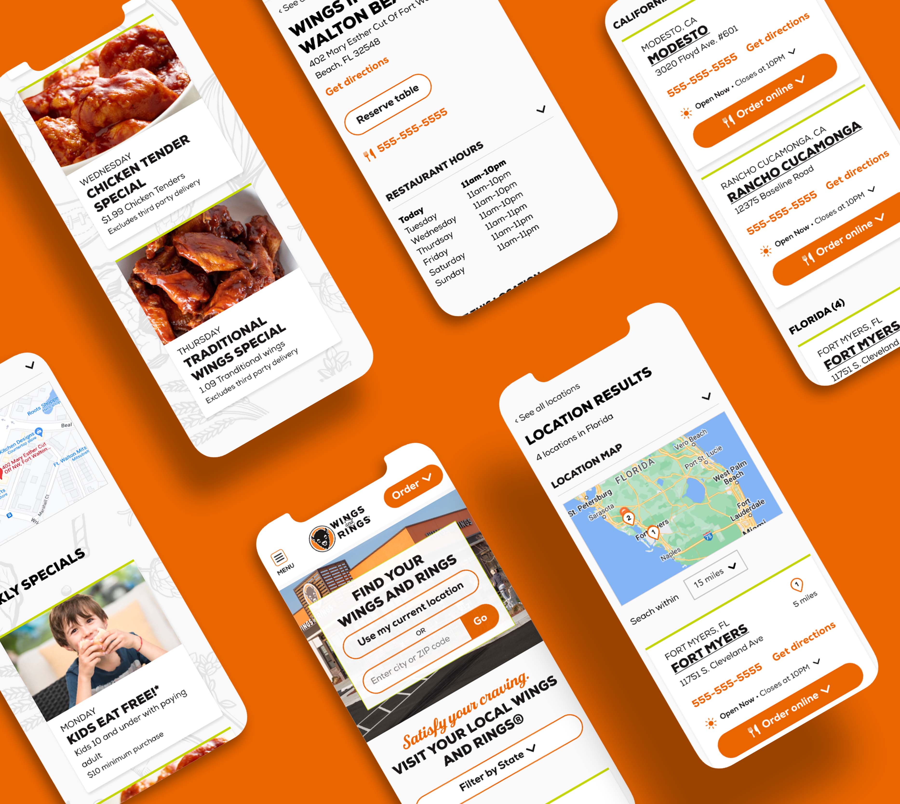
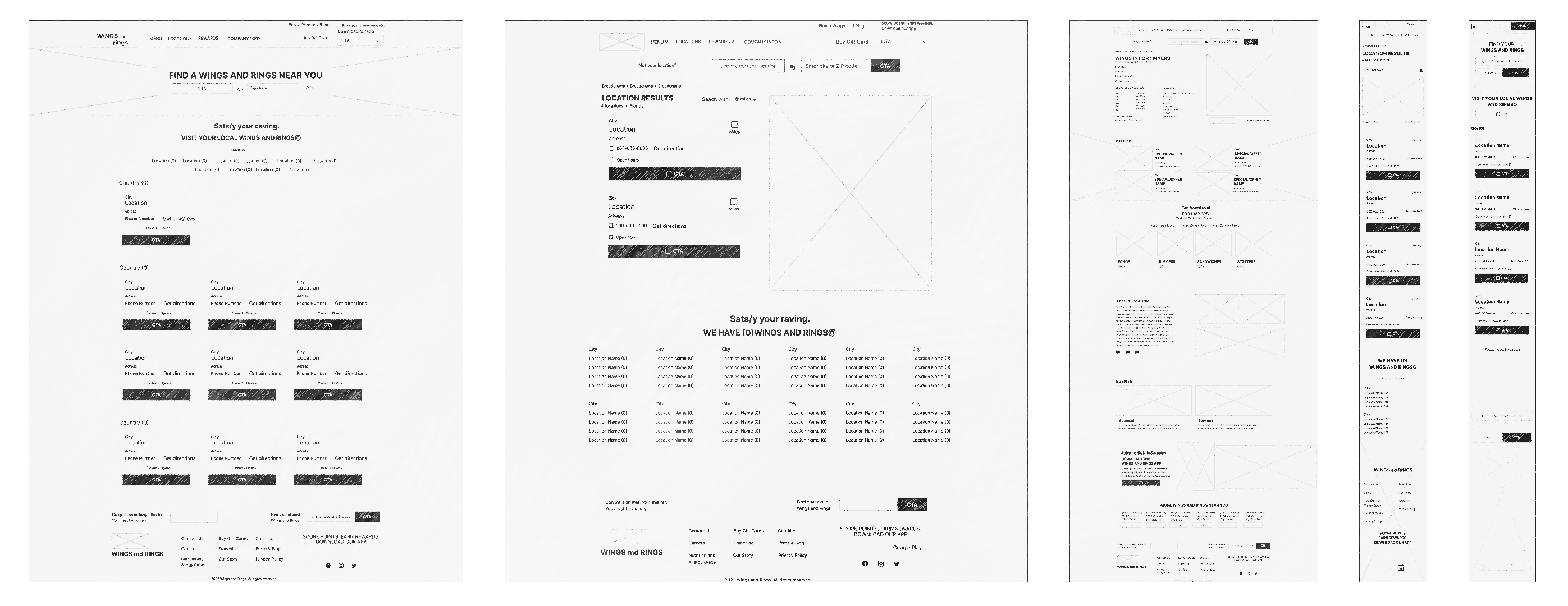
After some initial sketches, I created mid-fi wireframes to build out interactions and flows to test with users. The following shows the mobile version of the application.
After some initial sketches, I created mid-fi wireframes to build out interactions and flows to test with users. The following shows the mobile version of the application.


Establishing Design Consistency
Establishing Design Consistency
UI Library
UI Library
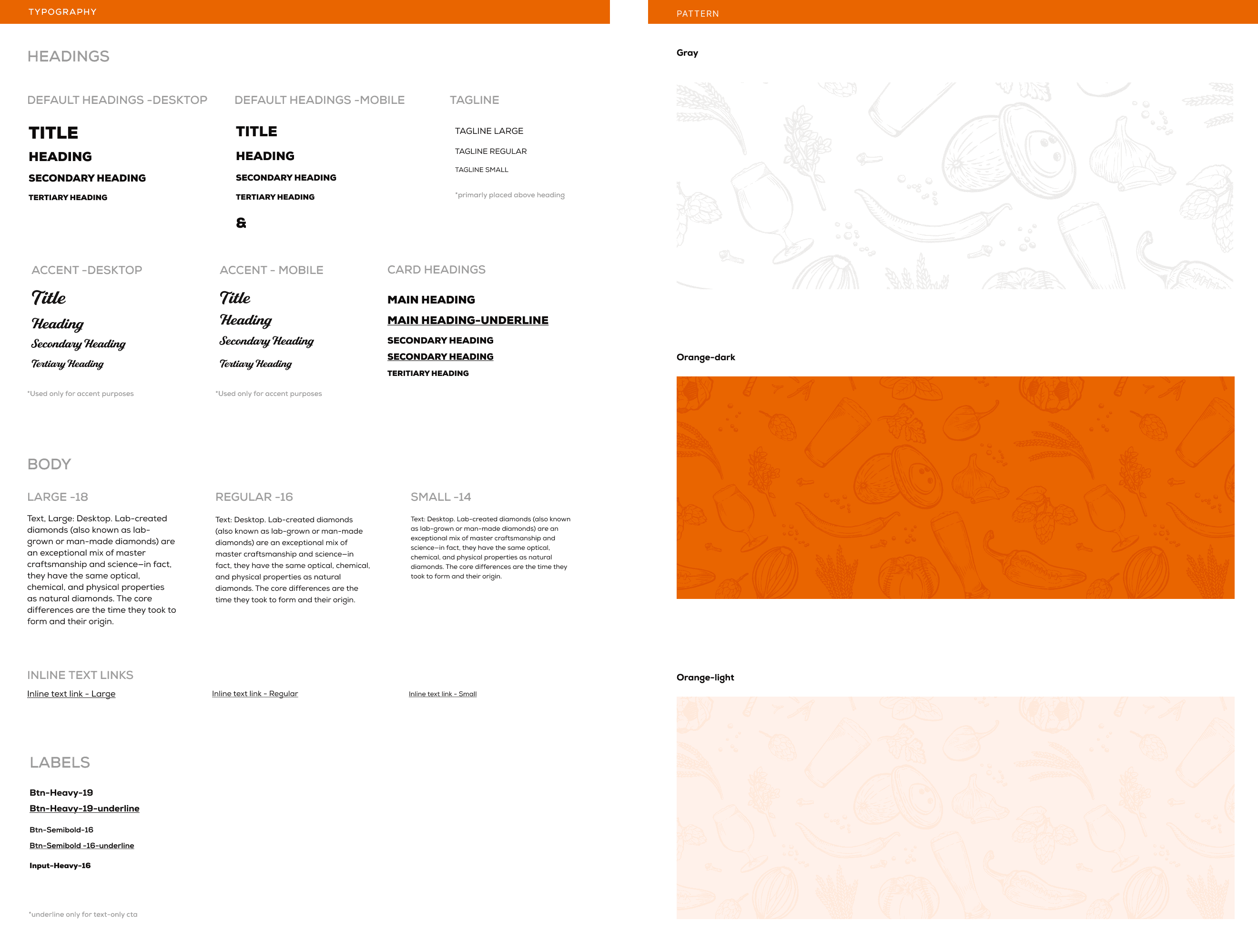
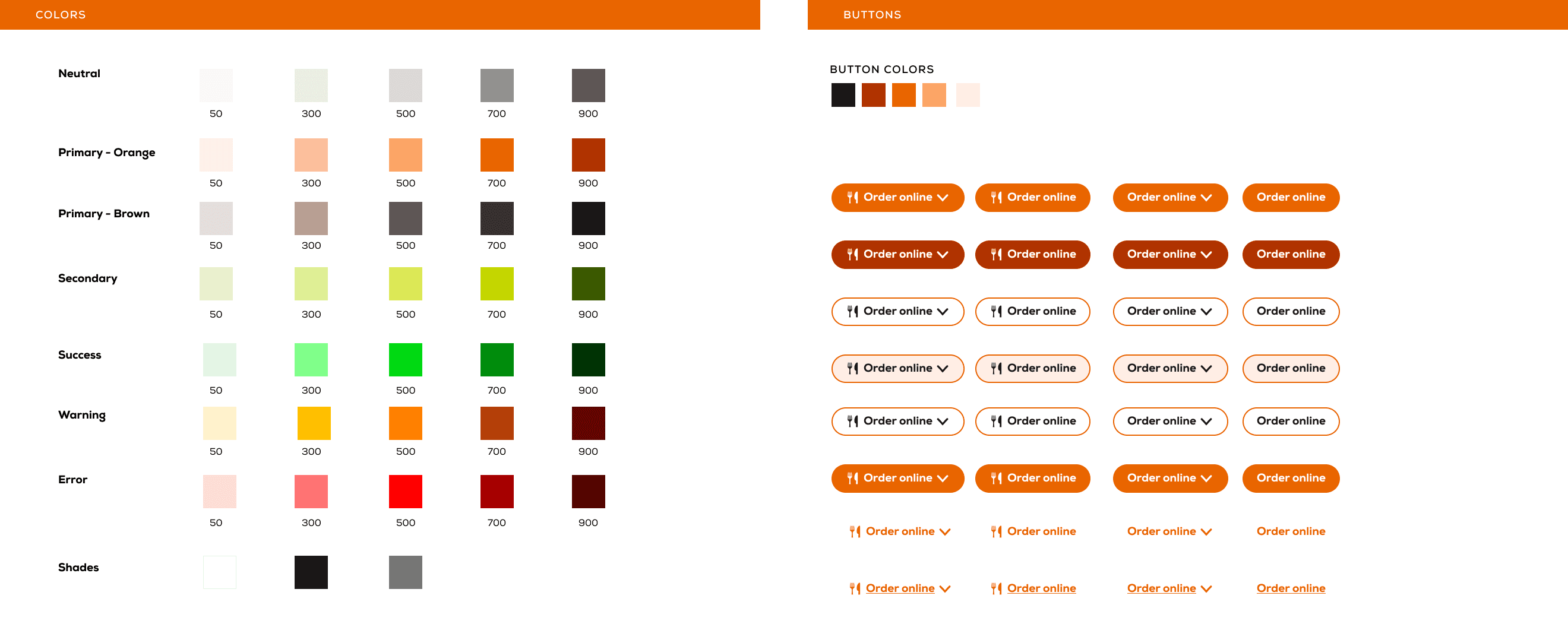
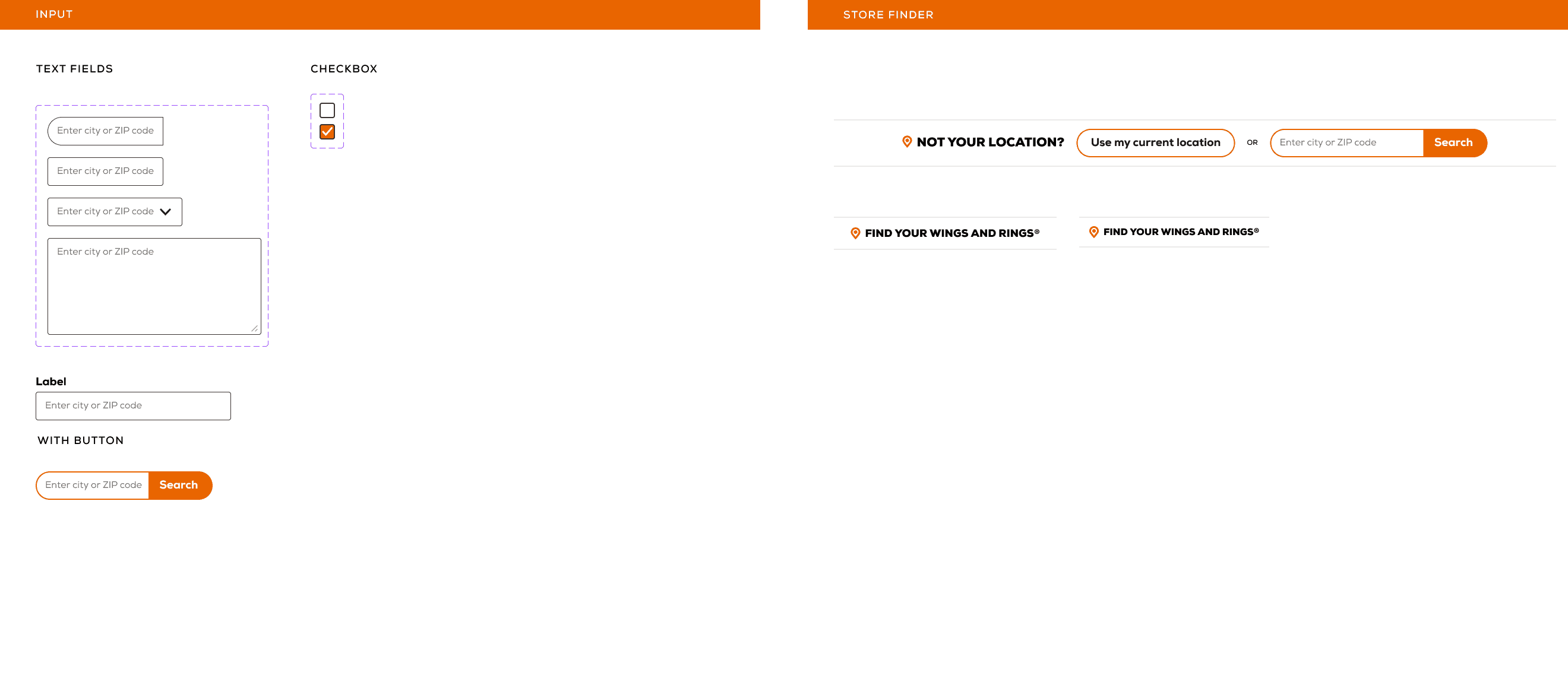
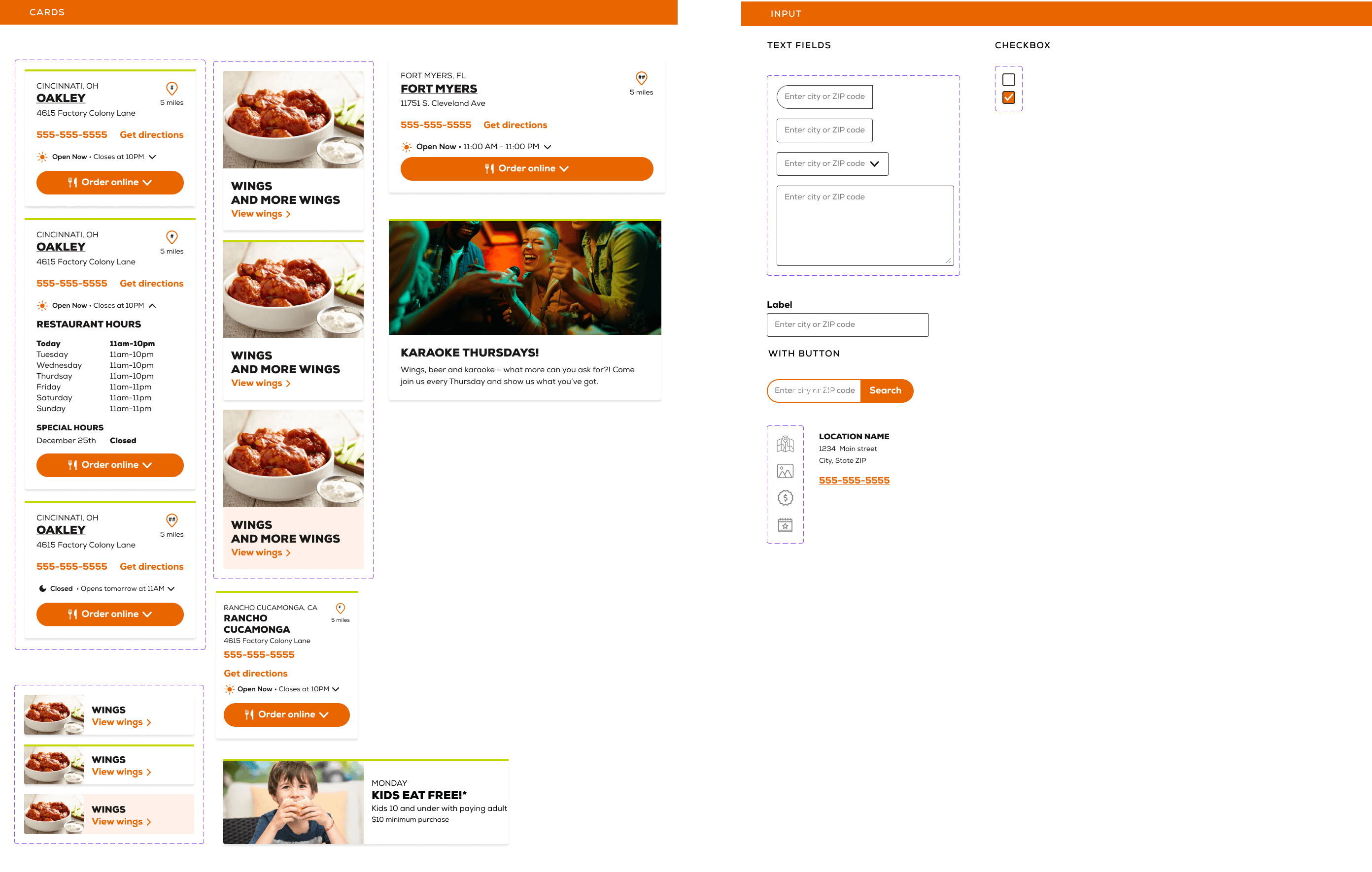
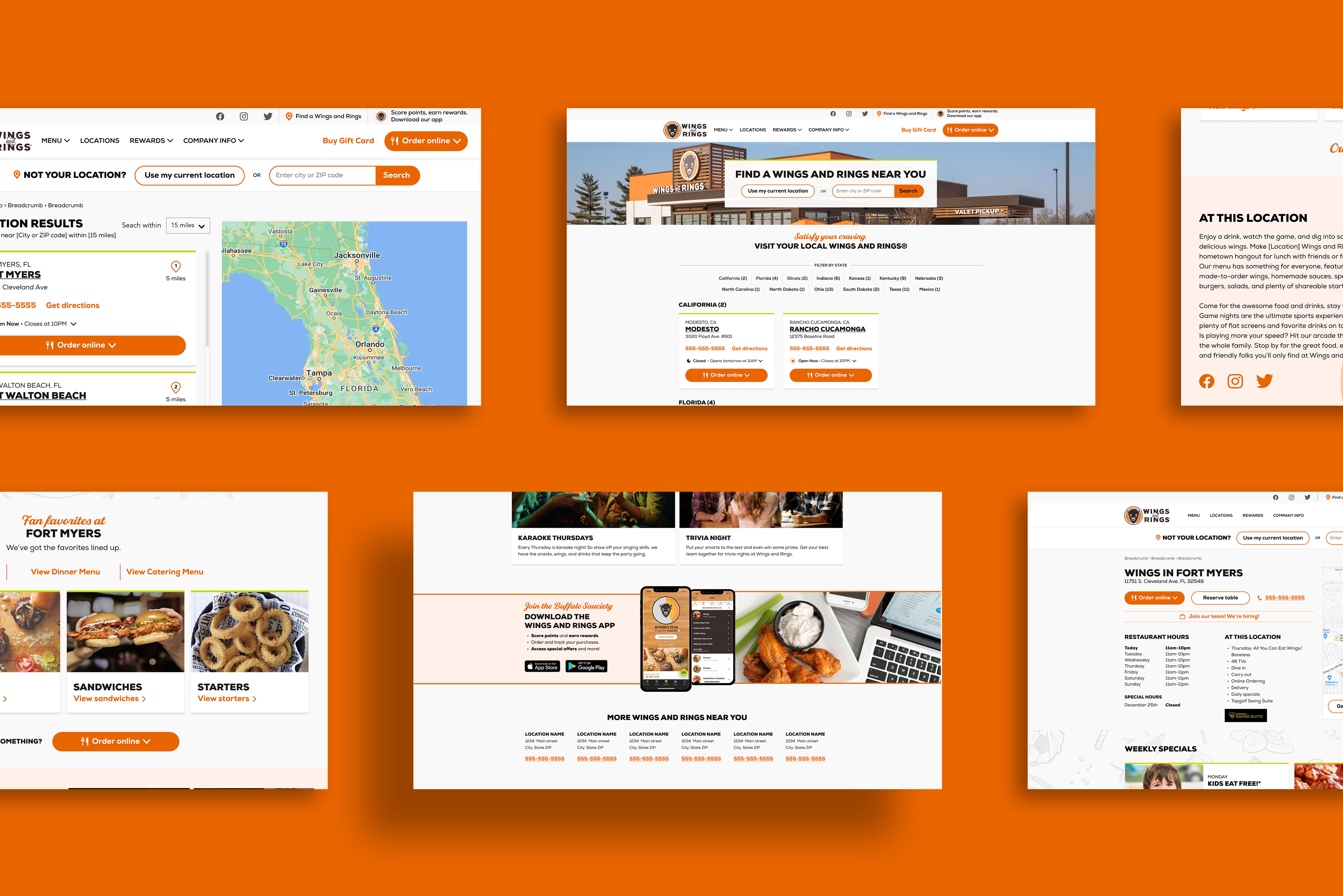
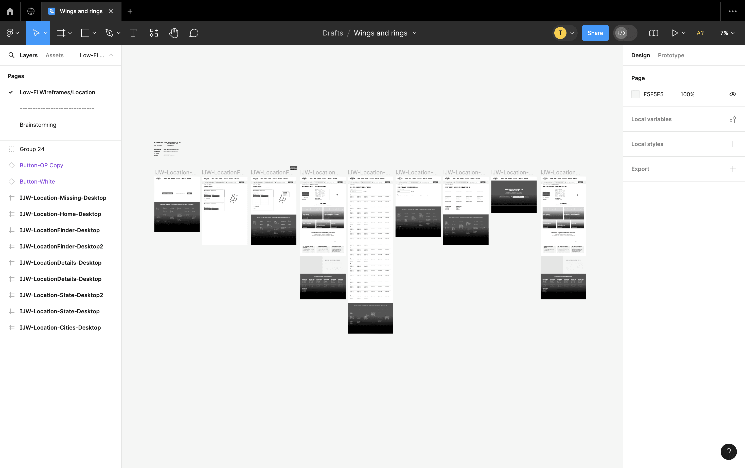
While creating high-resolution wireframes, I established a set of components like typography, buttons, icons, and components representing different services on Wings and Rings restaurant's location pages within an atomic design system. This facilitated quick implementation of designs and easy coding by the development team.
While creating high-resolution wireframes, I established a set of components like typography, buttons, icons, and components representing different services on Wings and Rings restaurant's location pages within an atomic design system. This facilitated quick implementation of designs and easy coding by the development team.
Optimizing Information Flow
Iteration
I conducted a small usability test with 4 individuals. I was looking to test clarity, completion and comprehension of the different features I made.
I conducted a small usability test with 4 individuals. I was looking to test clarity, completion and comprehension of the different features I made.

bEFORE
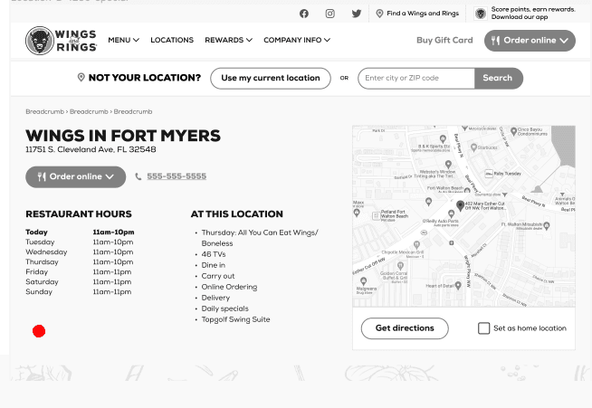
We found the absence of the Special Hours section, crucial for indicating the operating status on special days.
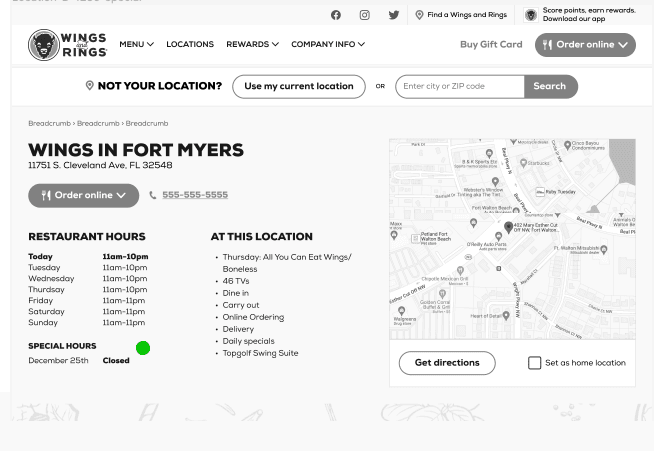

aFTER
Therefore, we added the Special Hours section to create a better location page for users.

bEFORE
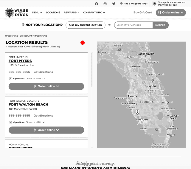
We decided to add the Miles section to help users reach the nearest location more quickly.
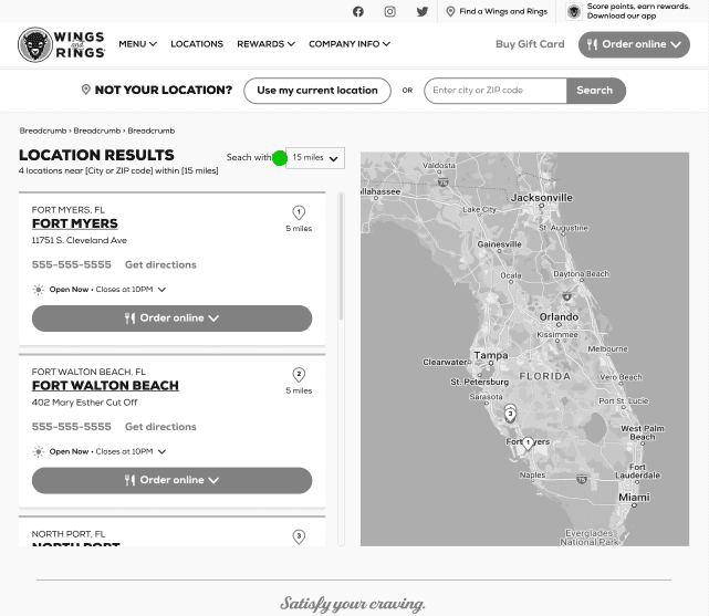

aFTER
The Miles section was added, enabling users to access the nearest location in miles.
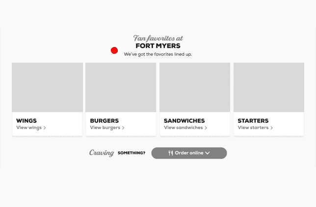

bEFORE
We did not specify whether the location page offered lunch, dinner, or catering contents.
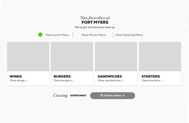

aFTER
Therefore, we added these sections to the newly designed website.
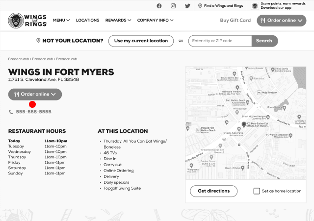

bEFORE
The phone section had remained too far down, which could have caused people to press the order menu instead of the phone. Therefore, we decided to move it next to the button.
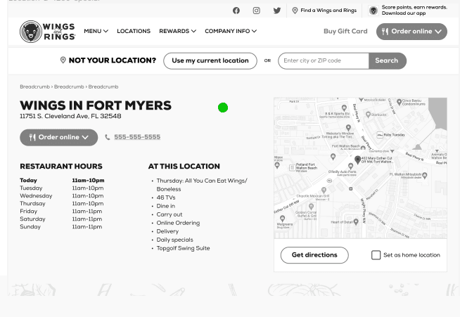

aFTER
The phone section was repositioned near the order button to avoid interaction problems, while the "Restaurant hours" and "At this location" sections were relocated upward with adjusted padding.
Real-World Validation
User Testing
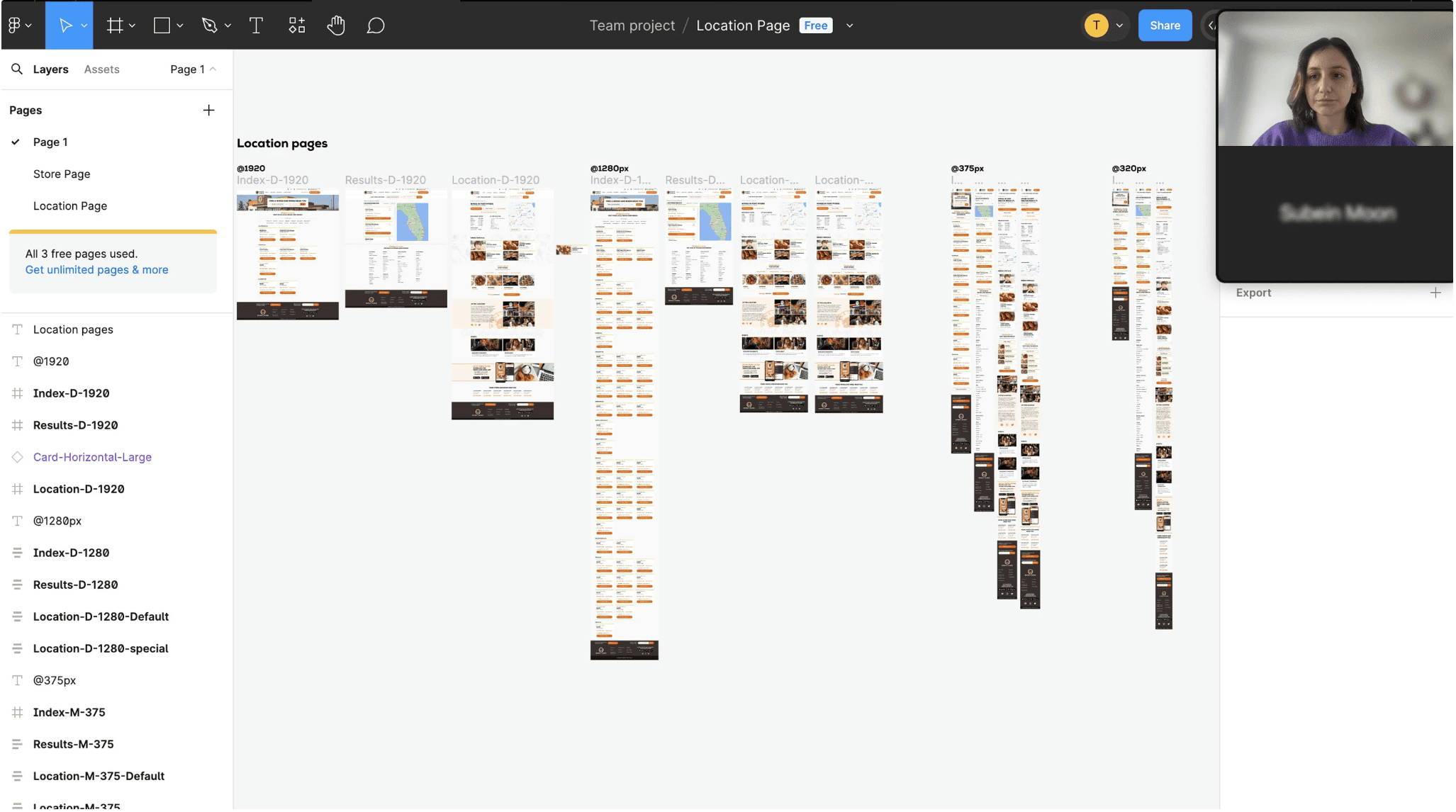
After the iteration, I conducted a user test via the Zoom platform, which included the entire team, Wings And Rings operators, and real users. This user test enabled us to gather user feedback, and we were pleased to see an increase in satisfaction.
After the iteration, I conducted a user test via the Zoom platform, which included the entire team, Wings And Rings operators, and real users. This user test enabled us to gather user feedback, and we were pleased to see an increase in satisfaction.
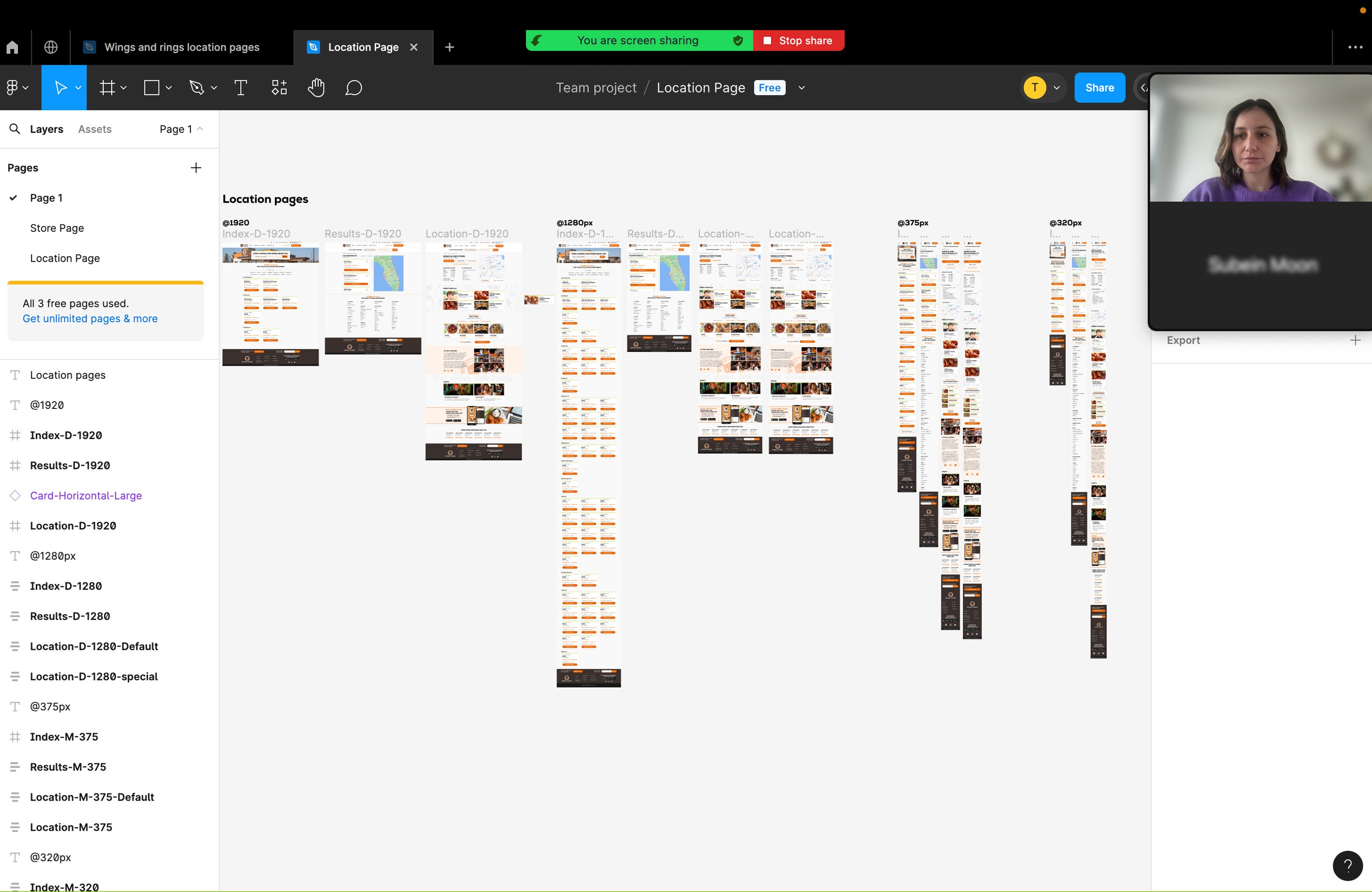
Test
Test
Prototype
Prototype
After various iterations and user tests, as well as corrections, I created a prototype and sent it to the development team. This step allowed me to see how users would interact with UI elements and content.
After various iterations and user tests, as well as corrections, I created a prototype and sent it to the development team. This step allowed me to see how users would interact with UI elements and content.
Future Directions
Future Directions
Next Steps
Next Steps
After deciding to proceed with several rounds of user testing on the Wings and Rings website, we then shared it with the development team. However, during this period, we also requested a refresh of the images on the Wings and Rings menu and homepage. While overseeing the development and testing of the website sent to the development team, I began working on the design for the menu and homepage.
After deciding to proceed with several rounds of user testing on the Wings and Rings website, we then shared it with the development team. However, during this period, we also requested a refresh of the images on the Wings and Rings menu and homepage. While overseeing the development and testing of the website sent to the development team, I began working on the design for the menu and homepage.
Key Insights
Key Insights
What I have Learned
What I have Learned
From this project, I've learned the importance of user-centric design and iterative improvement. By prioritizing user needs and feedback, we optimized the location page, enhancing accessibility and functionality. Additionally, I gained valuable experience in creating personas, wireframing, and prototyping, contributing to a more seamless user experience.
From this project, I've learned the importance of user-centric design and iterative improvement. By prioritizing user needs and feedback, we optimized the location page, enhancing accessibility and functionality. Additionally, I gained valuable experience in creating personas, wireframing, and prototyping, contributing to a more seamless user experience.

© Teni Melkonyan 2024. All rights reserved.
Designed by Teni Melkonyan
© Teni Melkonyan 2024. All rights reserved.
Designed by Teni Melkonyan


The Problem
Upon entering the Wings and Rings website, users encountered issues with locating, impeding access to location-based details, prompting the recognition for a redesign due to previously underestimated limitations.
- Selecting a location took 10 minutes to access and gather information.
- Upon reaching the location info, sections like Weekly Specials, Fan favorites at Fort Myers, At This Location (Amenities), Download the Wings and Rings App were missing.
- Visually, it wasn't as strong as other restaurant websites, with some colors not meeting web accessibility guidelines.
Goal
My main goal was to maintain the essence of our current system while seizing opportunities on the location page, addressing problematic areas, and laying the groundwork for future advancements. This way, we aimed to provide a holistic and seamless location experience.
- We optimized the existing location layout to facilitate quicker and easier access to desired information for users.
- With the redesign, we planned to add a "Search Within" section for users to easily find the nearest locations on the location page.
- We also aimed to correct elements that were not compliant with web accessibility standards on the Wings and Rings location page, such as low-contrast color combinations or missing alternative texts.

Wings And Rings
Wings and Rings, deeply entrenched in both the restaurant and sports events industries, relentlessly aims to provide unparalleled dining and entertainment experiences.
UI/UX Design


Overview
The project aimed to revamp the Wings and Rings website's location page to elevate user experience, boost accessibility, and bolster brand loyalty. The focus was on rectifying navigation hurdles and integrating missing features while preserving the brand's essence.
Challenge
Upon joining, the team faced low traffic on the Wings and Rings website's location page, necessitating a redesign to attract more visitors and enhance brand affinity. The challenge lay in addressing navigation issues, missing features, and visual inconsistencies while aligning with the brand's identity.
Info
Agency
Pound & Grain
Year
2023
Tools
Figma
My Role
User Experience and User Interface
Team
Oleg Portnoy-Creative Director
Teni Melkonyan-Designer
Wings and Rings users were having difficulty accessing the correct location of the restaurants.
As a result of the improvements made, this rate decreased.
Google Analytics
The Problem
Upon entering the Wings and Rings website, users encountered issues with locating, impeding access to location-based details, prompting the recognition for a redesign due to previously underestimated limitations.
- Selecting a location took 10 minutes to access and gather information.
- Upon reaching the location info, sections like Weekly Specials, Fan favorites at Fort Myers, At This Location (Amenities), Download the Wings and Rings App were missing.
- Visually, it wasn't as strong as other restaurant websites, with some colors not meeting web accessibility guidelines.
Goal
My main goal was to maintain the essence of our current system while seizing opportunities on the location page, addressing problematic areas, and laying the groundwork for future advancements. This way, we aimed to provide a holistic and seamless location experience.
- We optimized the existing location layout to facilitate quicker and easier access to desired information for users.
- With the redesign, we planned to add a "Search Within" section for users to easily find the nearest locations on the location page.
- We also aimed to correct elements that were not compliant with web accessibility standards on the Wings and Rings location page, such as low-contrast color combinations or missing alternative texts.


Process
Design Thinking
In the Wings And Rings x project, the design thinking steps provided me with crucial guidance to understand, define, ideate, design, and iteratively advance the process. These steps were important for me to understand user needs and develop satisfactory solutions.


UNDERSTAND THE PROBLEM
User Research
I further analyzed the research data collected by the marketing team and found that users found the Wings and Rings brand sincere, but they mentioned drifting away due to issues on the website. New users expressed satisfaction when using the website, but hesitated to continue using it when navigating to the location page.


Points
Key Research Insights
After conducting a more detailed secondary research following our initial investigation, the outcome remained unchanged. As a result of these studies, we gathered four key insights to guide the project.


Evaluating Market Landscape
Competitive Analysis
I chose and compared the three major competitors which has similar services and business models with Wings and Rings, aiming to find out what’s unique about Wings and Rings and what its website should improve.


Defining User Profiles
User Persona
Based on user research and feedback, I created a two different personas that helped me identify the goals and frustrations of the users I had in mind throughout the design process.


Mapping User Experience
User Flow
After creating user personas, I chose to create a user flow because it allowed me to detail the steps users took to complete specific tasks, optimizing the user experience.


Understanding User Needs
Empthy Map
I created an empathy map focusing on user personas, incorporating the see, hear, think, feel, and do sections, as it allowed me to delve into the depths of the users' minds and better understand their expectations.


GATHERING IDEAS
Feature Prioritization Matrix
After creating user personas, I created a Feature Prioritization Matrix and took a series of steps to improve the user experience in order to better serve the project's goals.


Visualizing Interface Design
Wireframes
After some initial sketches, I created mid-fi wireframes to build out interactions and flows to test with users. The following shows the mobile version of the application.


Establishing Design Consistency
UI Library
While creating high-resolution wireframes, I established a set of components like typography, buttons, icons, and components representing different services on Wings and Rings restaurant's location pages within an atomic design system. This facilitated quick implementation of designs and easy coding by the development team.
Optimizing Information Flow
Iteration
I conducted a small usability test with 4 individuals. I was looking to test clarity, completion and comprehension of the different features I made.


bEFORE
The phone section had remained too far down, which could have caused people to press the order menu instead of the phone. Therefore, we decided to move it next to the button.


aFTER
The phone section was repositioned near the order button to avoid interaction problems, while the "Restaurant hours" and "At this location" sections were relocated upward with adjusted padding.


bEFORE
We found the absence of the Special Hours section, crucial for indicating the operating status on special days.


aFTER
Therefore, we added the Special Hours section to create a better location page for users.


bEFORE
We decided to add the Miles section to help users reach the nearest location more quickly.


aFTER
The Miles section was added, enabling users to access the nearest location in miles.


bEFORE
We did not specify whether the location page offered lunch, dinner, or catering contents.


aFTER
Therefore, we added these sections to the newly designed website.
Real-World Validation
User Testing
After the iteration, I conducted a user test via the Zoom platform, which included the entire team, Wings And Rings operators, and real users. This user test enabled us to gather user feedback, and we were pleased to see an increase in satisfaction.


Test
Prototype
After various iterations and user tests, as well as corrections, I created a prototype and sent it to the development team. This step allowed me to see how users would interact with UI elements and content.
Future Directions
Next Steps
After deciding to proceed with several rounds of user testing on the Wings and Rings website, we then shared it with the development team. However, during this period, we also requested a refresh of the images on the Wings and Rings menu and homepage. While overseeing the development and testing of the website sent to the development team, I began working on the design for the menu and homepage.
Key Insights
What I have Learned
From this project, I've learned the importance of user-centric design and iterative improvement. By prioritizing user needs and feedback, we optimized the location page, enhancing accessibility and functionality. Additionally, I gained valuable experience in creating personas, wireframing, and prototyping, contributing to a more seamless user experience.
© Teni Melkonyan 2024. All rights reserved.
Designed by Teni Melkonyan
© Teni Melkonyan 2024. All rights reserved.
Designed by Teni Melkonyan
